import random

import matplotlib.pyplot as plt
import numpy as np
import numpy.random as rnd
import pandas as pd

import geopandas as gpd
import contextily as ctx
from shapely.geometry import Point
import plotly.graph_objects as go

import keras
from keras.metrics import SparseTopKCategoricalAccuracy
from keras.models import Sequential, Model
from keras.layers import Dense, Input
from keras.callbacks import EarlyStopping

from sklearn import tree, set_config
from sklearn.preprocessing import LabelEncoder, OrdinalEncoder, StandardScaler, OneHotEncoder
from sklearn.feature_extraction.text import CountVectorizer
from sklearn.model_selection import train_test_split
from sklearn.compose import make_column_transformer
from sklearn.metrics import mean_poisson_deviance, mean_absolute_error
from sklearn.base import BaseEstimator, RegressorMixin
from sklearn.inspection import PartialDependenceDisplay
set_config(transform_output="pandas")

import statsmodels.api as sm
import statsmodels.formula.api as smf

from pygam import PoissonGAM, s, f

from anam import (
    ANAM, train_anam, TrainingConfig, prepare_data,
    poisson_nll, plot_shape_function,
)Interpretability
ACTL3143 & ACTL5111 Deep Learning for Actuaries
Introduction
The right to an explanation
On your thirtieth birthday, you awake to find two police officers standing over you. They inform you that you’re under arrest. When you ask what for, they tell you that they don’t know, but their boss, the inspector, will be along soon, and he’ll be able to tell you. A few hours later, you’re ushered into a neighboring tenant’s bedroom. The inspector tells you that he doesn’t know what you’ve been charged with, but you’re free to go about your life, except that you must report to a hearing on Sunday. And so you move through the criminal justice system, never knowing what crime you’ve allegedly committed, nor understanding the rules of the process. On the eve of your thirty-first birthday, you’re taken away and executed.
Fortunately, this story is not about you, but is instead about Josef K., the fictional protagonist of Kafka’s The Trial.
— Vredenburgh (2022, p. 1)

Unfortunately, a broadly similar story is probably true about you, thanks to the use of algorithms to aid decision-making in a variety of institutions. One such example comes from Washington, DC. In 2009, the city set out to improve its school system, where only 8 percent of eighth graders were performing at grade level in math. It introduced IMPACT, a model to evaluate teacher performance developed by Mathematica Policy Research. The aim of the model was to identify poorly performing teachers, as input to firing decisions. The model that Mathematica Policy Research developed was complex and proprietary, and teachers couldn’t find anyone to explain to them why they’d been fired. In response to the firing of her colleagues on the basis of the model’s outputs, Sarah Bax, a math teacher, asked: “How do you justify evaluating people by a measure for which you are unable to provide an explanation?”.
— Vredenburgh (2022, p. 1)

The situation in insurance
“Understanding the relationships between the model inputs and outputs builds additional confidence in any model but is particularly challenging for many types of machine learning models. And in many applications, it is necessary for users and reviewers of models to understand whether the relationships between the model inputs and outputs make business sense, are compliant with laws and regulations, and/or can be explained to individuals impacted by the use of the model.”
— Baeder et al. (2021, p. 5)
NoteArticle 22 GDPR – Automated individual decision-making, including profiling
The data subject shall have the right not to be subject to a decision based solely on automated processing, including profiling, which produces legal effects concerning him or her or similarly significantly affects him or her.
Paragraph 1 shall not apply if the decision:
- is necessary for entering into, or performance of, a contract between the data subject and a data controller;
- is authorised by Union or Member State law to which the controller is subject and which also lays down suitable measures to safeguard the data subject’s rights and freedoms and legitimate interests; or
- is based on the data subject’s explicit consent.
- is necessary for entering into, or performance of, a contract between the data subject and a data controller;
In the cases referred to in points (a) and (c) of paragraph 2, the data controller shall implement suitable measures to safeguard the data subject’s rights and freedoms and legitimate interests, at least the right to obtain human intervention on the part of the controller, to express his or her point of view and to contest the decision.
Decisions referred to in paragraph 2 shall not be based on special categories of personal data referred to in Article 9(1), unless point (a) or (g) of Article 9(2) applies and suitable measures to safeguard the data subject’s rights and freedoms and legitimate interests are in place.
In some high-stakes contexts, governance and legal obligations make justification, human review and contestability especially important.
Definitions
“Surprisingly enough, although the concept of interpretability is increasingly widespread, there is no general consensus on both the definition and the measurement of the interpretability of a model.”
— Delcaillau et al. (2022)
“Definition Interpret means to explain or to present in understandable terms. In the context of ML systems, we define interpretability as the ability to explain or to present in understandable terms to a human.”
— Doshi-Velez & Kim (2017)
Interpretability \ne Explainability
“Interpretability is about transparency, about understanding exactly why and how the model is generating predictions, and therefore, it is important to observe the inner mechanics of the algorithm considered. This leads to interpreting the model’s parameters and features used to determine the given output. Explainability is about explaining the behavior of the model in human terms.”
— Charpentier (2024)
Aspects of interpretability
- Inherent Interpretability
-
The model is interpretable by design.
Models with inherent interpretability generally have a simple model architecture where the relationships between inputs and outputs are straightforward. This makes it easy to understand and comprehend the model’s inner workings and its predictions. As a result, the decision-making process becomes more convenient. Examples for models with inherent interpretability include:
- linear regression models
- generalized linear regression models
- decision trees.
- Post-hoc Explanations
-
The model is not interpretable by design, but we can use other methods to explain the model.
Post-hoc explanations refer to applying various techniques to understand how the model makes its predictions after the model is trained. Post-hoc explanations are useful for understanding predictions coming from complex models (less interpretable models) such as:
- neural networks
- random forests
- gradient boosting trees.
- Global Interpretability
-
The ability to understand how the model works.
- Local Interpretability
-
The ability to interpret/understand each prediction.
Global Interpretability focuses on understanding the model’s decision-making process as a whole. Global interpretability takes into account the entire dataset. These techniques will try to look at general patterns related to how input data drives the output in general. Examples for global interpretability techniques include:
- global feature importance method
- permutation importance methods
Local Interpretability focuses on understanding the model’s decision-making for a specific input observation. These techniques will try to look at how different input features contributed to the output.
Interpretable insurance pricing
For general insurance pricing, we adopted six interpretability and practical requirements:
- Transparency of main effects — an exact description of each covariate’s univariate effect on the output.
- Transparency of interaction effects — which interactions are used, and how they influence the prediction.
- Quantification of variable importance — rank the covariates by their influence on the output.
- Sparsity — only include features with a significant impact on the prediction.
- Monotonicity — capture known monotone relationships (e.g. worse bonus–malus \Rightarrow higher premium).
- Smoothness — predictions should vary smoothly with certain rating factors.
Models With False Accuracy
Package imports
Husky vs. Wolf
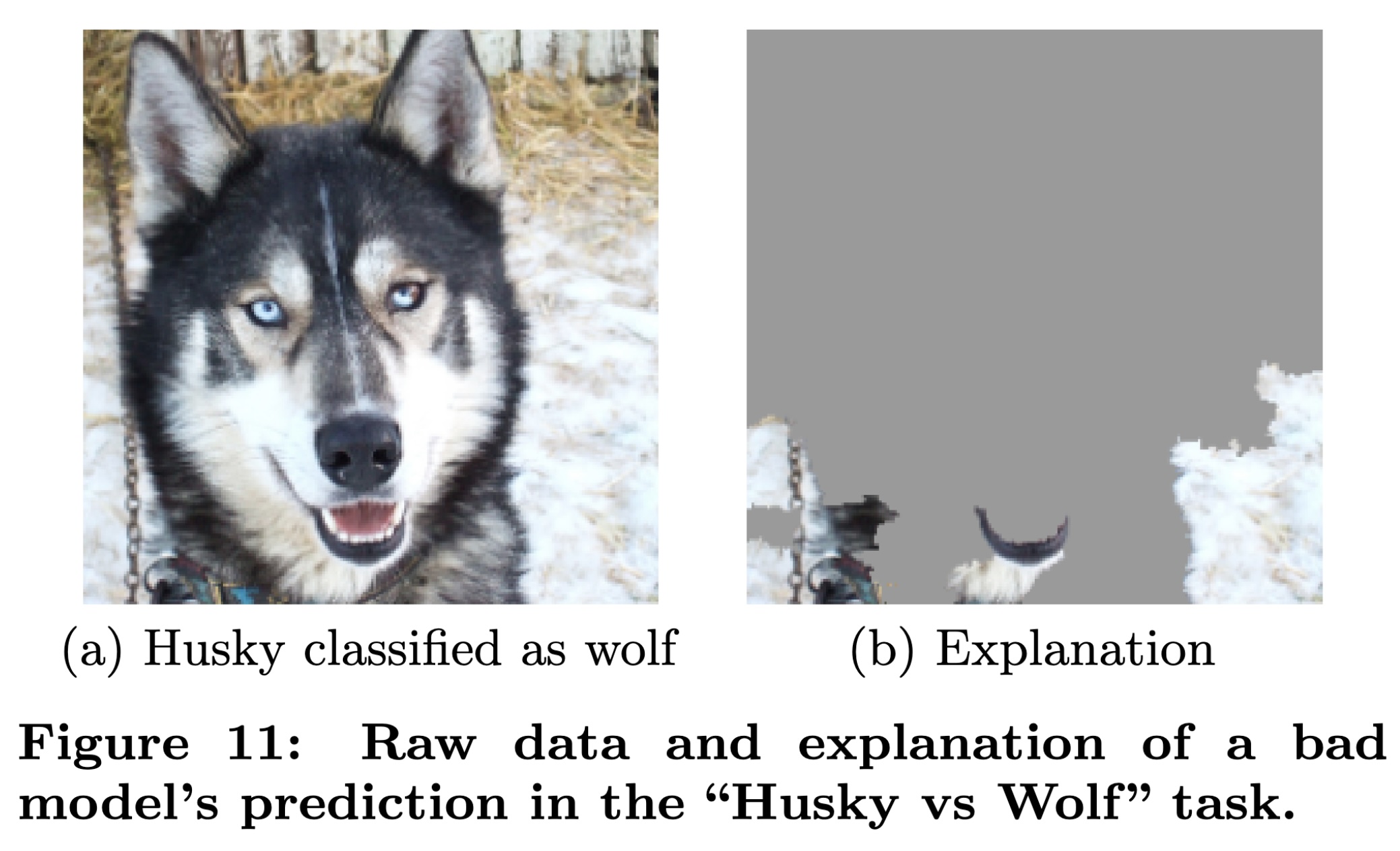
While the model might perform very well on the training data, it performs badly on the test set. This model has learned the wrong things: rather than looking at the facial features of the animal, it looks instead at the background. The model may have learned that wolves tend to be photographed in snowy environments, and huskies in non-snowy environments.
First attempt at NLP task
Code
df_raw = pd.read_parquet("data/NHTSA_NMVCCS_extract.parquet.gzip")

df_raw["NUM_VEHICLES"] = df_raw["NUMTOTV"].map(lambda x: str(x) if x <= 2 else "3+")

weather_cols = [f"WEATHER{i}" for i in range(1, 9)]
features = df_raw[["SUMMARY_EN"] + weather_cols]

target_labels = df_raw["NUM_VEHICLES"]
target = LabelEncoder().fit_transform(target_labels)

X_main, X_test, y_main, y_test = train_test_split(features, target, test_size=0.2, random_state=1)
X_train, X_val, y_train, y_val = train_test_split(X_main, y_main, test_size=0.25, random_state=1)df_raw["SUMMARY_EN"]0 V1, a 2000 Pontiac Montana minivan, made a lef...
1 The crash occurred in the eastbound lane of a ...
2 This crash occurred just after the noon time h...
...
6946 The crash occurred in the eastbound lanes of a...
6947 This single-vehicle crash occurred in a rural ...
6948 This two vehicle daytime collision occurred mi...
Name: SUMMARY_EN, Length: 6949, dtype: strdf_raw["NUM_VEHICLES"].value_counts()\
.sort_index()NUM_VEHICLES
1 1822
2 4151
3+ 976
Name: count, dtype: int64Trained neural networks performing really well on predictions does not necessarily imply good performance. Interrogating the model can help us understand its internal workings to ensure there are no underlying problems with the model.
Bag of words for the top 1,000 words
Code
def vectorise_dataset(X, vect, txt_col="SUMMARY_EN", dataframe=False):
    X_vects = vect.transform(X[txt_col]).toarray()
    X_other = X.drop(txt_col, axis=1)

    if not dataframe:
        return np.concatenate([X_vects, X_other], axis=1)
    else:
        # Add column names and indices to the combined dataframe.
        vocab = list(vect.get_feature_names_out())
        X_vects_df = pd.DataFrame(X_vects, columns=vocab, index=X.index)
        return pd.concat([X_vects_df, X_other], axis=1)
vect = CountVectorizer(max_features=1_000, stop_words="english")
vect.fit(X_train["SUMMARY_EN"])
X_train_bow = vectorise_dataset(X_train, vect)
X_val_bow = vectorise_dataset(X_val, vect)
X_test_bow = vectorise_dataset(X_test, vect)
vectorise_dataset(X_train, vect, dataframe=True).head()| 10 | 105 | 113 | 12 | 15 | 150 | 16 | 17 | 18 | 180 | ... | yield | zone | WEATHER1 | WEATHER2 | WEATHER3 | WEATHER4 | WEATHER5 | WEATHER6 | WEATHER7 | WEATHER8 | |
|---|---|---|---|---|---|---|---|---|---|---|---|---|---|---|---|---|---|---|---|---|---|
| 2532 | 0 | 0 | 0 | 0 | 0 | 0 | 0 | 0 | 0 | 0 | ... | 0 | 0 | 0 | 0 | 0 | 0 | 0 | 0 | 0 | 0 |
| 6209 | 0 | 0 | 0 | 0 | 0 | 0 | 0 | 0 | 0 | 0 | ... | 0 | 0 | 0 | 0 | 0 | 0 | 0 | 0 | 0 | 0 |
| 2561 | 1 | 0 | 1 | 0 | 0 | 0 | 0 | 0 | 0 | 0 | ... | 0 | 0 | 0 | 0 | 0 | 0 | 0 | 0 | 0 | 0 |
| 6664 | 0 | 0 | 0 | 0 | 0 | 0 | 0 | 0 | 0 | 0 | ... | 0 | 0 | 0 | 0 | 0 | 0 | 0 | 0 | 0 | 0 |
| 4214 | 0 | 0 | 0 | 0 | 0 | 0 | 0 | 0 | 0 | 0 | ... | 0 | 0 | 0 | 0 | 0 | 0 | 0 | 0 | 0 | 0 |
5 rows × 1008 columns
Trained a basic neural network on that
Code
def build_model(num_features, num_cats):
    random.seed(42)

    model = Sequential([
        Input((num_features,)),
        Dense(100, activation="relu"),
        Dense(num_cats, activation="softmax")
    ])

    topk = SparseTopKCategoricalAccuracy(k=2, name="topk")
    model.compile("adam", "sparse_categorical_crossentropy",
        metrics=["accuracy", topk])

    return model
num_features = X_train_bow.shape[1]
num_cats = df_raw["NUM_VEHICLES"].nunique()
model = build_model(num_features, num_cats)
es = EarlyStopping(patience=1, restore_best_weights=True, monitor="val_accuracy")
model.fit(X_train_bow, y_train, epochs=10,
callbacks=[es], validation_data=(X_val_bow, y_val), verbose=0)
model.summary()Model: "sequential"
┏━━━━━━━━━━━━━━━━━━━━━━━━━━━━━━━━━┳━━━━━━━━━━━━━━━━━━━━━━━━┳━━━━━━━━━━━━━━━┓
┃ Layer (type)                    ┃ Output Shape           ┃       Param # ┃
┡━━━━━━━━━━━━━━━━━━━━━━━━━━━━━━━━━╇━━━━━━━━━━━━━━━━━━━━━━━━╇━━━━━━━━━━━━━━━┩
│ dense (Dense)                   │ (None, 100)            │       100,900 │
├─────────────────────────────────┼────────────────────────┼───────────────┤
│ dense_1 (Dense)                 │ (None, 3)              │           303 │
└─────────────────────────────────┴────────────────────────┴───────────────┘
Total params: 303,611 (1.16 MB)
Trainable params: 101,203 (395.32 KB)
Non-trainable params: 0 (0.00 B)
Optimizer params: 202,408 (790.66 KB)
model.evaluate(X_train_bow, y_train, verbose=0)[0.03331480547785759, 0.9949628114700317, 0.9997601509094238]model.evaluate(X_val_bow, y_val, verbose=0)[0.09635408222675323, 0.9748201370239258, 0.9978417158126831]The model performs very well on both the training and validation data.
What words are actually important to making these predictions?
Code
def permutation_test(model, X, y, num_reps=1, seed=42):
    """
    Run the permutation test for variable importance.
    Returns matrix of shape (X.shape[1], len(model.evaluate(X, y))).
    """
    rnd.seed(seed)
    scores = []

    for j in range(X.shape[1]):
        original_column = np.copy(X[:, j])
        col_scores = []

        for r in range(num_reps):
            rnd.shuffle(X[:,j])
            col_scores.append(model.evaluate(X, y, verbose=0))

        scores.append(np.mean(col_scores, axis=0))
        X[:,j] = original_column

    return np.array(scores)
Run the permutation test
1all_perm_scores = permutation_test(model, X_val_bow, y_val)- 1
-
The
permutation_test, aims to evaluate the model’s performance on different sets of unseen data. The idea here is to shuffle the order of the val set, and compare themodelperformance.
Code
1perm_scores = all_perm_scores[:,1]
plt.plot(perm_scores)
plt.xlabel("Input index")
plt.ylabel("Accuracy when shuffled");- 1
-
[:,1]part will extract the accuracy of the output from the model evaluation and store is as a vector.
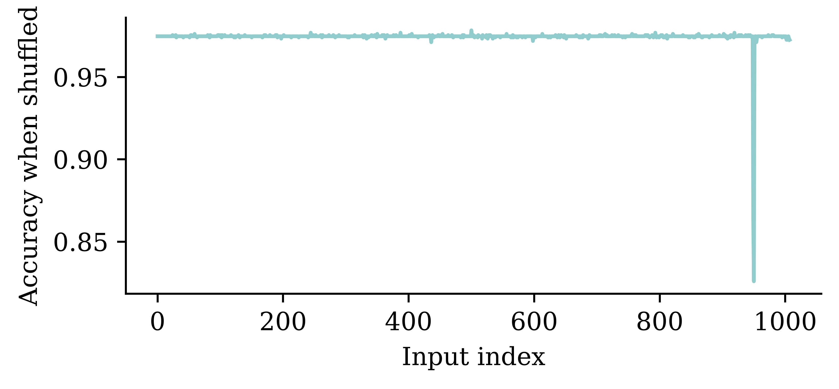
The above method on a high-level says that, if we corrupt the information contained in a feature by changing the order of the data in that feature column, then we are able to see how much information the variable brings in. If a certain variable is not contributing to the prediction accuracy, then changing the order of the variable will not result in a notable drop in accuracy. However, if a certain variable is highly important, then changing the order of data will result in a larger drop. This is an indication of variable importance. The plot above shows how model’s accuracy fluctuates across variables, and we can see how certain variables result in larger drops of accuracies.
Find the most significant inputs
Code
- 1
- Extracts the names of the features in a vectorizer object
- 2
- Combines the list of names in the vectorizer object with the weather columns
- 3
-
Sorts the
perm_scoresin the ascending order and select the 100 observation which had the most impact on model’s accuracy - 4
- Find the names of the input features by mapping the index
- 5
- Prints the output
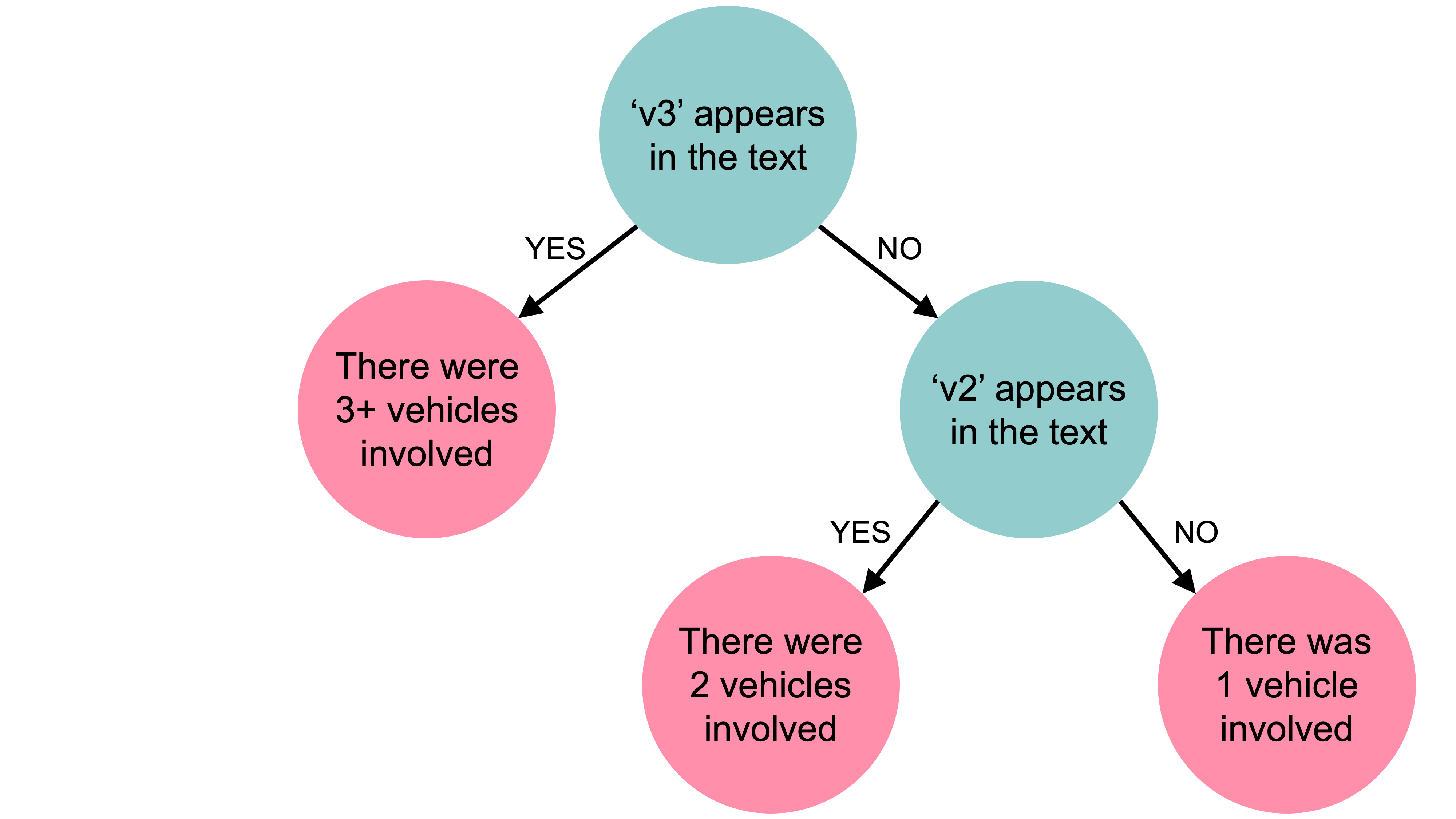
['v3', 'v2', 'vehicle', 'harmful', 'v4', 'motor', 'WEATHER8', 'WEATHER5', 'WEATHER4', 'WEATHER3', 'posted', 'trailer', 'parked', 'drove', 'chevrolet', 'event', 'single', 'WEATHER7', 'lane', 'light', 'legally', 'steered', 'traffic', 'continued', 'rest', 'concrete', 'afternoon', 'surface', 'arterial', 'asphalt', 'coded', 'second', 'seizure', 'seven', 'shortly', 'change', 'sightline', 'sign', 'struck', 'signs', 'striking', 'braking', 'began', 'spun', 'started', 'steady', 'attack', 'researcher', 'directions', 'decision', 'medication', 'median', 'maneuver', 'male', 'make', 'gas', 'meters', 'located', 'heading', 'leaving', 'kilometers', 'involved', 'inadequate', 'information', 'limit', 'crossed', 'minivan', 'mph', 'pre', 'pole', 'plane', 'direction', 'pickup', 'drivers', 'movement', 'pain', 'ordered', 'oncoming', 'encroaching', 'observed', 'number', 'noticed', 'dry', 'travel', 'injuries', '2006', 'waiting', 'year', 'vehicles', 'utility', '30', 'treatment', 'WEATHER1', '38', '48', 'ability', 'notice', 'noted', 'numerous', 'object']It turns out 'v2' and 'v3' are the terms used to describe the vehicles in the police reports. From just these two words it becomes pretty easy to predict how many cars were involved in an accident. No wonder they have the most impact on the model’s accuracy.
How about a simple decision tree?
We can try building a simpler model using only the most important features. Here, we chose a classification decision tree.
- 1
-
Specifies a decision tree with 3 leaf nodes.
max_leaf_nodes=3ensures that the fitted tree will have at most 3 leaf nodes - 2
-
Fits the decision tree on the selected dataset. Here we only select the
best_input_indscolumns from the train set
print(clf.score(X_train_bow[:, best_input_inds], y_train))
print(clf.score(X_val_bow[:, best_input_inds], y_val))
0.9186855360997841
0.9316546762589928The decision tree ends up giving pretty good results.
Decision tree
tree.plot_tree(clf, feature_names=best_inputs, filled=True);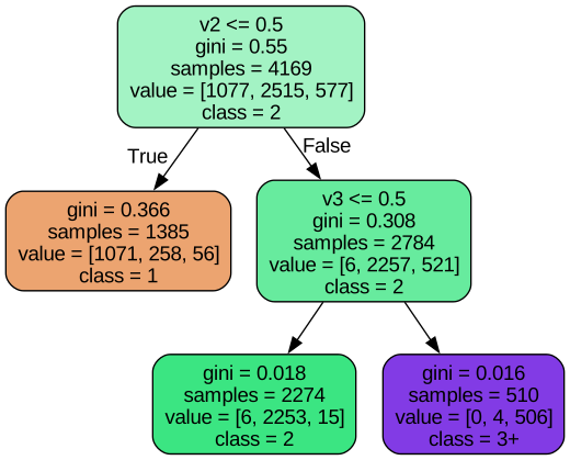
print(np.where(clf.feature_importances_ > 0)[0])
[best_inputs[ind] for ind in np.where(clf.feature_importances_ > 0)[0]]
[0 1]['v3', 'v2']Another choice for decision tree is by just using the terms 'v2' and 'v3' as follows:
This is why we replace “v1”, “v2”, “v3”
Code
# Go through every summary and find the words "V1", "V2" and "V3".
# For each summary, replace "V1" with a random number like "V1623", and "V2" with a different random number like "V1234".
rnd.seed(123)

df = df_raw.copy()
for i, summary in enumerate(df["SUMMARY_EN"]):
    word_numbers = ["one", "two", "three", "four", "five", "six", "seven", "eight", "nine", "ten"]
    num_cars = 10
    new_car_nums = [f"V{rnd.randint(100, 10000)}" for _ in range(num_cars)]
    num_spaces = 4

    for car in range(1, num_cars+1):
        new_num = new_car_nums[car-1]
        summary = summary.replace(f"V-{car}", new_num)
        summary = summary.replace(f"Vehicle {word_numbers[car-1]}", new_num).replace(f"vehicle {word_numbers[car-1]}", new_num)
        summary = summary.replace(f"Vehicle #{word_numbers[car-1]}", new_num).replace(f"vehicle #{word_numbers[car-1]}", new_num)
        summary = summary.replace(f"Vehicle {car}", new_num).replace(f"vehicle {car}", new_num)
        summary = summary.replace(f"Vehicle #{car}", new_num).replace(f"vehicle #{car}", new_num)
        summary = summary.replace(f"Vehicle # {car}", new_num).replace(f"vehicle # {car}", new_num)

        for j in range(num_spaces+1):
            summary = summary.replace(f"V{' '*j}{car}", new_num).replace(f"V{' '*j}#{car}", new_num).replace(f"V{' '*j}# {car}", new_num)
            summary = summary.replace(f"v{' '*j}{car}", new_num).replace(f"v{' '*j}#{car}", new_num).replace(f"v{' '*j}# {car}", new_num)

    df.loc[i, "SUMMARY_EN"] = summary
There was a slide in the NLP deck titled “Just ignore this for now…” That was going through each summary and replacing the words “V1”, “V2”, “V3” with random numbers. This was done to see if the model was overfitting to these words.
Code
features = df[["SUMMARY_EN"] + weather_cols]
X_main, X_test, y_main, y_test = train_test_split(features, target, test_size=0.2, random_state=1)
X_train, X_val, y_train, y_val = train_test_split(X_main, y_main, test_size=0.25, random_state=1)

vect = CountVectorizer(max_features=1_000, stop_words="english")
vect.fit(X_train["SUMMARY_EN"])

X_train_bow = vectorise_dataset(X_train, vect)
X_val_bow = vectorise_dataset(X_val, vect)
X_test_bow = vectorise_dataset(X_test, vect)

model = build_model(num_features, num_cats)

es = EarlyStopping(patience=1, restore_best_weights=True,
    monitor="val_accuracy", verbose=2)
model.fit(X_train_bow, y_train, epochs=10,
callbacks=[es], validation_data=(X_val_bow, y_val), verbose=0);Retraining on the fixed dataset gives us a more realistic (lower) accuracy.
model.evaluate(X_train_bow, y_train, verbose=0)[0.022723009809851646, 0.9990405440330505, 1.0]model.evaluate(X_val_bow, y_val, verbose=0)[0.16461113095283508, 0.9517985582351685, 0.9964028596878052]Permutation importance accuracy plot
Code
perm_scores = permutation_test(model, X_val_bow, y_val)[:,1]
plt.plot(perm_scores)
plt.xlabel("Input index"); plt.ylabel("Accuracy when shuffled");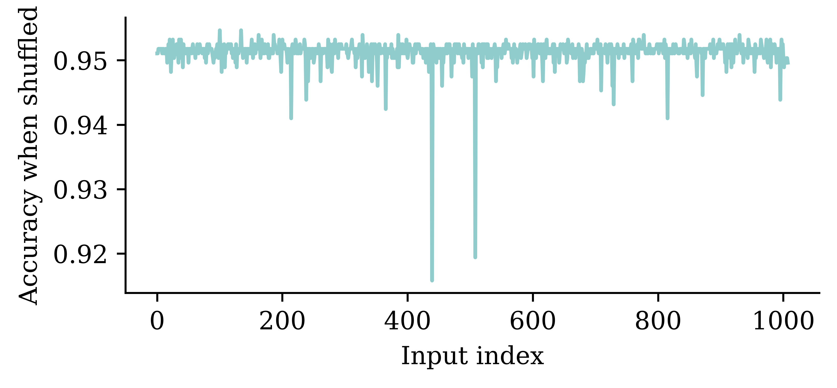
Once those words are removed, other words’ importance is more visible.
Find the most significant inputs
vocab = vect.get_feature_names_out()
input_cols = list(vocab) + weather_cols

best_input_inds = np.argsort(perm_scores)[:100]
best_inputs = [input_cols[idx] for idx in best_input_inds]

print(best_inputs)
['harmful', 'involved', 'single', 'coded', 'event', 'reason', 'year', 'contacted', 'struck', 'pushed', 'hit', 'encroachment', 'rear', 'continued', 'road', 'pickup', 'non', 'pole', 'limit', 'edge', 'critical', 'driven', 'impact', 'motor', 'intersection', 'stopped', 'police', 'guardrail', 'dry', 'vehicles', 'chevrolet', 'daylight', 'afternoon', '1999', 'occurred', 'traffic', 'day', 'alcohol', 'failure', 'WEATHER2', 'associated', 'westbound', 'familiar', 'interview', '30', 'lane', 'line', 'dodge', 'traveling', 'daily', 'away', 'encroaching', 'corner', 'asphalt', 'clear', 'ford', 'kph', 'grand', 'WEATHER5', 'WEATHER4', 'work', 'weekday', 'undivided', 'treated', 'toyota', 'stop', 'ran', 'poor', 'forward', 'parked', 'occupants', 'nissan', 'median', 'male', 'interviewed', 'injured', 'inadequate', 'impairment', 'home', 'heard', 'opposite', 'according', 'WEATHER8', '37', '1993', '23', '72', 'drives', 'right', 'contacting', '2003', 'contributed', 'unsuccessful', 'performance', 'paved', 'behavior', 'roof', 'brake', '46', 'initial']Adversarial examples
An adversarial attack refers to a small carefully created modification to the input data that aims to trick the model into making wrong predictions while keeping the y_true the same. The goal is to identify instances where subtle modifications in the input data (which are not instantaneously recognized) can lead to erroneous model predictions.
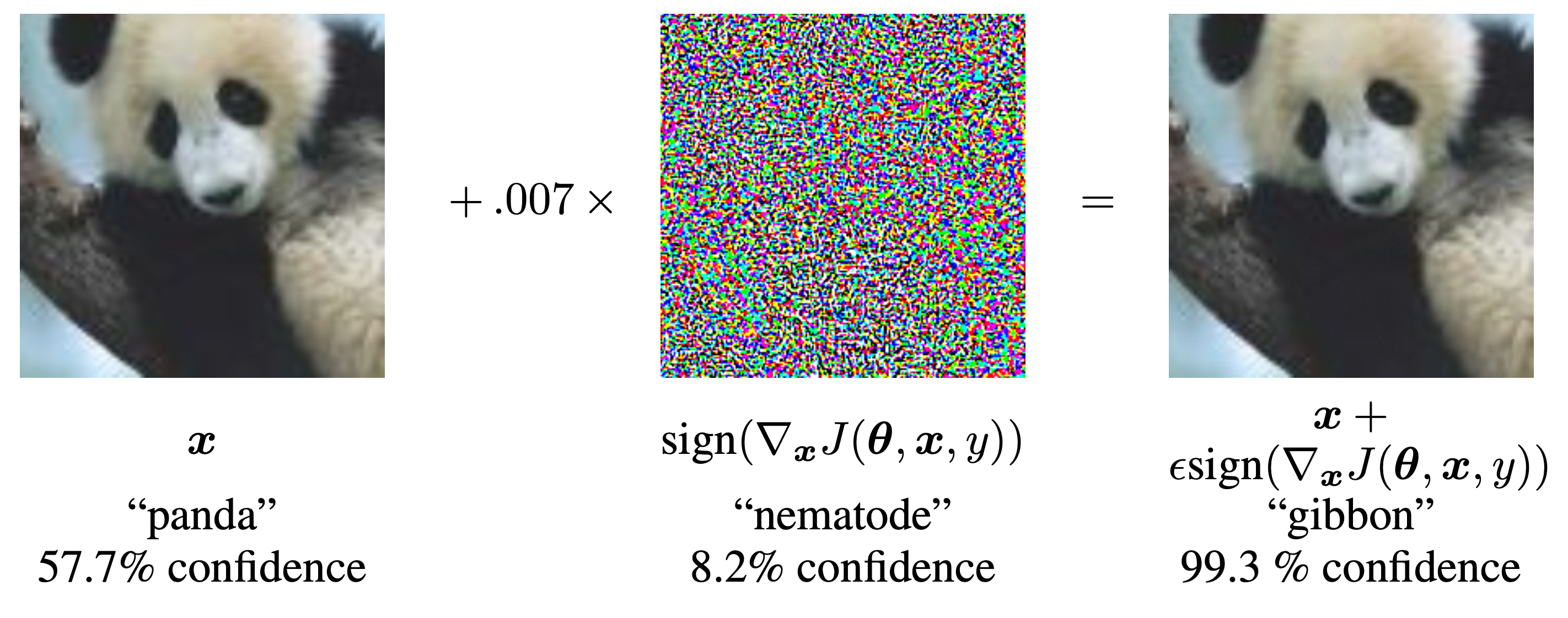
The above example shows how a small perturbation to the image of a panda led to the model predicting the image as a gibbon with high confidence. This indicates that there may be certain patterns in the data which are not clearly seen by the human eye, but the model is relying on them to make predictions. Identifying these sensitivities/vulnerabilities is important to understand how a model is making its predictions.
Inherently Interpretable Models
What is inherent interpretability?
“Interpretability by design is decided on the level of the machine learning algorithm. If you want a machine learning algorithm that produces interpretable models, the algorithm has to constrain the search of models to those that are interpretable. The simplest example is linear regression: When you use ordinary least squares to fit/train a linear regression model, you are using an algorithm that will produce … models that are linear in the input features. Models that are interpretable by design are also called intrinsically or inherently interpretable models.”
— Molnar (2020)

Examples of interpretable models
- Linear regression
- Generalised linear models
- Decision trees
- Decision rules
graph TD
  A{vpdmax8 < 27}
  A -->|true| B{pcpn8 ≥ 37}
  A -->|false| C{vpdmax6 < 29}

  B -->|true| D{tmax9 ≥ 21}
  B -->|false| E{tmax6 ≥ 26}

  D -->|true| F[11]
  D -->|false| G[118]

  E -->|true| H[60]
  E -->|false| I[133]

  C -->|true| J{tmax7 ≥ 31}
  C -->|false| M{tmax7 < 31}

  J -->|true| K[81]
  J -->|false| L[131]

  M -->|true| N[82]
  M -->|false| O[186]
E.g. decision tree for payouts of index insurance (Chen et al., 2024).
Non-greedy search can improve the accuracy of the tree, without sacrificing interpretability.
“The optimization over the node parameters (exact for axis-aligned trees, approximate for oblique trees) assumes the rest of the tree (structure and parameters) is fixed. The greedy nature of the algorithm means that once a node is optimized, it its [sic] fixed forever.”
— Carreira-Perpinán & Tavallali (2018)
Some processes don’t fit the tree structure
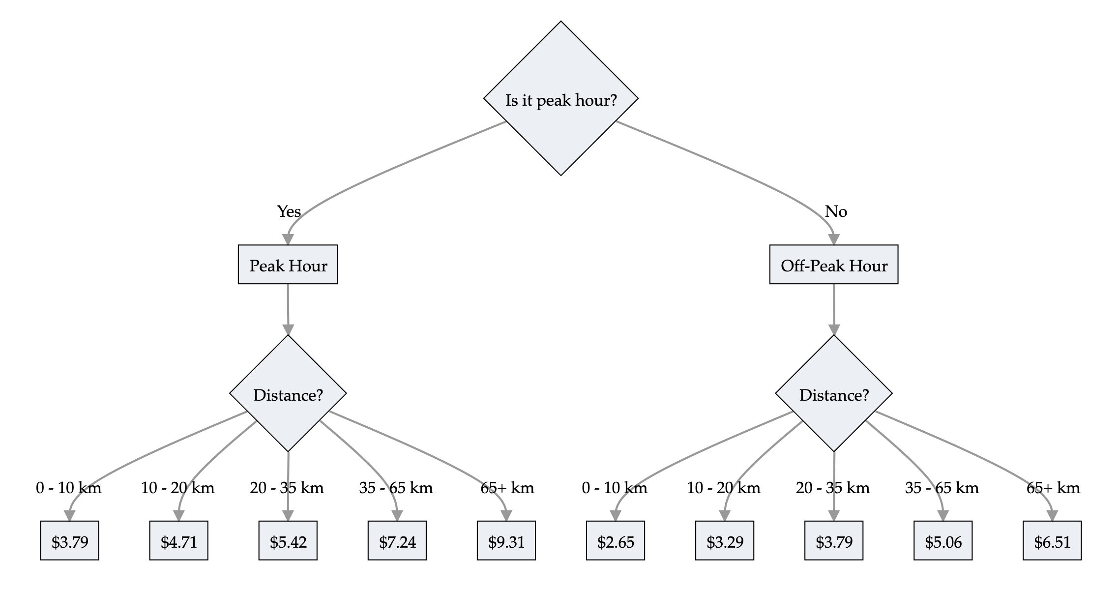
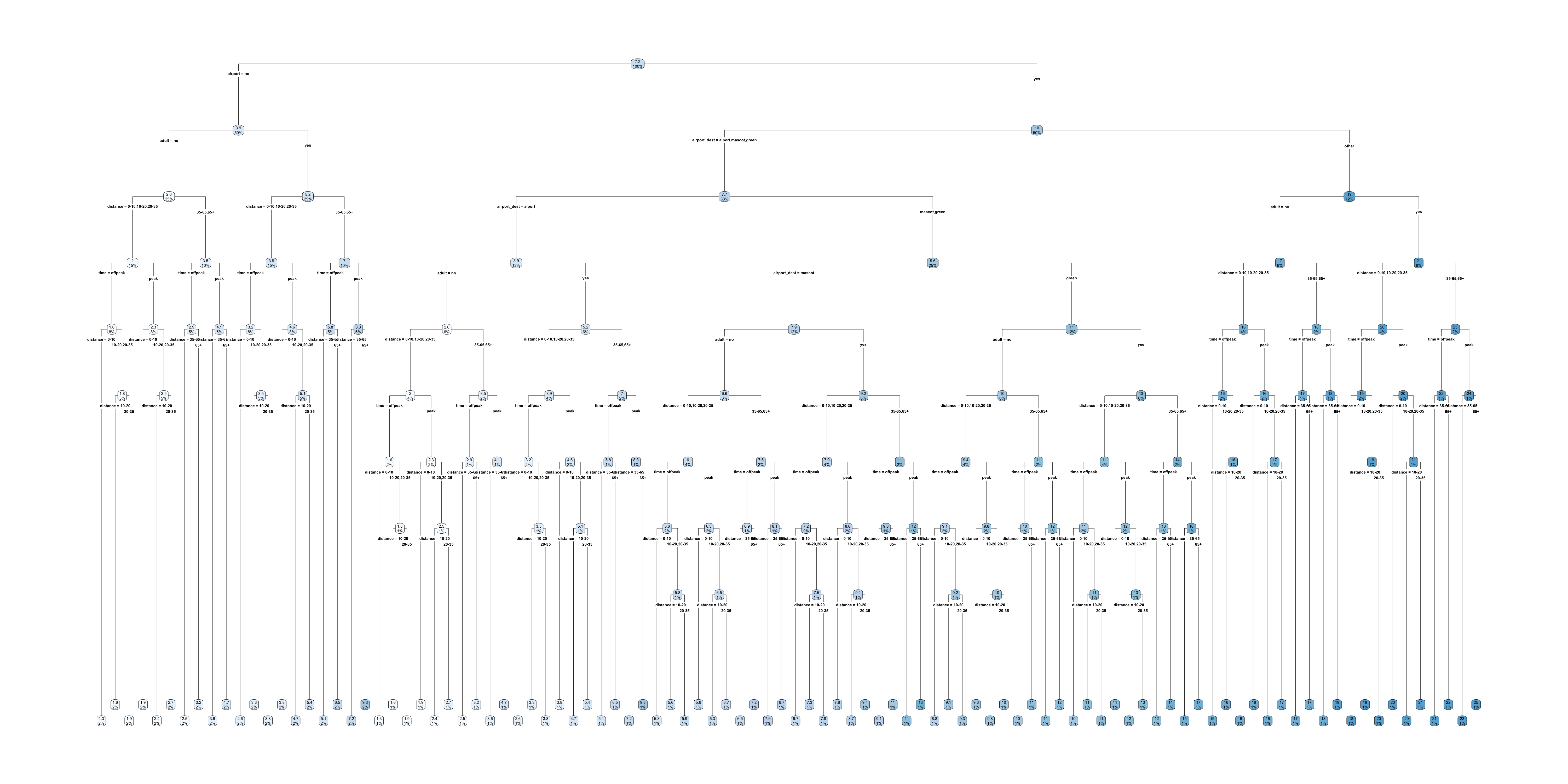
By including all train pricing, the tree is very big; this is an example of a process that does not fit the tree structure.
Decision rules
Make predictions using if-then statements related to the inputs.
“Decision rules can be as expressive as decision trees, while being more compact. Decision trees often also suffer from replicated sub-trees, that is, when the splits in a left and a right child node have the same structure.”
— Molnar (2020)
def rail_cost(peak_hours, distance):
  if peak_hours:
      if distance <= 10:
        cost = 3.79
      elif distance <= 20:
        cost = 4.71
      elif distance <= 35:
        cost = 5.42
      elif distance <= 65:
        cost = 7.24
      else:
        cost = 9.31
  else:
      if distance <= 10:
        cost = 2.65
      elif distance <= 20:
        cost = 3.29
      elif distance <= 35:
        cost = 3.79
      elif distance <= 65:
        cost = 5.06
      else:
        cost = 6.51
  return cost
Generalised linear & additive models
A generalised linear model has the form
\hat{y} = g^{-1}\bigl( \beta_0 + \beta_1 x_1 + \dots + \beta_p x_p \bigr)
where \beta_0, \dots, \beta_p are the model parameters.
Global & local interpretations are easy to obtain.
The above GLM representation provides a clear interpretation of how a marginal change in a variable x can contribute to a change in the mean of the output. This makes GLM inherently interpretable.
A Generalised Additive Model replaces each linear term with a flexible shape function f_j:
\hat{y} = g^{-1}\bigl( \beta_0 + f_1(x_1) + f_2(x_2) + \dots + f_p(x_p) \bigr)
The f_j are typically splines. Each covariate’s effect is still a curve you can plot, so the model stays transparent while capturing non-linear effects.
The interpretability story is unchanged from the GLM: the prediction is a sum of one-variable effects, so we can plot each f_j to see exactly what the model does with that variable. What we gain is flexibility — the effect of age on claims doesn’t need to be a straight line on the link scale. We fit a GAM to real data later in this lecture.
Neural Additive Models (NAMs)
A NAM is a GAM where each shape function f_j is a small neural network, learned jointly with the rest of the model (Agarwal et al., 2021).
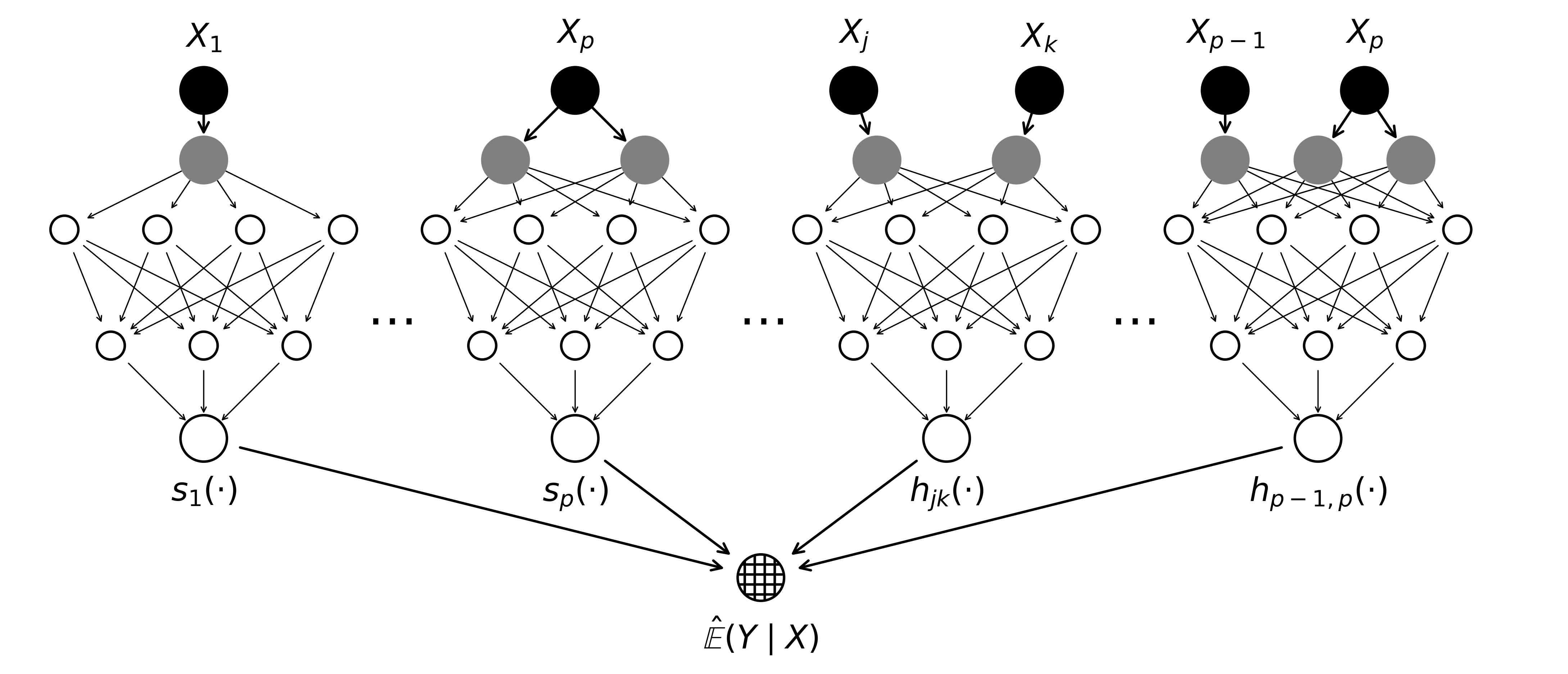
Actuarial NAMs (ANAMs)
Recall the six requirements for an interpretable pricing model — the ANAM is a NAM engineered around that checklist (Laub et al., 2026).
| Requirement | Mechanism in ANAM |
|---|---|
| Transparency of main effects | one subnetwork per covariate, plotted as a shape function |
| Transparency of interactions | dedicated subnetworks for the selected pairs only |
| Variable importance | variance of each shape function over the data |
| Sparsity | explicit selection of features and interactions |
| Monotonicity | enforced by the architecture |
| Smoothness | roughness penalty on the shape functions |
This is why the model is called the Actuarial NAM: the plain NAM already gives transparent main effects, but the remaining rows of the table are extra constraints and training procedures added so that every item on the pricing checklist is satisfied. The monotonicity constraint is baked into the subnetwork’s architecture (so it cannot be violated, even off the training data), while smoothness is encouraged with a penalty term added to the loss, in the same spirit as the roughness penalty in a classical GAM. Later in the lecture we fit an ANAM to Belgian motor insurance data with the anam package.
LocalGLMNet
A different route to interpretability: keep the GLM’s form, but let the coefficients vary (Richman & Wüthrich, 2023).
\hat{y_i} = g^{-1}\bigl( \beta_0(\boldsymbol{x}_i) + \beta_1(\boldsymbol{x}_i) x_{i1} + \dots + \beta_p(\boldsymbol{x}_i) x_{ip} \bigr)
A GLM with local parameters \beta_0(\boldsymbol{x}_i), \dots, \beta_p(\boldsymbol{x}_i) for each observation \boldsymbol{x}_i. The local parameters are the output of a neural network.
Here, \beta_p’s are the neurons from the output layer. First, we define a Feed Forward Neural Network using an input layer, several hidden layers and an output layer. The number of neurons in the output layer must be equal to the number of inputs. Thereafter, we define a skip connection from the input layer directly to the output layer, and merge them using scalar multiplication. Thereafter, the neural network returns the coefficients of the GLM fitted for each individual. We then train the model with the response variable.
Where the GAM/NAM/ANAM family earns its interpretability from an additive decomposition into one-variable effects, the LocalGLMNet instead keeps the familiar regression read-out (“this coefficient times this feature”) but makes the coefficients themselves functions of the whole feature vector — so the interpretation is local to each observation.
Post-hoc Explanations
Explaining a black box
A black box machine learning model is a formula that is either too complicated for any human to understand, or proprietary, so that one cannot understand its inner workings. Black box models are difficult to troubleshoot, which is particularly problematic for medical data. Black box models often predict the right answer for the wrong reason (the “Clever Hans” phenomenon), leading to excellent performance in training but poor performance in practice. There are numerous other issues with black box models. In criminal justice, individuals may have been subjected to years of extra prison time due to typographical errors in black box model inputs and poorly-designed proprietary models for air quality have had serious consequences for public safety during wildfires…
— Rudin et al. (2022, pp. 2–3)

Determining whether a black box model is fair with respect to gender or racial groups is much more difficult than determining whether an interpretable model has such a bias… Explaining black boxes, rather than replacing them with interpretable models, can make the problem worse by providing misleading or false characterizations, or adding unnecessary authority to the black box. There is a clear need for innovative machine learning models that are inherently interpretable.
— Rudin et al. (2022, pp. 2–3)
Permutation importance
We’ve seen this in the NLP example.
Inputs: fitted model m, tabular dataset D.
Compute the reference score s of the model m on data D (for instance the accuracy for a classifier or the R^2 for a regressor).
For each feature j (column of D):
For each repetition k in {1, \dots, K}:
- Randomly shuffle column j of dataset D to generate a corrupted version of the data named \tilde{D}_{k,j}.
- Compute the score s_{k,j} of model m on corrupted data \tilde{D}_{k,j}.
Compute importance i_j for feature f_j defined as:
i_j = s - \frac{1}{K} \sum_{k=1}^{K} s_{k,j}
Originally proposed by Breiman (2001), extended by Fisher et al. (2019).
Permutation importance
def permutation_test(model, X, y, num_reps=1, seed=42, batch_size=8192):
    """
    Run the permutation test for variable importance.
    Returns matrix of shape (X.shape[1], len(model.evaluate(X, y))).
    """
    rnd.seed(seed)
    scores = []

    for j in range(X.shape[1]):
        original_column = np.copy(X[:, j])
        col_scores = []

        for r in range(num_reps):
            rnd.shuffle(X[:,j])
            col_scores.append(model.evaluate(X, y, verbose=0, batch_size=batch_size))

        scores.append(np.mean(col_scores, axis=0))
        X[:,j] = original_column

    return np.array(scores)
Three different plots
A Ceteris Paribus plot shows how the model’s prediction changes as we vary the value of one covariate/input while keeping all other features constant at their original values for some observation.
An Individual Conditional Expectation (ICE) plot is the same thing as a ceteris paribus plot, but for all observations in the dataset.
A Partial Dependence Plot (PDP) shows how the model’s prediction changes as we vary the value of one covariate/input while averaging over all other features in the dataset.
ICE plots allow us to see the differences in the effect of a given variable based on the values of the other variables.
All of these show the relationship between an input and the prediction that the model has learned — not necessarily the true relationship in the world.
Example: ceteris paribus plot
Fit a random forest to predict diabetes progression, take one patient, and vary their bmi while holding every other feature fixed.
Code
from sklearn.datasets import load_diabetes
from sklearn.ensemble import RandomForestRegressor

diab_X, diab_y = load_diabetes(return_X_y=True, as_frame=True, scaled=False)
diab_model = RandomForestRegressor(random_state=42).fit(diab_X, diab_y)

patient = diab_X.iloc[[0]]
bmi_grid = np.linspace(diab_X["bmi"].min(), diab_X["bmi"].max(), 100)
cp_curve = [diab_model.predict(patient.assign(bmi=bmi))[0] for bmi in bmi_grid]

plt.plot(bmi_grid, cp_curve)
plt.scatter(patient["bmi"], diab_model.predict(patient), color="black", zorder=3)
plt.xlabel("bmi")
plt.ylabel("Predicted progression");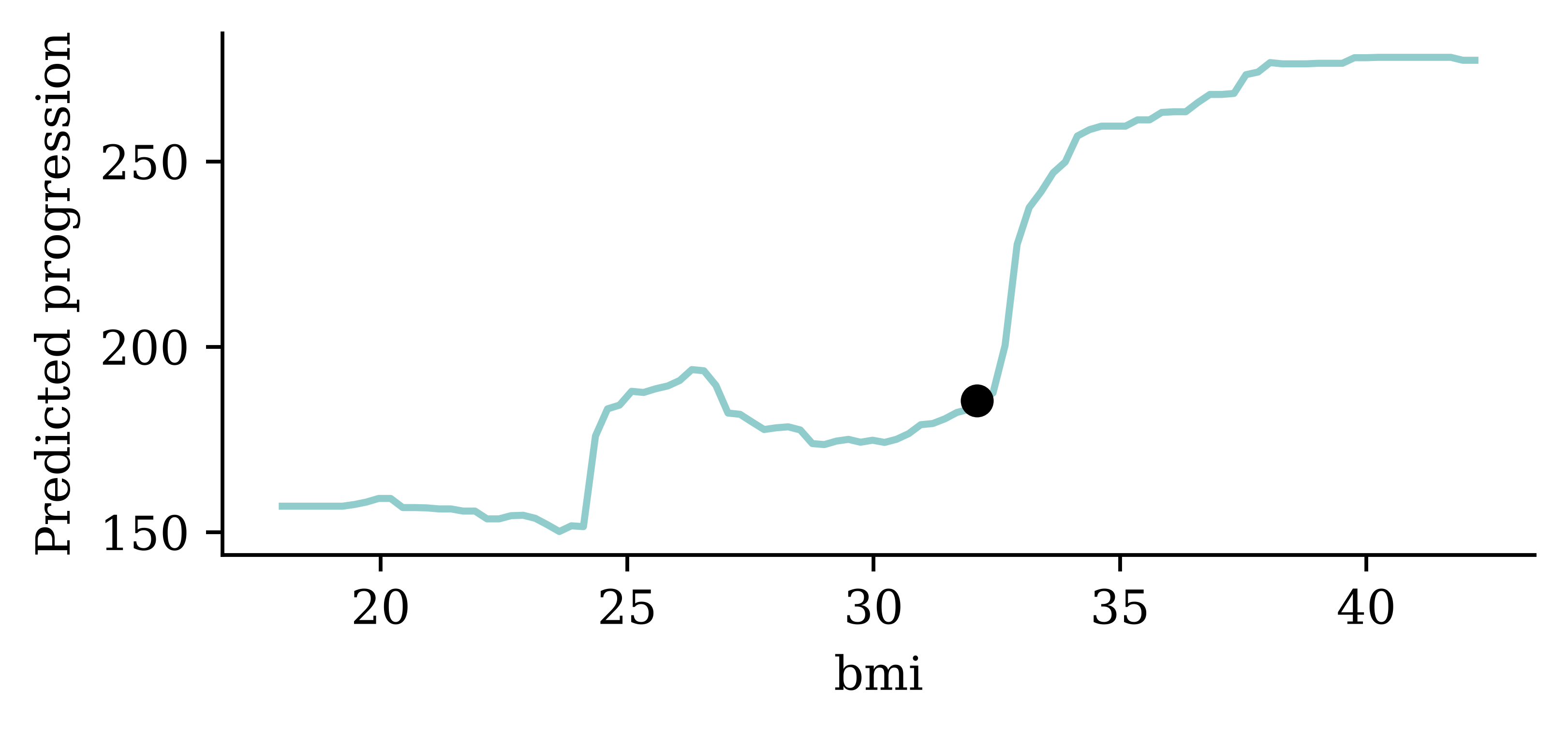
The dot marks the patient’s actual bmi and the model’s prediction for them. The curve answers a what-if question for this one patient: what would the model predict if their bmi were different, other things being equal (ceteris paribus)?
Example: ICE plot
Draw the same ceteris paribus curve for every observation in the dataset.
Code
PartialDependenceDisplay.from_estimator(
    diab_model, diab_X, ["bmi"], kind="individual"
);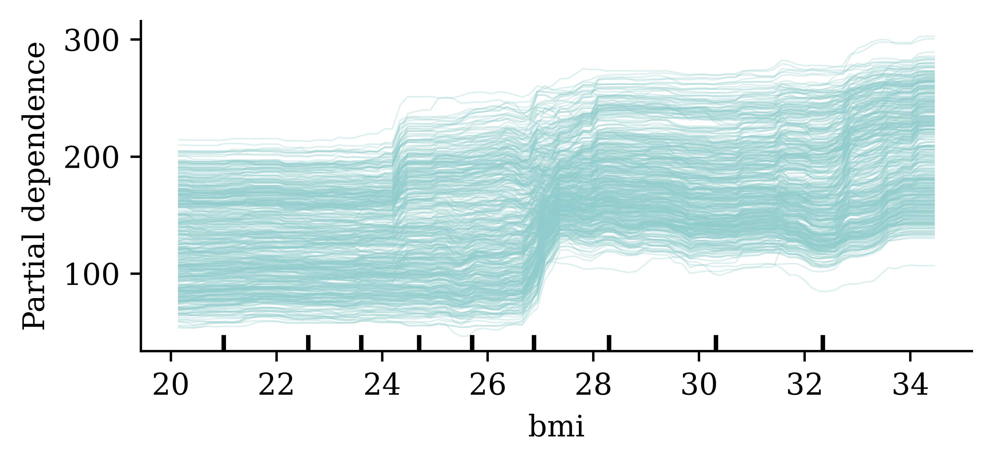
If the curves are roughly parallel, the feature’s effect is similar for everyone; crossing or fanning curves are a sign of interactions with other features.
Example: partial dependence plot
Averaging the ICE curves gives the partial dependence plot.
Code
PartialDependenceDisplay.from_estimator(
    diab_model, diab_X, ["bmi"], kind="both",
    pd_line_kw={"color": "black"}
);
The dashed line is the PDP: the average of all the individual ICE curves. It summarises the overall effect of bmi on the model’s predictions, at the cost of hiding the individual-level variation seen in the ICE plot.
Warning: correlated features
These methods (and permutation importance) change one feature at a time, leaving the others untouched — so they can manufacture inputs that could never exist.
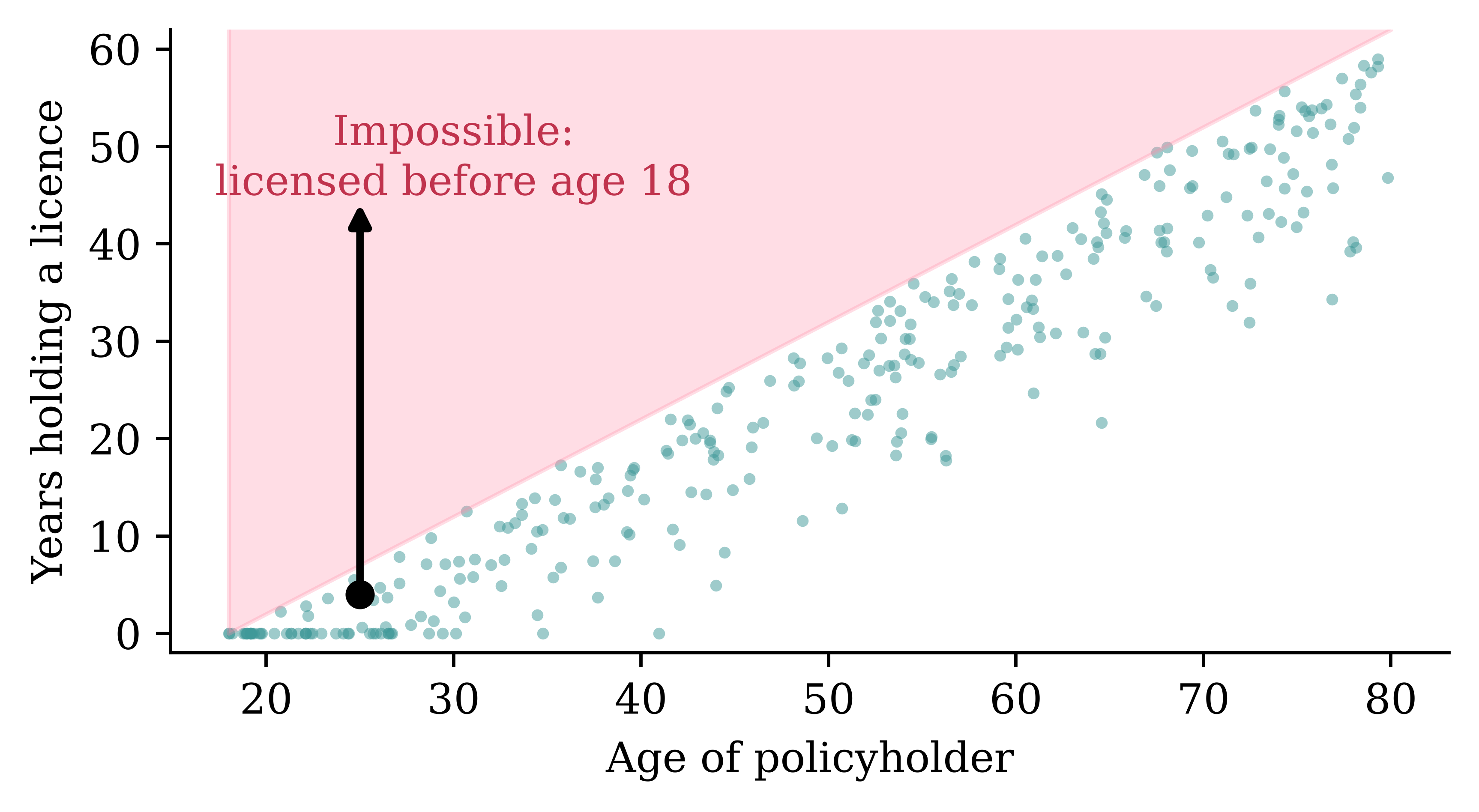
Say the model uses the policyholder’s age and the number of years they have held their driver’s licence. These two features are strongly dependent: you cannot have held a licence for longer than your age minus the minimum driving age. A ceteris paribus curve for the 25-year-old above (the arrow) sweeps the licence tenure up to 45 years while pinning their age at 25 — implying they were licensed 20 years before they were born. The same happens when permutation importance shuffles one column, pairing young ages with long tenures. The model’s predictions in that region are pure extrapolation (it saw no training data there), yet PDP and permutation importance happily average over them. This is one of the documented pitfalls that Xin et al. (2025) exploit: because nobody checks the extrapolated region, a discriminatory model can be tuned to look innocent on a PDP.
Explain the model on the raw features
The model to explain is the composition f \circ t; perturb the raw features \boldsymbol{x} and re-apply the preprocessing t, rather than perturbing t(\boldsymbol{x}).
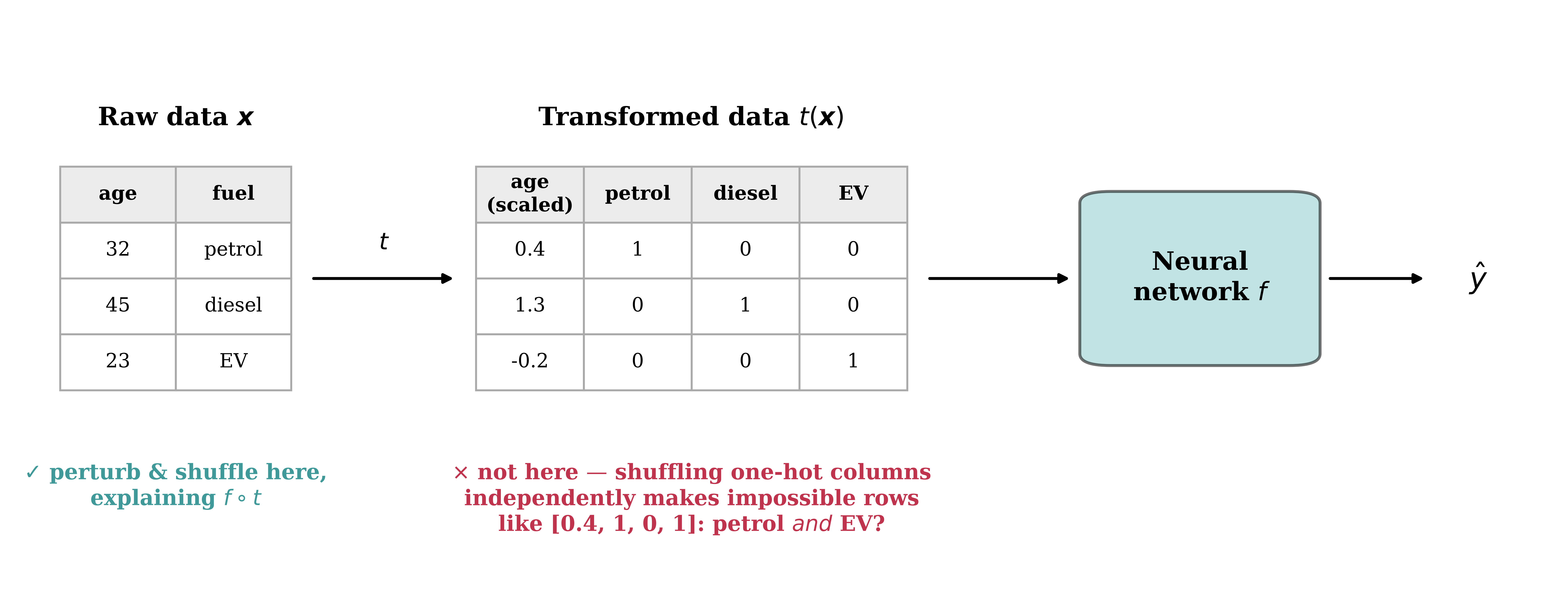
Preprocessing like standardisation and one-hot encoding is part of the model as far as the customer is concerned: they have an age and a fuel type, not a z-score and three indicator columns. If an interpretability method perturbs the transformed matrix t(\boldsymbol{x}) directly — shuffling each column for permutation importance, or sweeping one column over a grid for a PDP — it treats the one-hot columns as independent features. It can then switch petrol to 1 without switching EV off, producing “multi-hot” rows that no real customer generates, and the scaled age column loses its real-world units. Instead, perturb the raw feature (swap the category, change the age in years), push the perturbed row back through t, and only then ask the network for a prediction — that is, explain the composite function f \circ t. This is exactly why, later in this lecture, we wrap the column transformer and the Keras model together into one SklearnModel object before handing it to scikit-learn’s PDP tools.
Belgian Motor Dataset
beMTPL97 dataset
data = pd.read_csv('data/raw/beMTPL97.csv')
claims = data.drop(columns = ["id", "claim", "amount", "average"])
claims.shape
(163212, 14)postcode = claims.pop("postcode")
train_raw, test_raw = train_test_split(claims, test_size=0.2, random_state=2000, stratify=postcode)
X_train_raw = train_raw.drop(columns='nclaims')
X_test_raw = test_raw.drop(columns='nclaims')
y_train_raw = train_raw['nclaims']
y_test_raw = test_raw['nclaims']
int_cols = X_train_raw.select_dtypes(include='integer').columns
X_train_raw[int_cols] = X_train_raw[int_cols].astype(float)
X_test_raw[int_cols] = X_test_raw[int_cols].astype(float)
num_vars = ['expo', 'ageph', 'bm', 'power', 'agec', 'lat', 'long']
cat_vars = ['coverage', 'sex', 'fuel', 'use', 'fleet']Covariates
Numerical variables:
| Variable | Description |
|---|---|
expo |
exposure to risk. |
ageph |
policyholder’s age. |
bm |
An integer for the level on the former Belgian bonus-malus scale (0 to 22; higher = worse claims history). |
power |
vehicle’s horsepower in kilowatts. |
agec |
vehicle’s age in years. |
long |
longitude of the policyholder’s municipality center. |
lat |
latitude of the policyholder’s municipality center. |
Target is nclaims.
Categorical variables:
| Variable | Description |
|---|---|
coverage |
insurance coverage level: "TPL" (third party liability), "TPL+" (TPL + limited material damage), "TPL++" (TPL + comprehensive material damage). |
sex |
policyholder’s gender: "female", "male". |
fuel |
vehicle’s fuel type: "gasoline" or "diesel". |
use |
vehicle’s use: "private" or "work". |
fleet |
vehicle is part of a fleet (1 = yes, 0 = no). |
NoteBonus-malus
A customer’s premium is adjusted based on the number of claims they have made in the past. If a customer made multiple claims, their premium will increase (malus); if they made no claims, their premium will decrease (bonus).
Exposure & frequency
claims["expo"].plot(kind='hist', title='Exposure Distribution')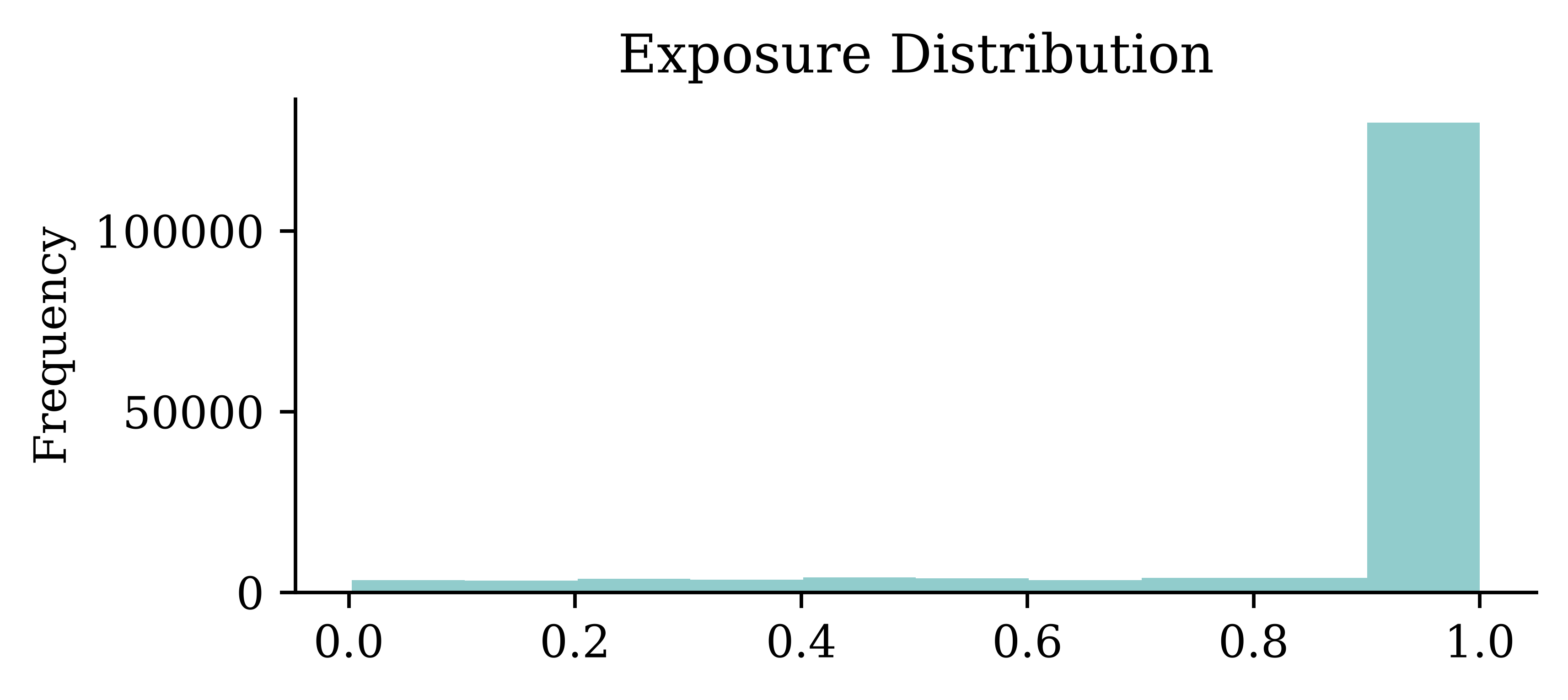
claims["nclaims"].value_counts()nclaims
0 144936
1 16539
2 1556
3 162
4 17
5 2
Name: count, dtype: int64In-class exercise
Consider:
- exposure
- policyholder age
- bonus–malus level
- vehicle age or power
- geographical location
For at least three variables:
- Describe or sketch the relationship you would expect with the predicted number of claims.
- Decide whether the relationship should be imposed by the model, learned freely from the data, or merely checked after fitting.
- Identify one result that would make you distrust the model, even if its predictive performance were good.
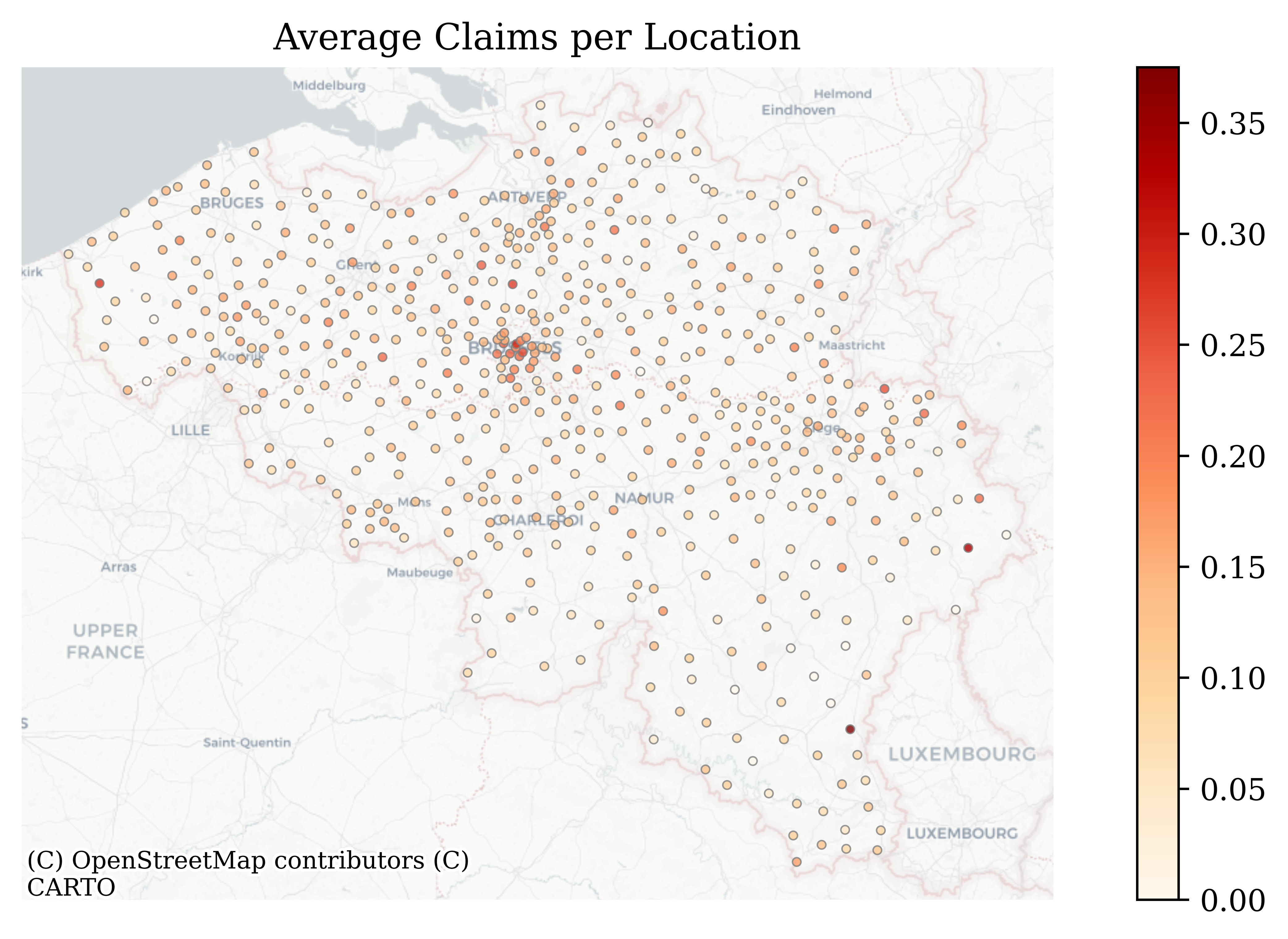
Map of claims
Code
# Compute average claims per location
avg = train_raw.groupby(['lat', 'long'], as_index=False)['nclaims'].mean()

# Build GeoDataFrame in Web Mercator
gdf = gpd.GeoDataFrame(
    avg,
    geometry=[Point(xy) for xy in zip(avg.long, avg.lat)],
    crs="EPSG:4326"
).to_crs(epsg=3857)

# Plot
ax = gdf.plot(
    column='nclaims',
    cmap='OrRd',
    markersize=8,
    edgecolor='grey',
    linewidth=0.5,
    alpha=0.8,
    legend=True,
    figsize=(10, 5)
)
ctx.add_basemap(ax, source=ctx.providers.CartoDB.Positron(r="@2x"))
ax.set_axis_off()
plt.title("Average Claims per Location")
plt.show()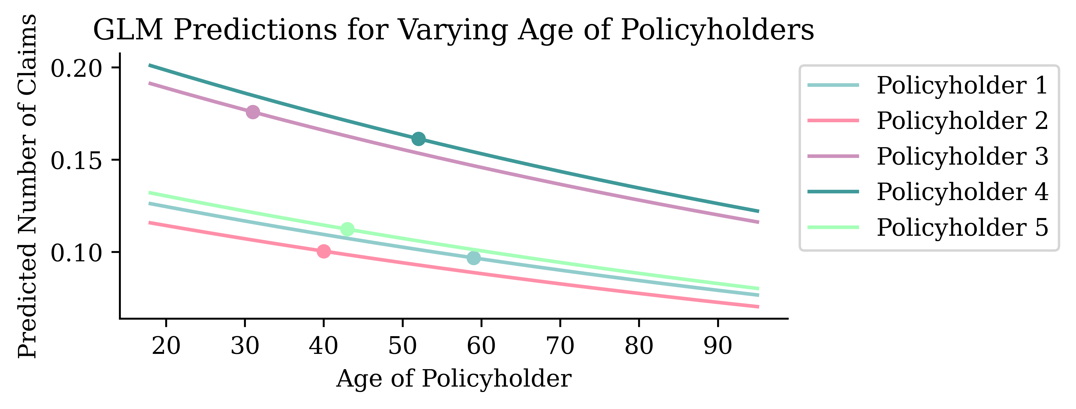
Fitting using statsmodels
formula = "nclaims ~ expo + ageph + bm + power + agec + lat + long " + \
    " + C(coverage) + C(sex) + C(fuel) + C(use) + C(fleet)"

glm_model = smf.glm(
    formula=formula,
    data=train_raw,
    family=sm.families.Poisson()
).fit()
NoteQuestion
What do you expect to be the relationship between ageph and nclaims?
X_train_first = X_train_raw.iloc[0:1].copy()
X_train_first| expo | coverage | ageph | sex | bm | power | agec | fuel | use | fleet | long | lat | |
|---|---|---|---|---|---|---|---|---|---|---|---|---|
| 25776 | 1.0 | TPL | 59.0 | female | 0.0 | 51.0 | 15.0 | gasoline | private | 0.0 | 4.387146 | 51.216042 |
Summary
glm_model.summary().tables[0]| Dep. Variable: | nclaims | No. Observations: | 130569 |
|---|---|---|---|
| Model: | GLM | Df Residuals: | 130555 |
| Model Family: | Poisson | Df Model: | 13 |
| Link Function: | Log | Scale: | 1.0000 |
| Method: | IRLS | Log-Likelihood: | -49908. |
| Date: | Sun, 12 Jul 2026 | Deviance: | 69690. |
| Time: | 22:03:32 | Pearson chi2: | 1.39e+05 |
| No. Iterations: | 6 | Pseudo R-squ. (CS): | 0.01842 |
| Covariance Type: | nonrobust |
Summary
glm_model.summary().tables[1]| coef | std err | z | P>|z| | [0.025 | 0.975] | |
|---|---|---|---|---|---|---|
| Intercept | -7.0204 | 1.344 | -5.222 | 0.000 | -9.655 | -4.386 |
| C(coverage)[T.TPL+] | -0.0765 | 0.020 | -3.889 | 0.000 | -0.115 | -0.038 |
| C(coverage)[T.TPL++] | -0.0715 | 0.027 | -2.660 | 0.008 | -0.124 | -0.019 |
| C(sex)[T.male] | -0.0259 | 0.018 | -1.429 | 0.153 | -0.061 | 0.010 |
| C(fuel)[T.gasoline] | -0.1793 | 0.017 | -10.459 | 0.000 | -0.213 | -0.146 |
| C(use)[T.work] | -0.0864 | 0.037 | -2.306 | 0.021 | -0.160 | -0.013 |
| C(fleet)[T.1] | -0.0886 | 0.048 | -1.832 | 0.067 | -0.183 | 0.006 |
| expo | 0.9893 | 0.041 | 24.196 | 0.000 | 0.909 | 1.069 |
| ageph | -0.0065 | 0.001 | -10.724 | 0.000 | -0.008 | -0.005 |
| bm | 0.0642 | 0.002 | 33.035 | 0.000 | 0.060 | 0.068 |
| power | 0.0036 | 0.000 | 8.309 | 0.000 | 0.003 | 0.004 |
| agec | -0.0019 | 0.002 | -0.872 | 0.383 | -0.006 | 0.002 |
| lat | 0.0777 | 0.026 | 2.969 | 0.003 | 0.026 | 0.129 |
| long | 0.0279 | 0.011 | 2.542 | 0.011 | 0.006 | 0.049 |
Interpreting Inherently Interpretable Models
GLM Ceteris Paribus Plots
ageph_range = np.linspace(train_raw['ageph'].min(), train_raw['ageph'].max(), 20)
y_pred_batch = []
for ageph in ageph_range:
    X_train_first['ageph'] = ageph
    y_pred_batch.append(glm_model.predict(X_train_first))
Code
plt.plot(ageph_range, y_pred_batch, 'r')

real_age = X_train_raw['ageph'].iloc[0:1].item()
orig_prediction = glm_model.predict(X_train_raw.iloc[0:1]).item()
plt.plot(real_age, orig_prediction, 'o', color='r', markersize=5)

plt.xlabel('Age of Policyholder')
plt.ylabel('Predicted Number of Claims')
plt.title('GLM Predictions for Varying Age of Policyholder #1');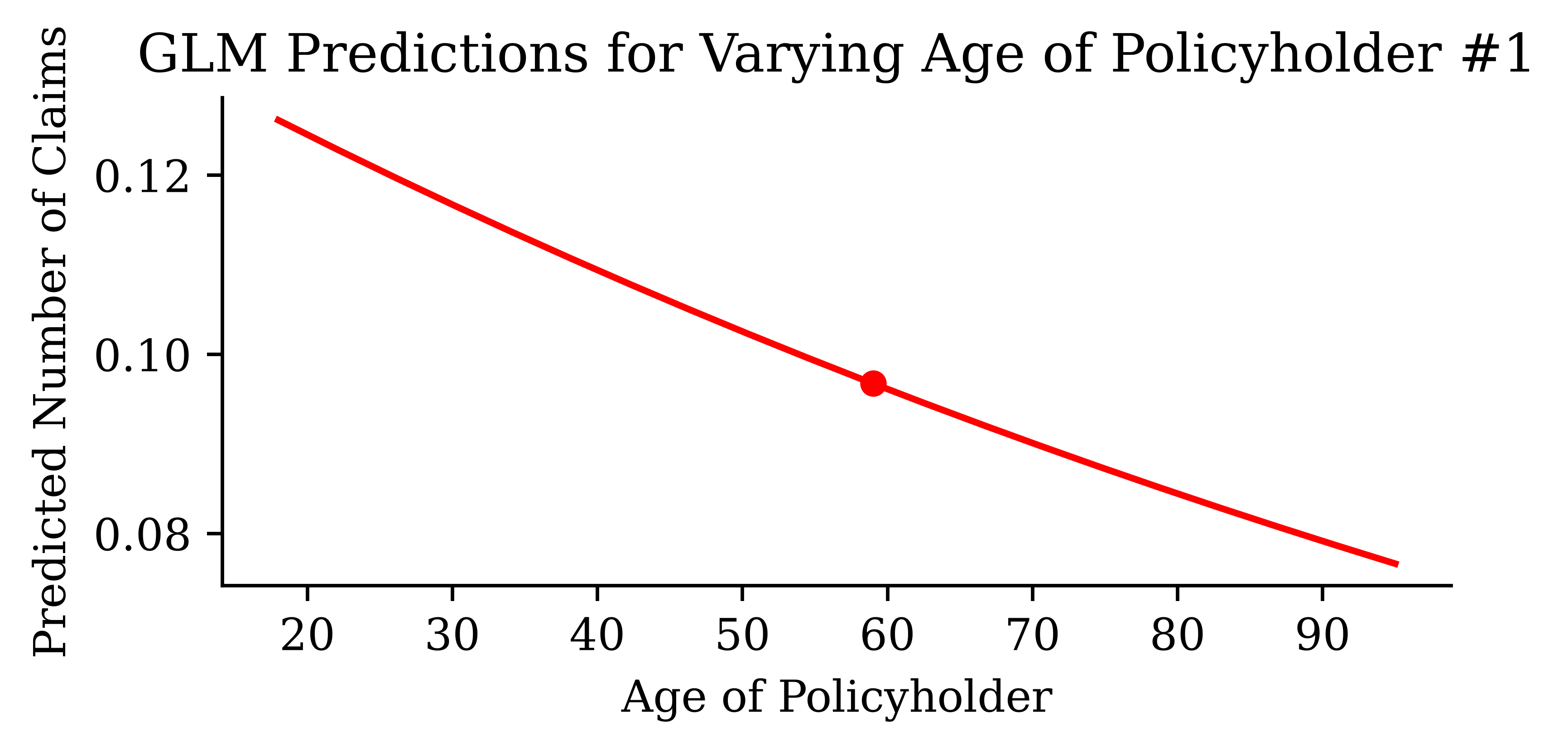
Zoomed out
We can see the trend if we zoom out to ages between 0 & 1,000.
Code
ageph_range = np.linspace(0, 1000, 20)

X_train_first = X_train_raw.iloc[0:1].copy()
y_pred_batch = []
for ageph in ageph_range:
    X_train_first['ageph'] = ageph
    y_pred_ageph = glm_model.predict(X_train_first)
    y_pred_batch.append(y_pred_ageph)

plt.plot(ageph_range, y_pred_batch, 'r')
plt.plot(real_age, orig_prediction, 'o', markersize=5, color='r')

plt.xlabel('Age of Policyholder')
plt.ylabel('Predicted Number of Claims')
plt.title('GLM Predictions for Varying Age of Policyholder #1');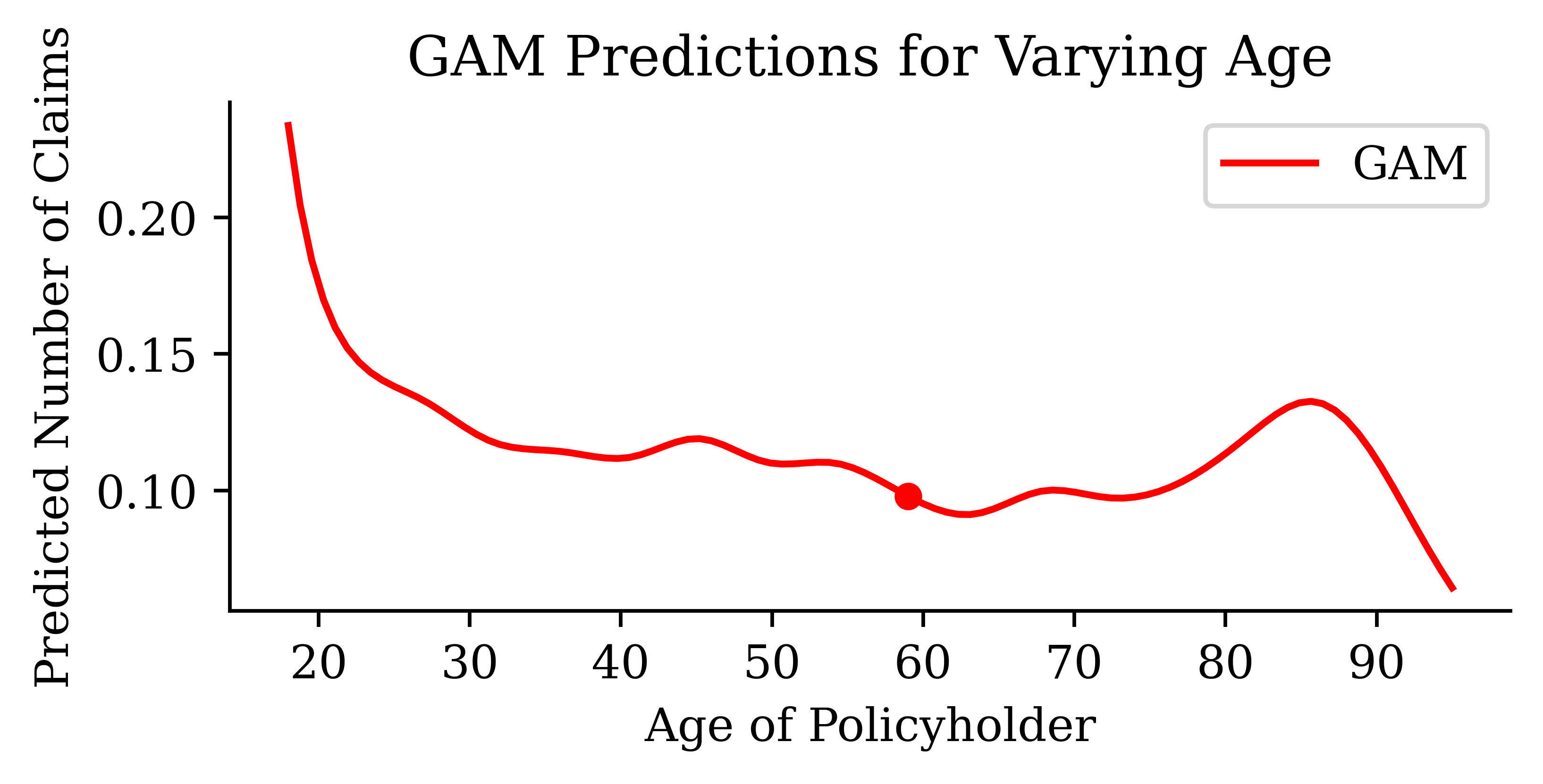
This is an exponential curve. Is this surprising? It shouldn’t be, since the GLM has a log link function.
Interrogating an intentional bug
We fed expo in as an ordinary covariate — the CP plot exposes the consequence.
Code
expo_range = np.linspace(train_raw['expo'].min(), train_raw['expo'].max(), 20)

X_train_first = X_train_raw.iloc[0:1].copy()
y_pred_batch = []
for expo in expo_range:
    X_train_first['expo'] = expo
    y_pred_batch.append(glm_model.predict(X_train_first).item())

plt.plot(expo_range, y_pred_batch, 'r', label='GLM ceteris paribus')
plt.plot([0, expo_range[-1]], [0, y_pred_batch[-1]], '--', color='grey',
    label='Proportional to exposure')

real_expo = X_train_raw['expo'].iloc[0:1].item()
plt.plot(real_expo, orig_prediction, 'o', markersize=5, color='r')

plt.xlabel('Exposure')
plt.ylabel('Predicted Number of Claims')
plt.title('GLM Predictions for Varying Exposure of Policyholder #1')
plt.legend();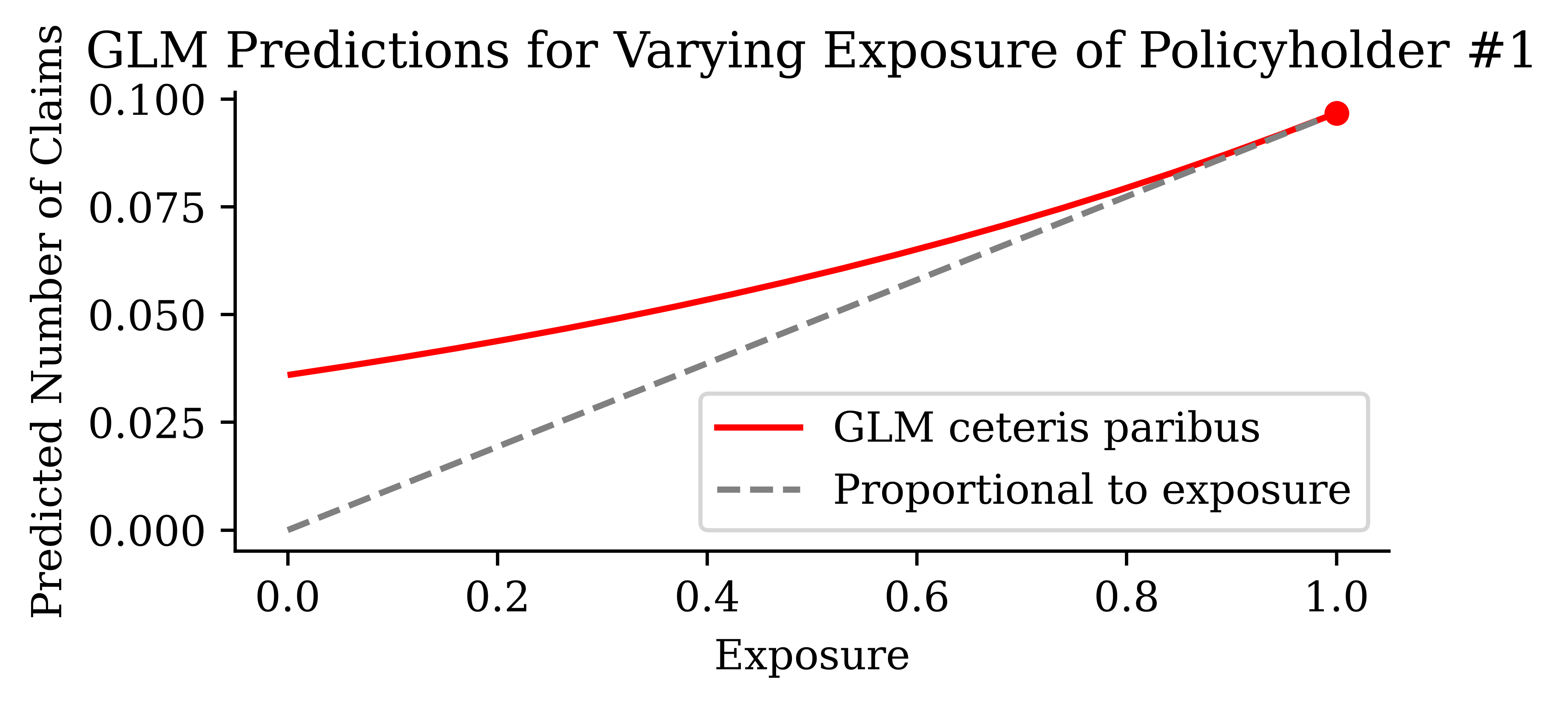
This modelling bug is deliberate, and we will keep it for this lecture. Expected claim counts should scale proportionally with exposure: insuring a car for twice as long should double the expected number of claims, and a policy insured for one day should expect almost none. The proper treatment is to include exposure as an offset, adding \log(\text{expo}) to the linear predictor with a fixed coefficient of one (as the ANAM fit does later with exposure="expo"). Instead, we let the GLM estimate a coefficient for expo on the log-link scale, so it claims the claim count grows exponentially with exposure — and, worse, predicts a decidedly non-zero claim count for a policy insured for a single day (the red curve does not pass through the origin). Interrogating the model with a ceteris paribus plot is exactly how this kind of specification error gets caught: the plotted relationship contradicts what we know must be true. The same flaw shows up again in the neural network’s PDP for expo later in the lecture.
What if we look at multiple policyholders?
Code
ageph_range = np.linspace(train_raw['ageph'].min(), train_raw['ageph'].max(), 20)

# Just overlay the plots for the first 10 training observations
for i in range(5):
    X_train_first = X_train_raw.iloc[i:i+1].copy()
    y_pred_batch = []

    real_age = X_train_first['ageph'].item()
    orig_prediction = glm_model.predict(X_train_first).item()

    for ageph in ageph_range:
        X_train_first['ageph'] = ageph
        y_pred_ageph = glm_model.predict(X_train_first)
        y_pred_batch.append(y_pred_ageph)

    res = plt.plot(ageph_range, y_pred_batch, label=f'Policyholder {i+1}')
    plt.plot(real_age, orig_prediction, 'o', markersize=5, color=res[0].get_color())

plt.xlabel('Age of Policyholder')
plt.ylabel('Predicted Number of Claims')
plt.title('GLM Predictions for Varying Age of Policyholders')
plt.legend(loc='upper left', bbox_to_anchor=(1, 1), ncol=1);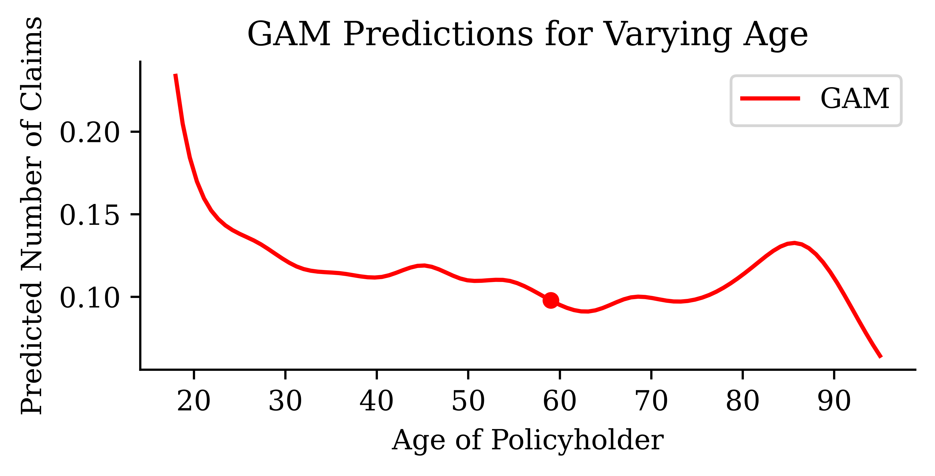
Logarithmic scale
Code
ageph_range = np.linspace(train_raw['ageph'].min(), train_raw['ageph'].max(), 100)

# Just overlay the plots for the first 10 training observations
for i in range(5):
    X_train_first = X_train_raw.iloc[i:i+1].copy()
    log_y_pred_batch = []

    real_age = X_train_first['ageph'].item()
    orig_prediction = np.log(glm_model.predict(X_train_first).item())


    for ageph in ageph_range:
        X_train_first['ageph'] = ageph
        y_pred_ageph = glm_model.predict(X_train_first)
        log_y_pred_batch.append(np.log(y_pred_ageph))

    res = plt.plot(ageph_range, log_y_pred_batch, label=f'Policyholder {i+1}')
    plt.plot(real_age, orig_prediction, 'o', markersize=5, color=res[0].get_color())

plt.xlabel('Age of Policyholder')
plt.ylabel('Log-Predicted Num. Claims')
plt.title('GLM Log-Predictions for Varying Age of Policyholders')
plt.legend(loc='upper left', bbox_to_anchor=(1, 1), ncol=1);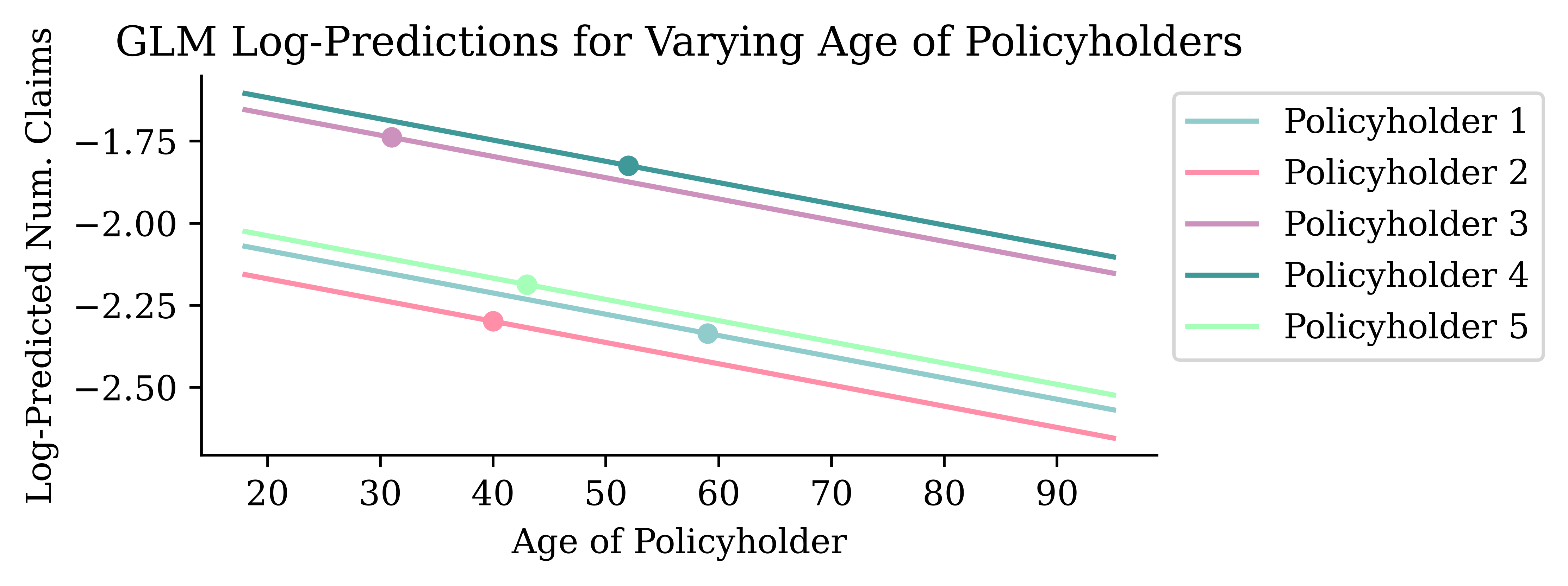
The lines should be straight since we have taken the log of predicted number of claims. Also, the lines should be parallel — the fitted coefficient is the same for all.
Do it for ageph and agec
Code
# Create ranges
ageph_range = np.linspace(train_raw['ageph'].min(), train_raw['ageph'].max(), 100)
agec_range = np.linspace(train_raw['agec'].min(), train_raw['agec'].max(), 100)

# Create grid
ageph_grid, agec_grid = np.meshgrid(ageph_range, agec_range)
ageph_flat = ageph_grid.ravel()
agec_flat = agec_grid.ravel()

# Get the first training observation as a dictionary
base_row = X_train_raw.iloc[0].to_dict()

# Create a DataFrame with repeated base_row and overwrite ageph/agec
df_batch = pd.DataFrame([base_row] * len(ageph_flat))
df_batch['ageph'] = ageph_flat
df_batch['agec'] = agec_flat

# Predict all at once
y_pred_flat = glm_model.predict(df_batch)

# Reshape predictions into 2D grid
Z = y_pred_flat.values.reshape(agec_grid.shape)  # shape = (100, 100)

# Plot
fig = go.Figure(data=[
    go.Surface(x=agec_grid, y=ageph_grid, z=Z, colorscale='Viridis')
])

fig.update_layout(
    title='GLM-predicted Number of Claims',
    scene=dict(
        xaxis_title='agec',
        yaxis_title='ageph',
        zaxis_title='Predicted Response'
    ),
    width=800,          # Wider figure
    height=500,         # Taller figure
    margin=dict(l=0, r=0, t=50, b=50),  # Reduce whitespace cropping
)
The age of the policyholder appears to have a more significant effect on claim count than the age of the car (for the ranges of those variables that we observe).
Generalised Additive Models (GAMs)
Transform a GLM’s inputs nonlinearly, i.e.,
\hat{y}_i = g^{-1}\bigl( \beta_0 + f_1(x_{i,1}) + f_2(x_{i,2}) + ... + f_p(x_{i,p}) \bigr)
The f_j are typically polynomials, step functions, or splines.
ct = make_column_transformer(
    ("passthrough", num_vars),
    (OrdinalEncoder(), cat_vars),
    verbose_feature_names_out = False
)
X_train_gam = ct.fit_transform(X_train_raw)
X_test_gam = ct.transform(X_test_raw)
y_train_gam = y_train_raw.values
y_test_gam = y_test_raw.values
formula = s(0) + s(1) + s(2) + s(3) + s(4) + s(5) + s(6) + \
f(7) + f(8) + f(9) + f(10) + f(11)
gam_model = PoissonGAM(formula).fit(X_train_gam, y_train_gam)Ceteris paribus plot for ageph
Code
# Define range of ageph values
ageph_range = np.linspace(X_train_gam['ageph'].min(), X_train_gam['ageph'].max(), 100)

# Start with a copy of the first encoded training row
X_first = X_train_gam.iloc[0:1].copy()
# Set the dtype of 'ageph' to float
X_first['ageph'] = X_first['ageph'].astype(float)
gam_preds = []

real_age = X_first['ageph'].item()
orig_prediction = gam_model.predict(X_first).item()

for ageph in ageph_range:
    X_first['ageph'] = ageph
    y_pred = gam_model.predict(X_first)[0]
    gam_preds.append(y_pred)

plt.plot(ageph_range, gam_preds, label='GAM', color='red')

# Add original GLM prediction for reference
plt.plot(real_age, orig_prediction, 'o', color='red', markersize=5)

plt.xlabel('Age of Policyholder')
plt.ylabel('Predicted Number of Claims')
plt.title('GAM Predictions for Varying Age')
plt.legend();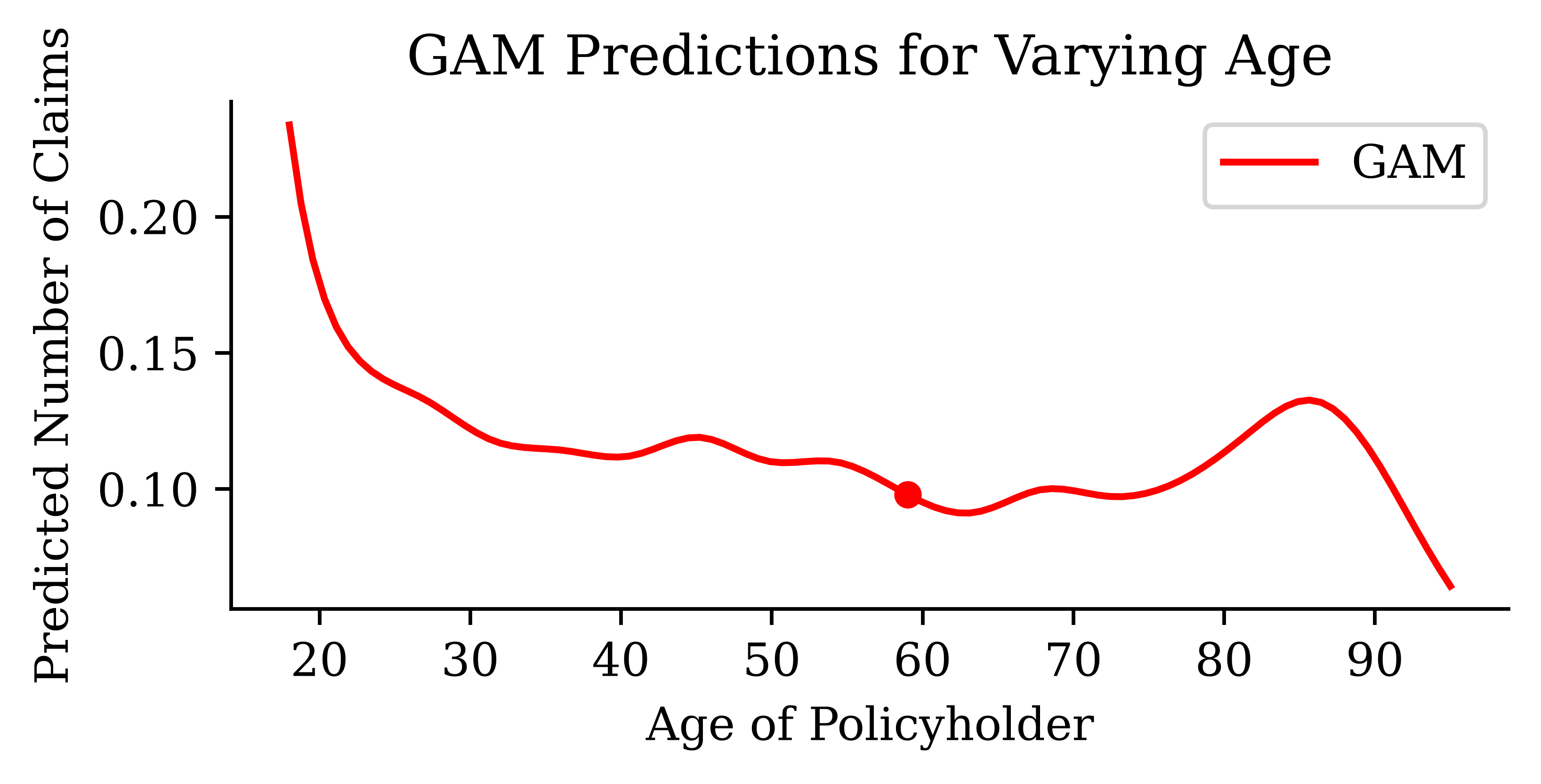
GAM bivariate effects for ageph and agec
Code
# Create ranges
ageph_range = np.linspace(X_train_gam['ageph'].min(), X_train_gam['ageph'].max(), 100)
agec_range = np.linspace(X_train_gam['agec'].min(), X_train_gam['agec'].max(), 100)

# Create grid
ageph_grid, agec_grid = np.meshgrid(ageph_range, agec_range)
ageph_flat = ageph_grid.ravel()
agec_flat = agec_grid.ravel()

# Get the first training observation as a dictionary
base_row = X_train_gam.iloc[0].to_dict()

# Create a DataFrame with repeated base_row and overwrite ageph/agec
df_batch = pd.DataFrame([base_row] * len(ageph_flat))
df_batch['ageph'] = ageph_flat
df_batch['agec'] = agec_flat

# Predict all at once
y_pred_flat = gam_model.predict(df_batch)

# Reshape predictions into 2D grid
Z = y_pred_flat.reshape(agec_grid.shape)  # shape = (100, 100)

# Plot
fig = go.Figure(data=[
    go.Surface(x=agec_grid, y=ageph_grid, z=Z, colorscale='Viridis')
])

fig.update_layout(
    title='GAM-predicted Number of Claims',
    scene=dict(
        xaxis_title='agec',
        yaxis_title='ageph',
        zaxis_title='Predicted Response'
    ),
    width=800,          # Wider figure
    height=500,         # Taller figure
    margin=dict(l=0, r=0, t=50, b=50),  # Reduce whitespace cropping
)
Neural Additive Models on the Belgian Data
Actuarial Neural Additive Model
ANAM, at its core, is a GAM where each f_j is a small neural network.
\hat{y}_i = g^{-1}\bigl( \beta_0 + f_1(x_{i,1}) + f_2(x_{i,2}) + \dots + f_p(x_{i,p}) \bigr)
The anam package fits these with a Poisson/Gamma likelihood, an exposure offset, optional monotonicity constraints, and automatic selection of features and pairwise interactions.
Specify the model
ANAM works on the raw data (standardising/encoding happens inside the model). A smoothness penalty is to help keep the continuous shape functions from overfitting.
from anam import ANAM

anam_train, anam_val = train_test_split(train_raw, test_size=0.25, random_state=2000)

model_anam = ANAM(
    distribution="poisson",         # implies log link + Poisson NLL
    exposure="expo",                # offset: log(expo) added to the linear predictor
    monotone={"bm": "increasing"},  # bonus-malus effect must be increasing
    smoothness=1e-3,                # roughness penalty on continuous shape functions
)
The idea is to choose the features and interactions semi-automatically.
Pick the main effects
Trains an ensemble of shallow NAMs and scores each covariate by the variance of its shape function.
model_anam.rank_main_effects(anam_train, anam_train["nclaims"],
    X_val=anam_val, y_val=anam_val["nclaims"], random_state=2000)
model_anam.plot_main_effect_importance()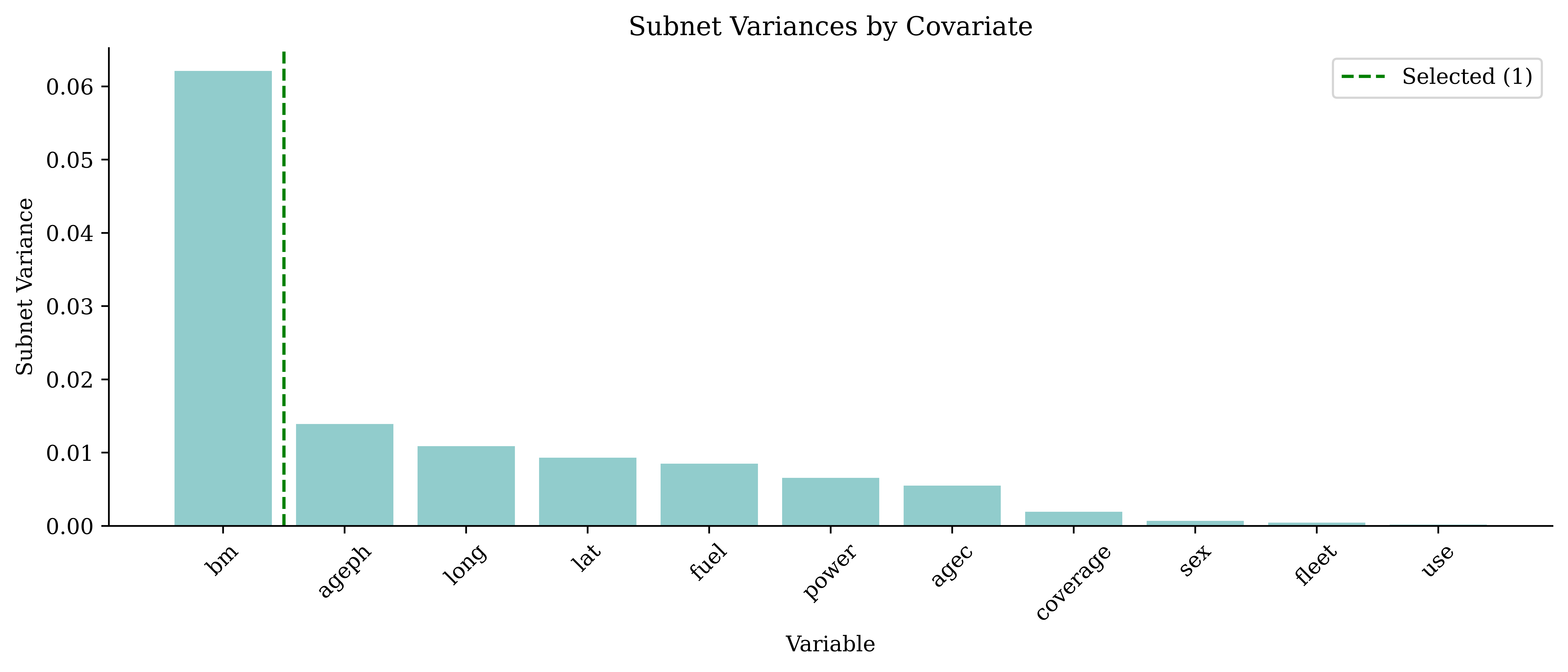
bm (bonus-malus) dominates, followed by a gently declining body — ageph, long, lat, fuel, power, agec — and then a sharp drop to a near-zero tail (coverage, sex, fleet, use). The dashed line is the automatic elbow: because bm towers over everything, it is a little conservative here and stops at six. But agec still sits clearly above the tail, so — like the paper — we keep seven.
Pick the interactions
Scores every pairwise term that passes the strong heredity rule (a pair is only considered if both of its main effects are in the top n\_main), measuring how much each candidate improves the validation loss over the mains-only baseline.
model_anam.rank_interactions(anam_train, anam_train["nclaims"],
    X_val=anam_val, y_val=anam_val["nclaims"],
    n_main=7, random_state=2000)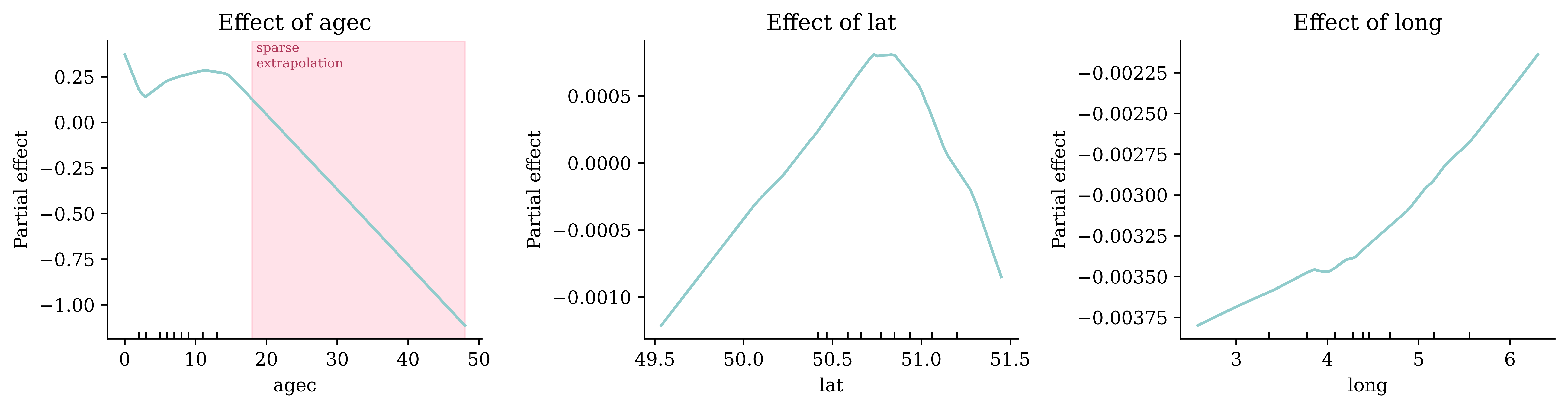
The plot shows how much each candidate pair improves the validation loss over the mains-only baseline, with the top six kept.
Lock in choices and fit
model_anam.choose(n_main=7, n_interactions=6)model_anam.features_['bm', 'ageph', 'long', 'lat', 'fuel', 'power', 'agec']model_anam.interactions_[('long', 'lat'),
('fuel', 'power'),
('bm', 'long'),
('ageph', 'fuel'),
('ageph', 'power'),
('bm', 'power')]Exposure enters the final fit as an offset, not a feature: \log \mu = \beta_0 + \sum_j f_j(x_j) + \log(\text{expo}).
model_anam.fit(anam_train, anam_train["nclaims"],
    X_val=anam_val, y_val=anam_val["nclaims"],
    epochs=300, batch_size=5000, lr=0.01, patience=40, random_state=2000)
Contrast this with the black-box neural network later in these slides, which (incorrectly) feeds expo in as an ordinary input feature. Here exposure is handled correctly as a multiplicative offset, exactly as in a Poisson GLM. The selection workflow uses strong heredity (a pair is only considered if both of its main effects survived), and fit then fine-tunes the chosen terms. The paper also tunes hyperparameters extensively; we use a smaller fixed configuration so the slides render quickly.
Reading the shape functions
Each curve is that feature’s contribution to \log \mu; back on the original scale, \exp(f_j) is a multiplier on the expected claim count.
Code
model_anam.plot_effects(["ageph", "bm", "power"]);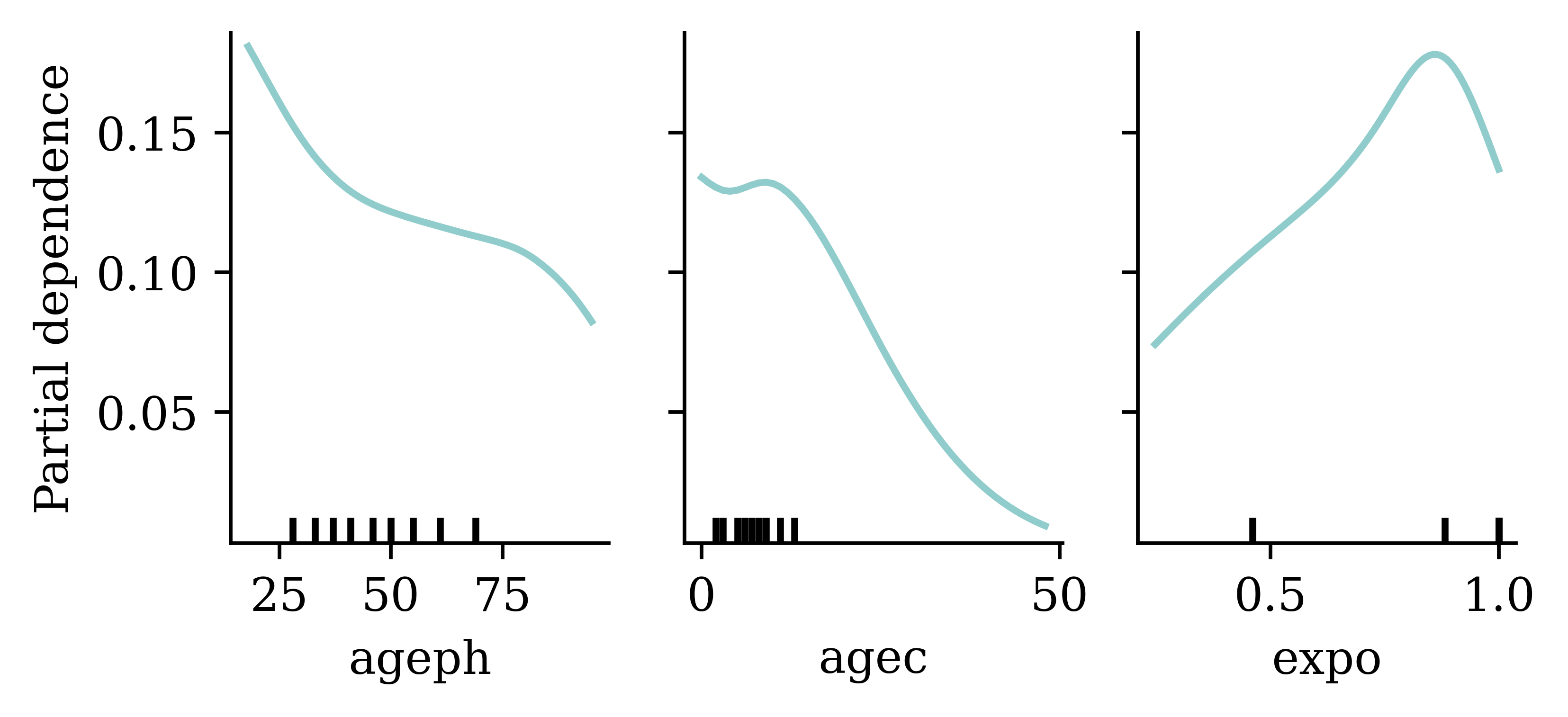
The ageph effect is U-shaped (young and older drivers are riskier), bm increases monotonically as we constrained it to, and higher power raises expected claims. Unlike the GLM’s forced exponential-in-age curve, the NAM learns the shape from the data while staying additive and hence interpretable. The axes are in the original units — the model remembers its own preprocessing.
Code
fig = model_anam.plot_effects(["agec", "lat", "long"])
# Flag agec's sparse, extrapolated tail: 99% of cars are 18 years or younger.
agec_ax = fig.axes[0]
cutoff = anam_train["agec"].quantile(0.99)
agec_ax.axvspan(cutoff, anam_train["agec"].max(), color="#FF8FA9", alpha=0.25)
agec_ax.text(cutoff, agec_ax.get_ylim()[1], " sparse\n extrapolation",
    ha="left", va="top", fontsize=7, color="#B03A5B");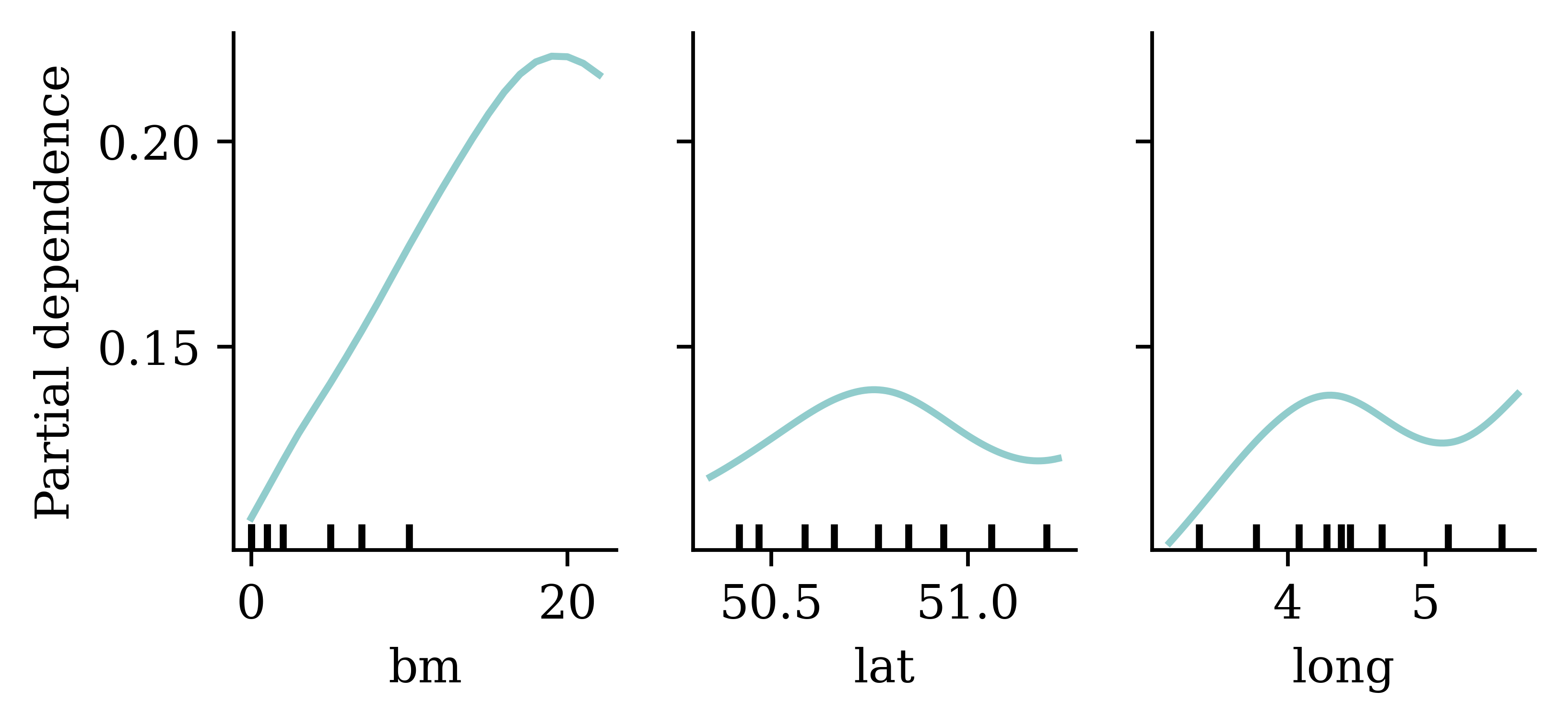
lat/long show a smooth spatial pattern and agec (vehicle age) a non-linear one. Because effects are additive, we can plot and interpret each one in isolation — the appeal of an inherently interpretable neural network. But each panel has its own y-axis, which hides how different these effects are in size, as the next slides show. The shaded band on agec marks where the curve is pure extrapolation — almost no cars are older than 18, so the steep decline there is not evidence.
A categorical effect: fuel
Continuous features give curves; a categorical feature gives one value per level.
Code
ax = model_anam.plot_effect("fuel")
# Label each bar with its multiplier on the expected claim frequency.
labels, values = model_anam.effect("fuel")
for x, v in enumerate(values):
    ax.annotate(f"×{np.exp(v):.2f}", (x, v), ha="center",
        va="bottom" if v >= 0 else "top",
        xytext=(0, 3 if v >= 0 else -3), textcoords="offset points")
# Expand the bottom margin so the ×0.74 label on the negative bar isn't clipped.
ymin, ymax = ax.get_ylim()
ax.set_ylim(ymin - 0.1 * (ymax - ymin), ymax)
ax.set_title("Effect of fuel type (categorical)");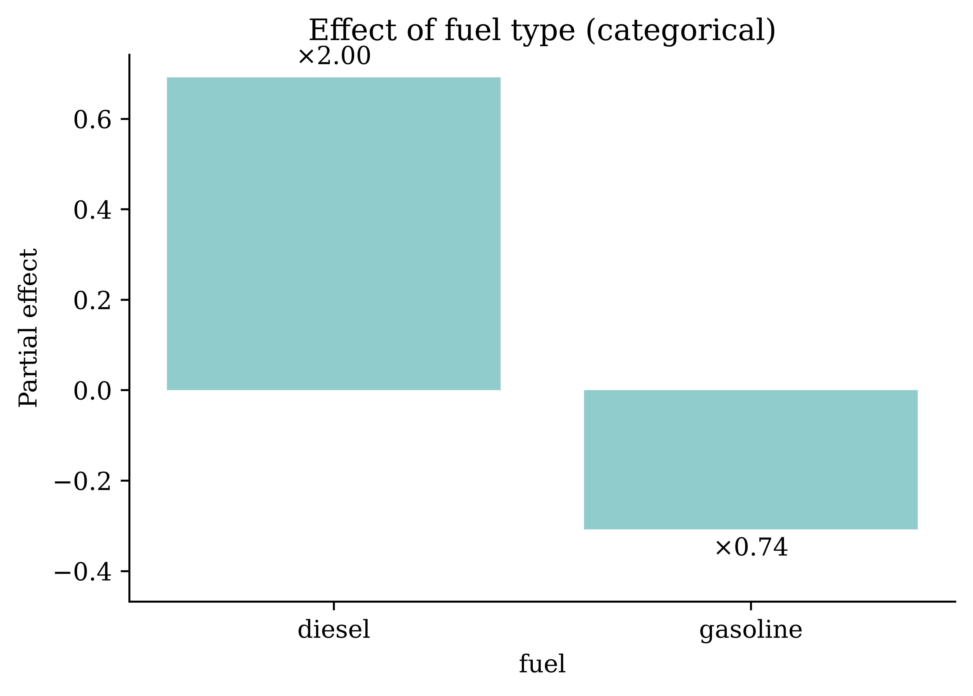
Diesel policies carry roughly double the baseline claim frequency (×2.0) while petrol sits below it (×0.74) — a diesel-vs-petrol ratio of about ×2.7. This single categorical term turns out to be the most important feature in the model (next slides), yet it never appears in the continuous shape-function plots; categoricals are handled by an embedding rather than an MLP, but read the same way — \exp(f_\text{fuel}) is a multiplier on the expected count.
The same curves, one honest scale
Each panel above had its own y-axis. Put the six continuous effects on a shared scale and the picture changes: agec and power swing hard, while ageph, lat and long flatten to near-zero lines.
Code
feats = ["ageph", "bm", "power", "agec", "lat", "long"]
fig, axes = plt.subplots(2, 3, figsize=(9, 5.5), sharey=True)
fig.subplots_adjust(hspace=0.45)
for ax, feat in zip(axes.ravel(), feats):
    grid, values = model_anam.effect(feat)
    ax.plot(grid, values)
    ax.axhline(0, color="0.7", lw=0.6, zorder=0)
    # Decile rug: black ticks at the 10th–90th percentiles of the data.
    deciles = model_anam.deciles_[feat]
    ax.plot(deciles, np.zeros_like(deciles), "|",
        transform=ax.get_xaxis_transform(), color="black",
        markeredgewidth=1.2, markersize=12)
    ax.set_title(feat)
fig.supylabel("Partial effect (log-rate)");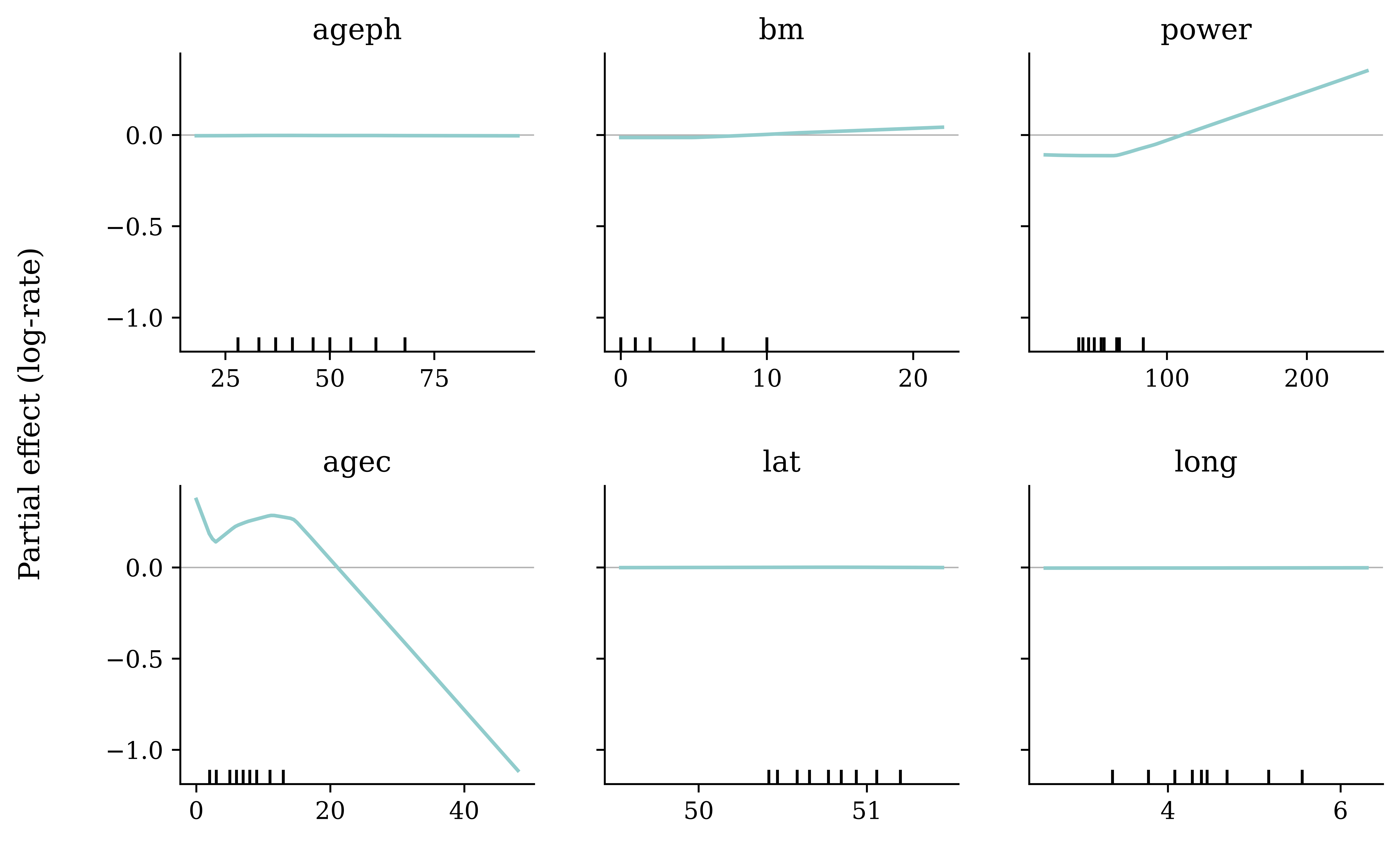
The free y-axes on the previous slides exaggerate the unimportant effects: a curve that only moves the log-rate by ±0.001 looks as structured as one that moves it by ±1. On a common scale, only agec, power (and bm, mildly) do real work; the wiggles in ageph, lat and long are essentially noise around zero.
Which effects actually matter
Measure the standard deviation of each shape function across the training data. Exponentiating gives a typical multiplier on the expected claim frequency.
Code
from matplotlib.patches import Patch

importance = {}
for feat in model_anam.features_:
    grid, values = model_anam.effect(feat)
    grid = np.asarray(grid)
    if np.issubdtype(grid.dtype, np.number):
        effect_on_data = np.interp(anam_train[feat], grid.astype(float), values)
    else:
        lookup = {str(k): v for k, v in zip(grid, values)}
        effect_on_data = anam_train[feat].astype(str).map(lookup).to_numpy()
    importance[feat] = float(np.std(effect_on_data))

names = sorted(importance, key=importance.get)
fig, ax = plt.subplots(figsize=(7, 4))
# Colour splits the material effects from the ones that do essentially nothing.
colors = ["#FF8FA9" if importance[f] < 0.002 else "#3F9999" for f in names]
bars = ax.barh(names, [importance[f] for f in names], color=colors)
ax.set_xscale("log")
ax.set_xlabel("Importance: std of shape function over the data (log-rate)")
for f, bar in zip(names, bars):
    ax.text(bar.get_width() * 1.15, bar.get_y() + bar.get_height() / 2,
        f"×{np.exp(importance[f]):.2f}", va="center")
ax.legend(handles=[
    Patch(color="#3F9999", label="material effect"),
    Patch(color="#FF8FA9", label="negligible (≈ ×1.00)"),
], loc="lower right", frameon=False)
ax.set_title("Importance");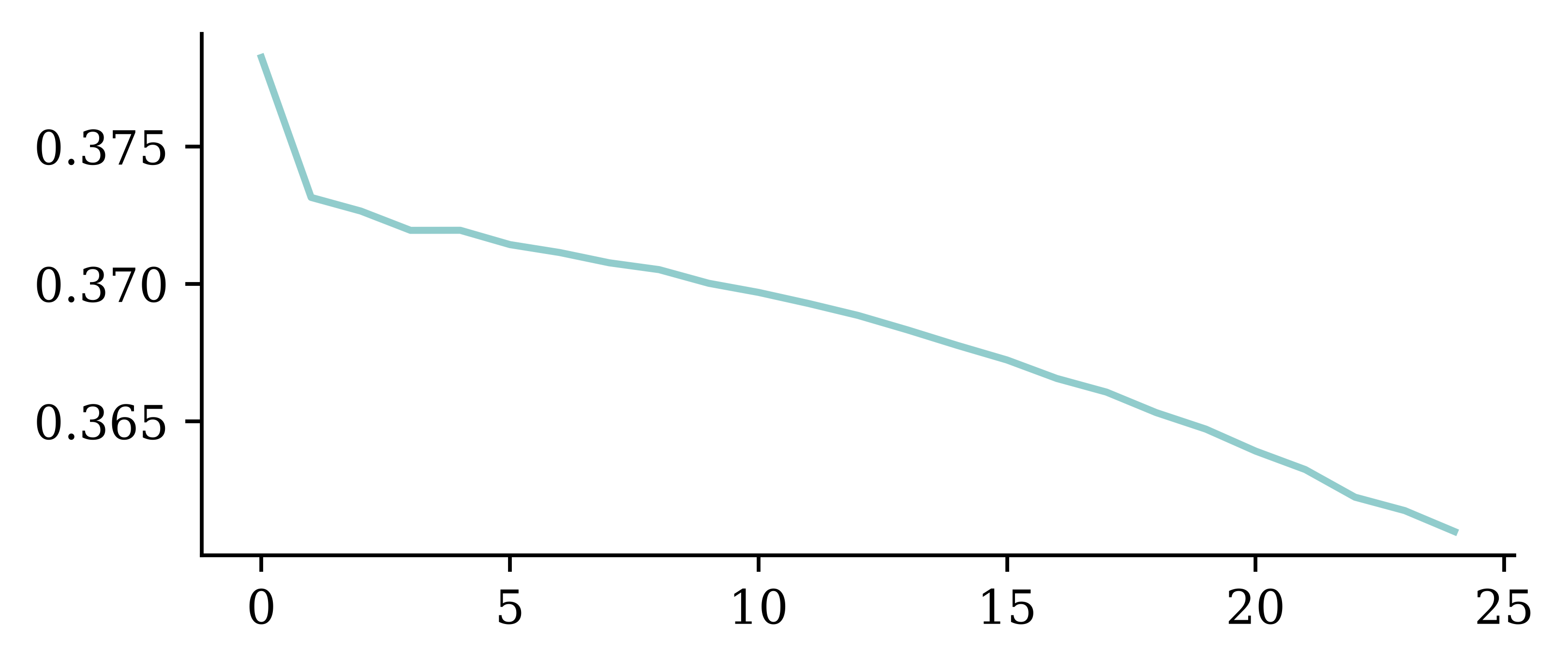
On this honest measure fuel leads, then agec and power, bm is small, and lat, ageph, long are negligible (×1.00). Contrast the naive grid swing, which crowned agec at ×4.4 — but that came entirely from its sparse, extrapolated tail beyond ~18 years (barely 1% of cars), which the data-weighted score correctly ignores. It also explains the earlier map: with the lat/long main effects near zero, the pairwise surface carries the whole spatial signal.
An interaction effect
Code
ax = model_anam.plot_effect("long", "lat")
ax.scatter(anam_train["long"], anam_train["lat"],
    s=2, c="white", alpha=0.15, linewidths=0)
# A degree of longitude is shorter than a degree of latitude this far from
# the equator, so use the true geographic proportions (Belgium is wider
# than it is tall) rather than the default aspect ratio.
ax.set_aspect(1 / np.cos(np.deg2rad(np.mean(ax.get_ylim()))));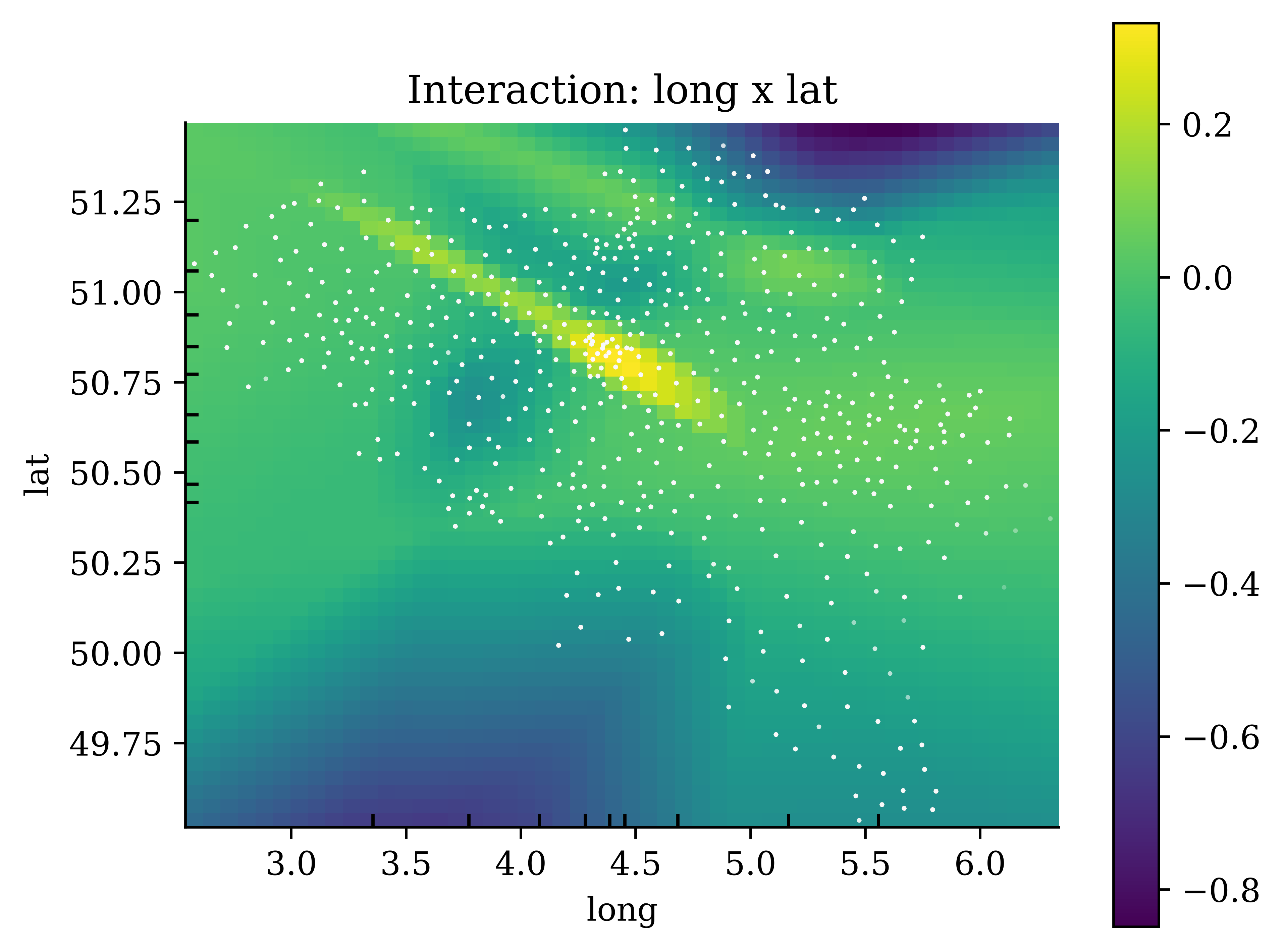
The lat:long pair is a learned spatial adjustment on top of the additive main effects. Overlaying the actual policy locations (white dots) shows where that surface is trustworthy.
The interaction over a map
Code
import contextily as ctx


def padded_effect(model, name, other, pad=0.05, n_points=50):
    """
    Like ``model.effect(name, other)``, but evaluated on a grid extended a
    fraction ``pad`` beyond the training data's range, so the surface
    extrapolates slightly past the outermost municipalities and covers the
    whole country.
    """
    def grid_for(feat):
        lo, hi = model.feature_configs_[feat]["bounds"]
        margin = pad * (hi - lo)
        g_std = torch.linspace(float(lo) - margin, float(hi) + margin, n_points)
        g_orig = model.scalers_[feat].inverse_transform(
            g_std.numpy().reshape(-1, 1)).ravel()
        return g_std, g_orig

    grid_a_std, grid_a = grid_for(name)
    grid_b_std, grid_b = grid_for(other)
    model.module_.eval()
    with torch.no_grad():
        values = model.module_.get_shape_function(
            name, grid_a_std, other, grid_b_std).cpu().numpy()
    if f"{name}_{other}" not in model.module_.interaction_subnets:
        values = values.T
    return grid_a, grid_b, values


# contextily wants x=longitude, y=latitude, so put long on the x-axis.
long_grid, lat_grid, effect = padded_effect(model_anam, "long", "lat")

fig, ax = plt.subplots(figsize=(6, 5))
# Discrete bands read far more clearly than a translucent continuous heatmap
# does; draw them at full opacity. Match the colour limits to the previous
# slide by using the effect's range over the data region --- the padded
# corners beyond it spill into the end bands (via extend="both").
_, _, effect_data = model_anam.effect("long", "lat")
levels = np.linspace(effect_data.min(), effect_data.max(), 8)
cf = ax.contourf(long_grid, lat_grid, effect.T, levels=levels,
    cmap="viridis", extend="both")
fig.colorbar(cf, ax=ax, label="Partial effect on log-rate", extendrect=True)

# Draw the country borders and coastline as vector lines over the colours.
# The file is Natural Earth's (public domain) 10m admin-0 boundary lines
# plus coastline, clipped to this corner of Europe.
borders = gpd.read_file("data/country-borders.geojson")
xlim, ylim = ax.get_xlim(), ax.get_ylim()
borders.plot(ax=ax, color="black", linewidth=1.0)
ax.set_xlim(xlim)
ax.set_ylim(ylim)

# Add the place names from CARTO's labels-only tile layer: transparent
# background with white-haloed names, made for overlaying on data like this.
# The "@2x" retina tiles keep the same zoom level (so the same city labels)
# but at double the resolution, so the text stays sharp at print DPI.
ctx.add_basemap(ax, crs="EPSG:4326",
    source=ctx.providers.CartoDB.PositronOnlyLabels(r="@2x"))

# A degree of longitude is shorter than a degree of latitude this far from
# the equator, so use the true geographic proportions.
ax.set_aspect(1 / np.cos(np.deg2rad(np.mean(ax.get_ylim()))))

ax.set(xlabel="long", ylabel="lat",
    title="lat × long interaction over Belgium");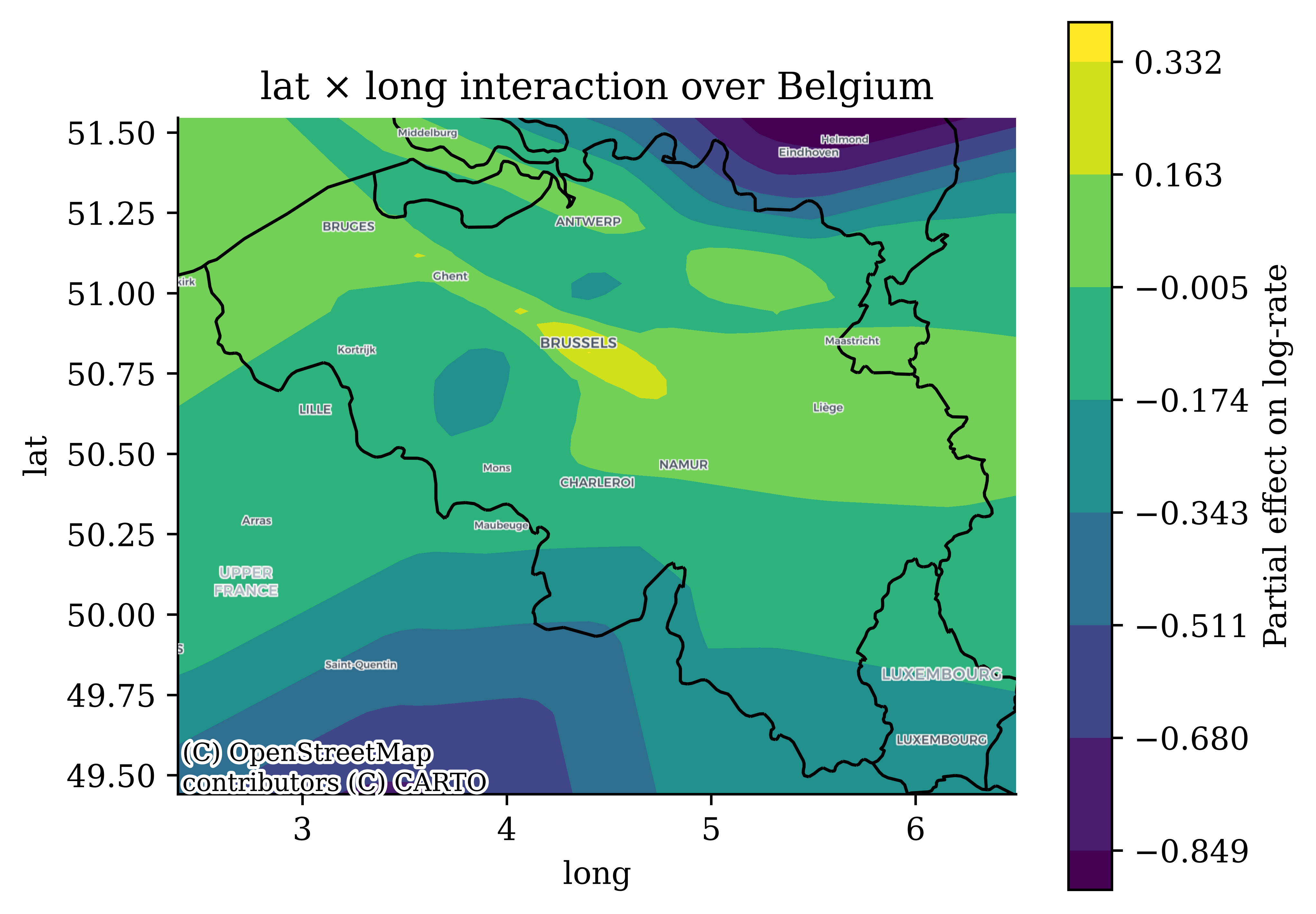
Laying the surface under some geography makes it legible — the high-risk band tracks the Brussels–Antwerp corridor, while the Ardennes in the south-east sits lower. Rather than fading the risk surface behind a translucent map, we keep the colours at full strength and draw only what we need on top: country borders and coastline as vector lines (Natural Earth), and place names from CARTO’s labels-only tile layer, which is designed for exactly this kind of overlay. The surface is evaluated on a grid extended slightly past the outermost municipalities, so the whole country is covered (the corners of the plot extrapolate a little beyond Belgium). Recall from the previous slide that the model has almost no data in the sparsely populated south, so the surface there is an extrapolation, not evidence.
Explaining a Neural Network with Partial Dependence Plots
Build a neural network
ct = make_column_transformer(
    (StandardScaler(), num_vars),
    (OneHotEncoder(drop="first", sparse_output=False), cat_vars),
    verbose_feature_names_out=False
)
ct.fit(X_train_raw)

X_train_nn = ct.transform(X_train_raw)
X_test_nn = ct.transform(X_test_raw)
y_train_nn = y_train_raw.values
y_test_nn = y_test_raw.values


random.seed(123)

nn_model = Sequential(
    [
        Input(shape=(X_train_nn.shape[1],)),
        Dense(128, activation="relu"),
        Dense(128, activation="relu"),
        Dense(128, activation="relu"),
        Dense(1, activation="exponential")
    ]
)
nn_model.compile(
optimizer="adam",
loss="poisson",
metrics=["mae"]
)
history = nn_model.fit(X_train_nn, y_train_nn,
epochs=25, batch_size=64, verbose=0,
)Code
plt.plot(history['loss'])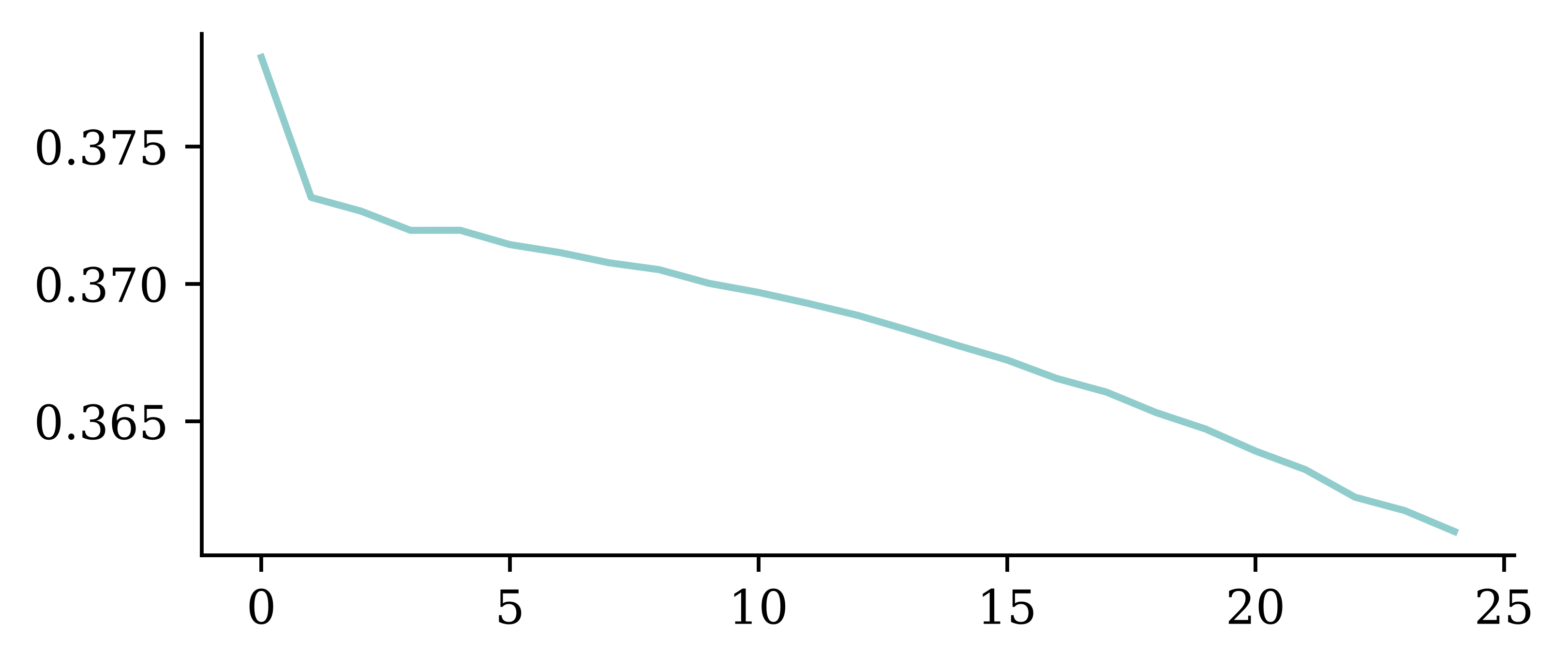
Permutation importance example
As recommended earlier, shuffle the raw columns and score the composition f \circ t, so each categorical is swapped wholesale and no “multi-hot” rows are created.
def permutation_test_raw(model, ct, X_raw, y, num_reps=1, seed=42, batch_size=8192):
    """
    Run the permutation test on the raw features,
    scoring the composite model (preprocessing then network).
    """
    rnd.seed(seed)
    scores = []

    for col in X_raw.columns:
        original_column = X_raw[col].copy()
        col_scores = []

        for r in range(num_reps):
            X_raw[col] = rnd.permutation(X_raw[col].values)
            X_shuffled = ct.transform(X_raw).to_numpy()
            col_scores.append(
                model.evaluate(X_shuffled, y, verbose=0, batch_size=batch_size))

        scores.append(np.mean(col_scores, axis=0))
        X_raw[col] = original_column

    return np.array(scores)
Permutation importance example
scores = permutation_test_raw(nn_model, ct, X_train_raw, y_train_nn)
plt.plot(scores[:,0], label='Loss')
plt.xticks(ticks=np.arange(len(X_train_raw.columns)), labels=X_train_raw.columns, rotation=90);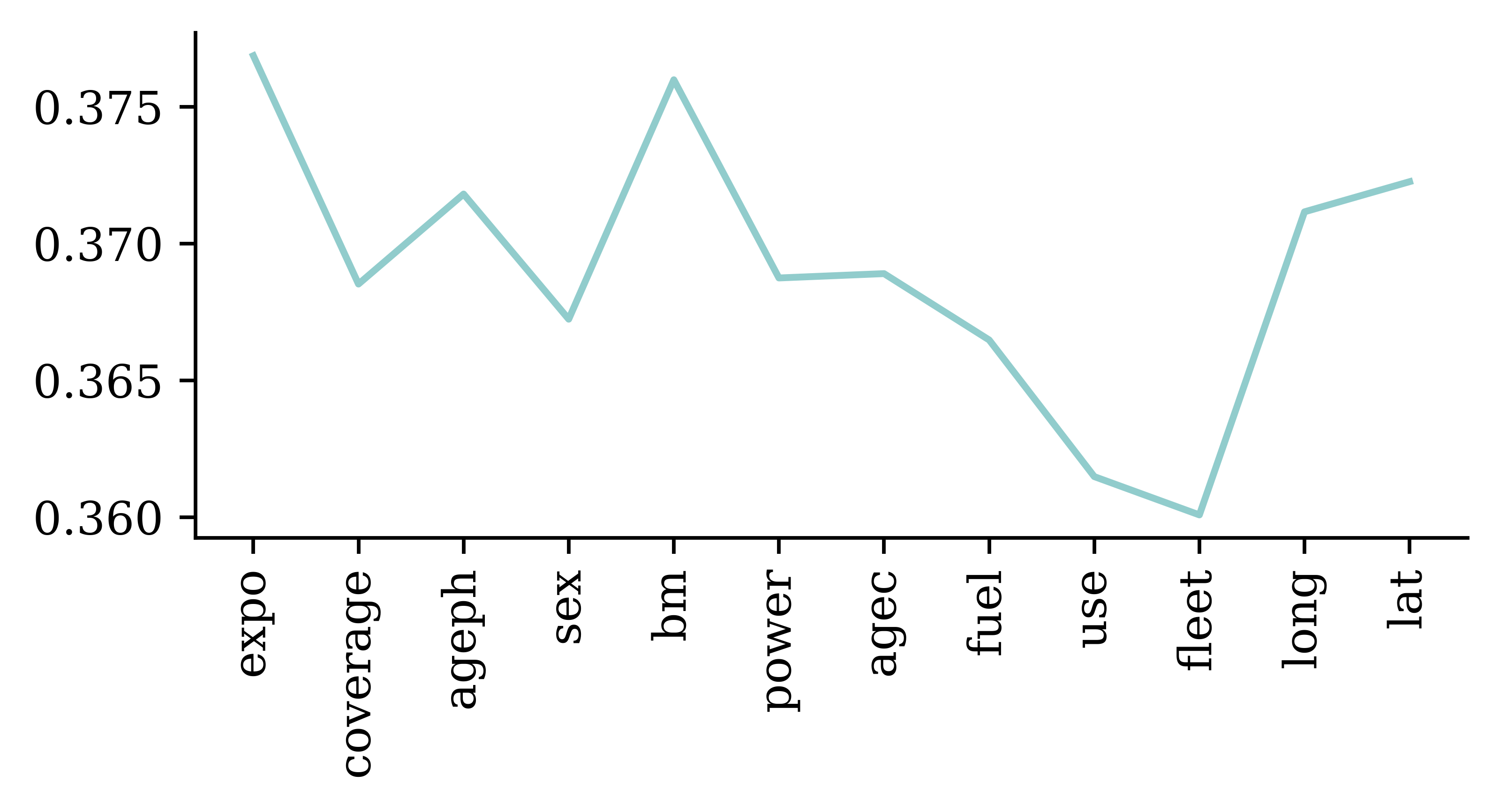
Shuffling expo or bm degrades the loss the most, followed by the location and policyholder/vehicle age variables, while use and fleet barely matter. Note there is now one importance score per raw feature: coverage is a single feature here, rather than the two separate coverage_TPL+ and coverage_TPL++ indicator columns the network actually sees. For the numeric features the composition makes no difference (shuffling a standardised column is the same as shuffling the raw one), but for the categoricals it both avoids impossible multi-hot rows and stops a variable’s importance being split across its indicator columns.
PDP: Training data
Partial dependence plots start by looking at the training data.
What is the average prediction over the training data?
X_train_raw| expo | coverage | ageph | sex | bm | power | agec | fuel | use | fleet | long | lat | |
|---|---|---|---|---|---|---|---|---|---|---|---|---|
| 25776 | 1.000000 | TPL | 59.0 | female | 0.0 | 51.0 | 15.0 | gasoline | private | 0.0 | 4.387146 | 51.216042 |
| 63185 | 0.819178 | TPL++ | 40.0 | female | 0.0 | 96.0 | 3.0 | gasoline | private | 0.0 | 5.500567 | 50.583188 |
| 130175 | 1.000000 | TPL | 31.0 | female | 8.0 | 40.0 | 8.0 | gasoline | private | 0.0 | 3.721116 | 50.535314 |
| ... | ... | ... | ... | ... | ... | ... | ... | ... | ... | ... | ... | ... |
| 24617 | 1.000000 | TPL | 75.0 | male | 0.0 | 29.0 | 17.0 | gasoline | private | 0.0 | 4.387146 | 51.216042 |
| 61581 | 1.000000 | TPL | 63.0 | male | 0.0 | 55.0 | 11.0 | gasoline | private | 0.0 | 5.612566 | 50.680020 |
| 10699 | 1.000000 | TPL+ | 50.0 | male | 6.0 | 74.0 | 3.0 | gasoline | private | 0.0 | 4.678745 | 50.687562 |
130569 rows × 12 columns
nn_model.predict(ct.transform(X_train_raw), verbose=0).mean()np.float32(0.12718096)PDP: Alternate Reality
Consider an alternate reality where all policyholders are 18 years old. What is the average prediction then?
X_train_pd = X_train_raw.copy()
X_train_pd['ageph'] = 18
X_train_pd| expo | coverage | ageph | sex | bm | power | agec | fuel | use | fleet | long | lat | |
|---|---|---|---|---|---|---|---|---|---|---|---|---|
| 25776 | 1.000000 | TPL | 18 | female | 0.0 | 51.0 | 15.0 | gasoline | private | 0.0 | 4.387146 | 51.216042 |
| 63185 | 0.819178 | TPL++ | 18 | female | 0.0 | 96.0 | 3.0 | gasoline | private | 0.0 | 5.500567 | 50.583188 |
| 130175 | 1.000000 | TPL | 18 | female | 8.0 | 40.0 | 8.0 | gasoline | private | 0.0 | 3.721116 | 50.535314 |
| ... | ... | ... | ... | ... | ... | ... | ... | ... | ... | ... | ... | ... |
| 24617 | 1.000000 | TPL | 18 | male | 0.0 | 29.0 | 17.0 | gasoline | private | 0.0 | 4.387146 | 51.216042 |
| 61581 | 1.000000 | TPL | 18 | male | 0.0 | 55.0 | 11.0 | gasoline | private | 0.0 | 5.612566 | 50.680020 |
| 10699 | 1.000000 | TPL+ | 18 | male | 6.0 | 74.0 | 3.0 | gasoline | private | 0.0 | 4.678745 | 50.687562 |
130569 rows × 12 columns
nn_model.predict(ct.transform(X_train_pd), verbose=0).mean()np.float32(0.17916383)PDP: Alternate Reality
What about if we pretend all the policyholders are 19 years old?
X_train_pd = X_train_raw.copy()
X_train_pd['ageph'] = 19
X_train_pd| expo | coverage | ageph | sex | bm | power | agec | fuel | use | fleet | long | lat | |
|---|---|---|---|---|---|---|---|---|---|---|---|---|
| 25776 | 1.000000 | TPL | 19 | female | 0.0 | 51.0 | 15.0 | gasoline | private | 0.0 | 4.387146 | 51.216042 |
| 63185 | 0.819178 | TPL++ | 19 | female | 0.0 | 96.0 | 3.0 | gasoline | private | 0.0 | 5.500567 | 50.583188 |
| 130175 | 1.000000 | TPL | 19 | female | 8.0 | 40.0 | 8.0 | gasoline | private | 0.0 | 3.721116 | 50.535314 |
| ... | ... | ... | ... | ... | ... | ... | ... | ... | ... | ... | ... | ... |
| 24617 | 1.000000 | TPL | 19 | male | 0.0 | 29.0 | 17.0 | gasoline | private | 0.0 | 4.387146 | 51.216042 |
| 61581 | 1.000000 | TPL | 19 | male | 0.0 | 55.0 | 11.0 | gasoline | private | 0.0 | 5.612566 | 50.680020 |
| 10699 | 1.000000 | TPL+ | 19 | male | 6.0 | 74.0 | 3.0 | gasoline | private | 0.0 | 4.678745 | 50.687562 |
130569 rows × 12 columns
nn_model.predict(ct.transform(X_train_pd), verbose=0).mean()np.float32(0.17551786)PDP: Alternate Reality
X_train_pd = X_train_raw.copy()
X_train_pd['ageph'] = 90
X_train_pd| expo | coverage | ageph | sex | bm | power | agec | fuel | use | fleet | long | lat | |
|---|---|---|---|---|---|---|---|---|---|---|---|---|
| 25776 | 1.000000 | TPL | 90 | female | 0.0 | 51.0 | 15.0 | gasoline | private | 0.0 | 4.387146 | 51.216042 |
| 63185 | 0.819178 | TPL++ | 90 | female | 0.0 | 96.0 | 3.0 | gasoline | private | 0.0 | 5.500567 | 50.583188 |
| 130175 | 1.000000 | TPL | 90 | female | 8.0 | 40.0 | 8.0 | gasoline | private | 0.0 | 3.721116 | 50.535314 |
| ... | ... | ... | ... | ... | ... | ... | ... | ... | ... | ... | ... | ... |
| 24617 | 1.000000 | TPL | 90 | male | 0.0 | 29.0 | 17.0 | gasoline | private | 0.0 | 4.387146 | 51.216042 |
| 61581 | 1.000000 | TPL | 90 | male | 0.0 | 55.0 | 11.0 | gasoline | private | 0.0 | 5.612566 | 50.680020 |
| 10699 | 1.000000 | TPL+ | 90 | male | 6.0 | 74.0 | 3.0 | gasoline | private | 0.0 | 4.678745 | 50.687562 |
130569 rows × 12 columns
nn_model.predict(ct.transform(X_train_pd), verbose=0).mean()np.float32(0.100023024)
NoteQuestion
What could go wrong?
Partial dependence plot code
Plot the average prediction for each age given to all policyholders.
# Make partial dependence plot for ageph by hand
ageph_range = np.linspace(X_train_raw['ageph'].min(), X_train_raw['ageph'].max(), 100)
y_preds = []
X_train_pd = X_train_raw.copy()

for age in ageph_range:
    X_train_pd['ageph'] = age
    X_train_pd_ct = ct.transform(X_train_pd)
    y_pred_batch = nn_model.predict(X_train_pd_ct, verbose=0, batch_size=X_train_pd_ct.shape[0])
    y_preds.append(y_pred_batch.mean())
Partial dependence plot
Code
plt.plot(ageph_range, y_preds, label='PDP for ageph')
plt.xlabel('Age of Policyholder')
plt.ylabel('Predicted Number of Claims')
plt.title('Partial Dependence Plot for Age of Policyholder');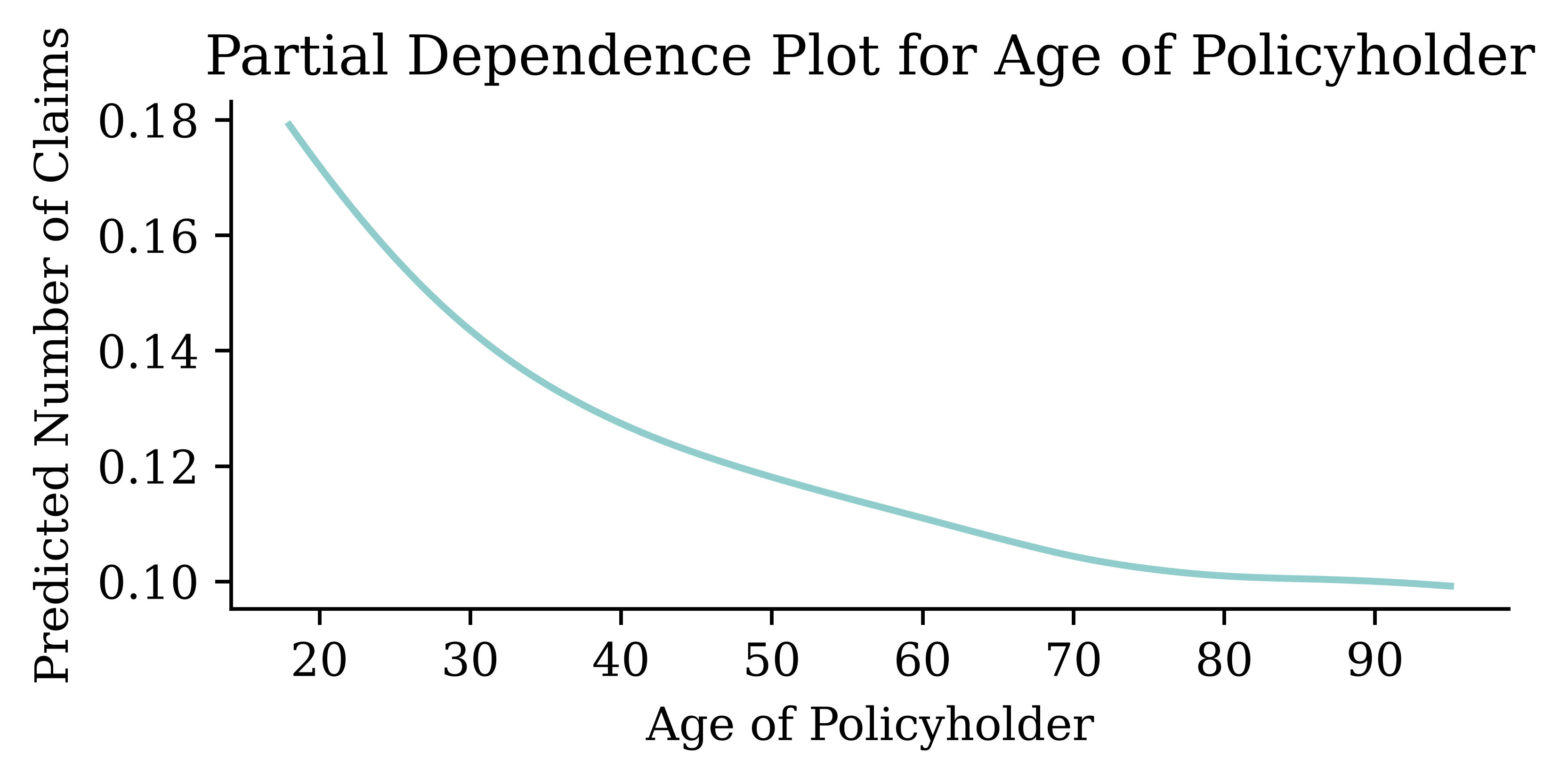
Using scikit-learn’s PDP
(First need to trick scikit-learn a little..)
Code
# Wrap the column transformer + Keras model as a scikit-learn regressor so
# PartialDependenceDisplay can use it.
class SklearnModel(RegressorMixin, BaseEstimator):
    def __init__(self, ct=None, model=None, batch_size=8192):
        self.ct = ct
        self.model = model
        self.batch_size = batch_size
        self.n_features_in_ = ct.n_features_in_

    def predict(self, X):
        X_trans = self.ct.transform(X)
        preds = self.model.predict(X_trans, verbose=0, batch_size=self.batch_size)
        return preds.ravel()

    def fit(self, X=None, y=None):
        return self

nn_model_skl = SklearnModel(ct, nn_model)
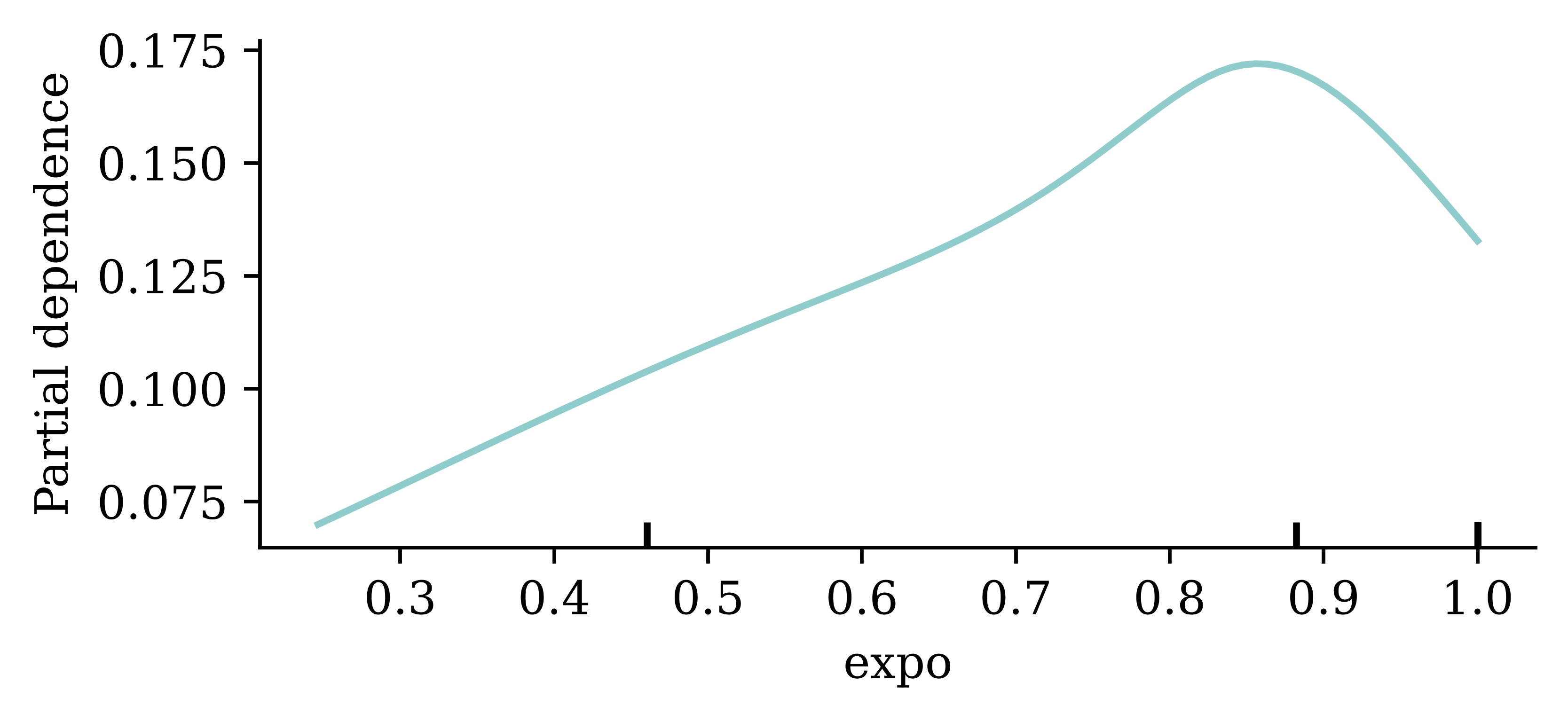
PartialDependenceDisplay.from_estimator(
nn_model_skl,
X_train_raw,
features=[0],
feature_names=X_train_raw.columns,
)
Explaining the ages and exposure
Code
cols = X_train_raw.columns.to_list()
inds = [cols.index(col) for col in ["ageph", "agec", "expo"]]
PartialDependenceDisplay.from_estimator(
    nn_model_skl,
    X_train_raw,
    features=inds,
    feature_names=X_train_raw.columns,
)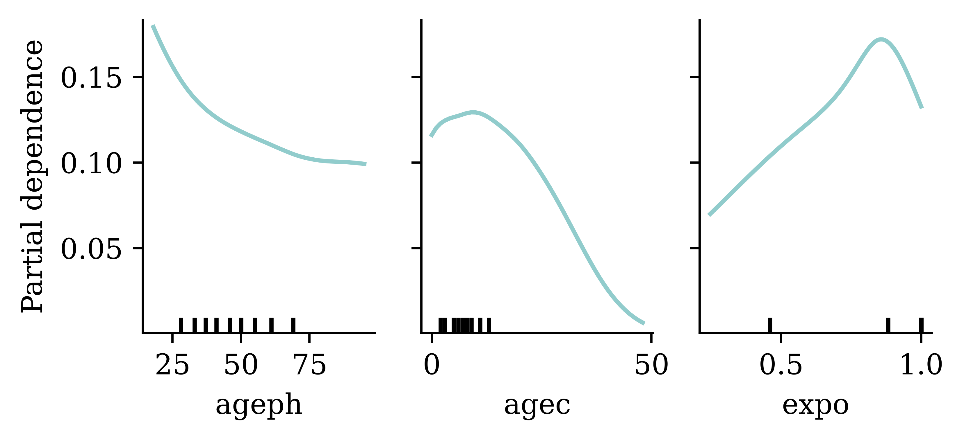
The 9 small vertical lines on the x-axis represent the bounds of the deciles of the dataset, i.e., 10% of observations lie between each pair of bars. This helps us understand where most of the observations lie. E.g., for agec, we can see that most of the cars were younger than around 15 years, and 10% of observations have agec greater than 15 years.
These bars are useful as they indicate where we should place most of our interpretation. We should avoid reading too much into PDP lines where only a small portion of the dataset lies.
Caution
Let’s have a closer look at the PDP for expo (exposure). Does this plot make sense to you?
Answer: Intuitively, exposure should have a multiplicative impact on expected claim numbers (i.e. y=mx, m>0). It should be an increasing straight line.
In this case, rather than putting exposure in as a feature like every other variable, it should be manually adjusted to have the right impact.
Explaining the bonus-malus and location
Code
cols = X_train_raw.columns.to_list()
inds = [cols.index(col) for col in ["bm", "lat", "long"]]
PartialDependenceDisplay.from_estimator(
    nn_model_skl,
    X_train_raw,
    features=inds,
    feature_names=X_train_raw.columns,
)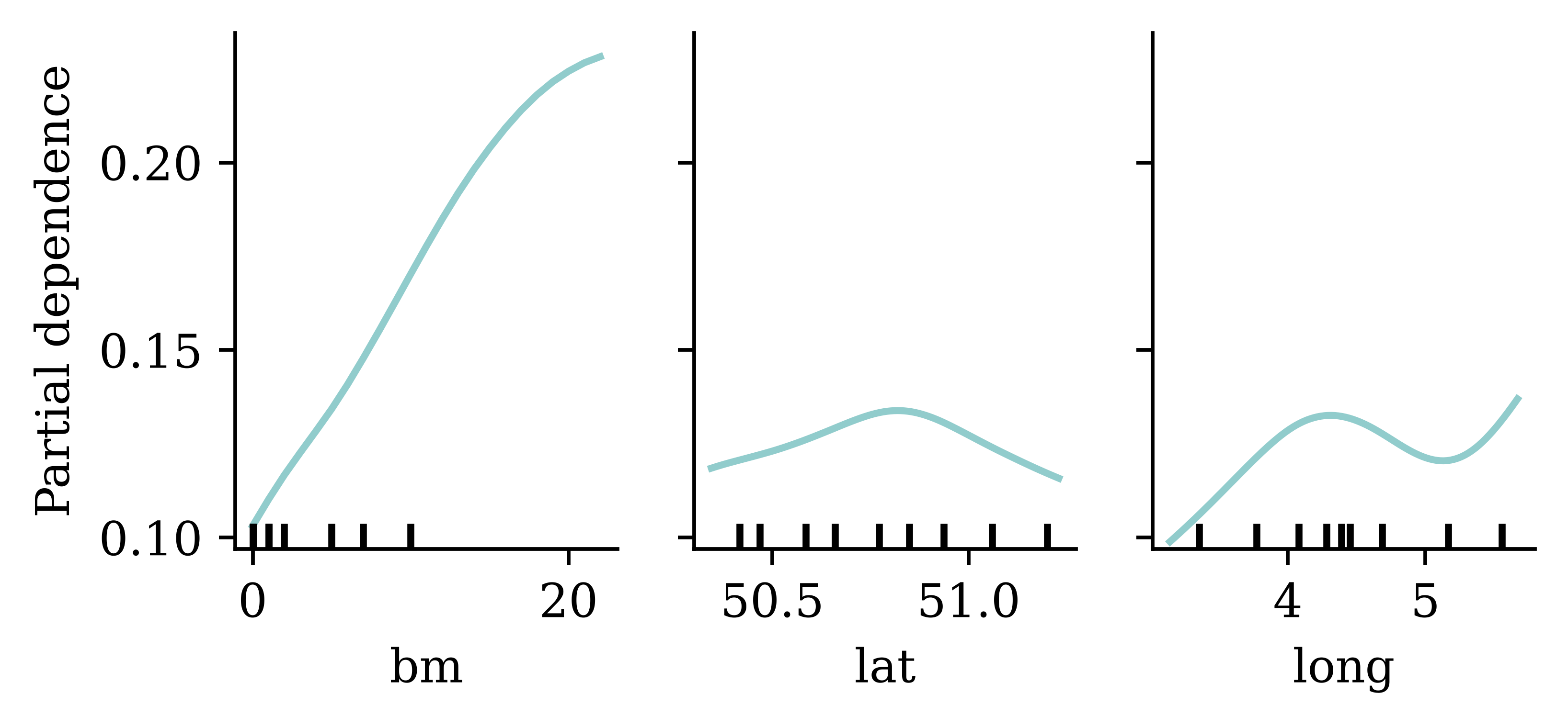
Bivariate age effects
cols = X_train_raw.columns.to_list()
inds = [cols.index(col) for col in ["ageph", "agec"]]

disp = PartialDependenceDisplay.from_estimator(
    nn_model_skl,
    X_train_raw,
    features=[tuple(inds)],
    feature_names=X_train_raw.columns,
)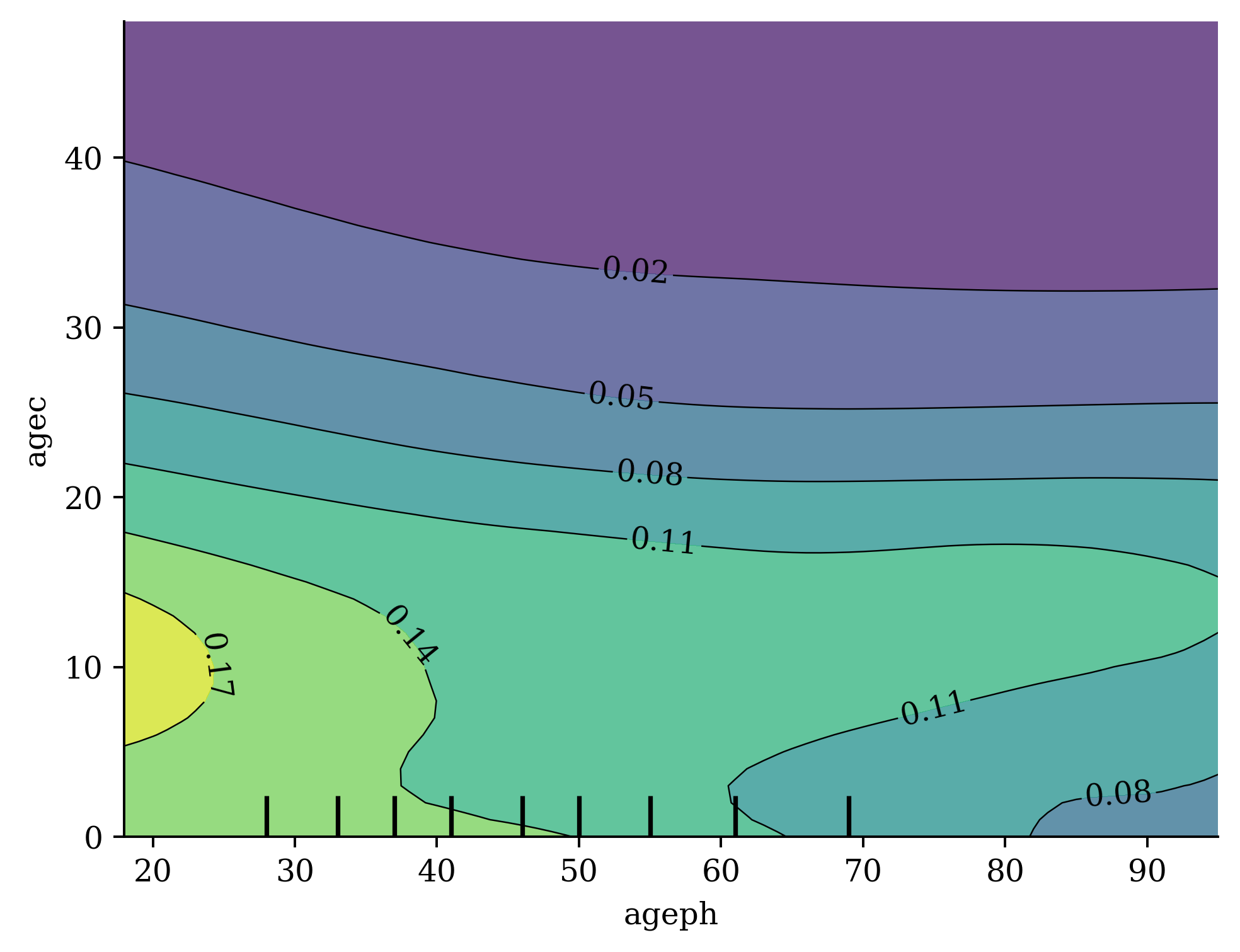
Other Local Methods
LIME
Local Interpretable Model-agnostic Explanations employs an interpretable surrogate model (e.g. a linear regression) to explain locally how the black-box model makes predictions for individual instances.
SHAP Values
The SHapley Additive exPlanations (SHAP) value helps to quantify the contribution of each feature to the prediction for a specific instance (Lundberg & Lee, 2017).
The SHAP value for the jth feature is defined as \begin{align*} \text{SHAP}^{(j)}(\boldsymbol{x}) &= \sum_{U\subset \{1, ..., p\} \backslash \{j\}} \frac{1}{p} \binom{p-1}{|U|}^{-1} \big(\mathbb{E}[Y| \boldsymbol{x}^{(U\cup \{j\})}] - \mathbb{E}[Y|\boldsymbol{x}^{(U)}]\big), \end{align*} where p is the number of features. A positive SHAP value indicates that the variable increases the prediction value.
SHAP waterfall plot
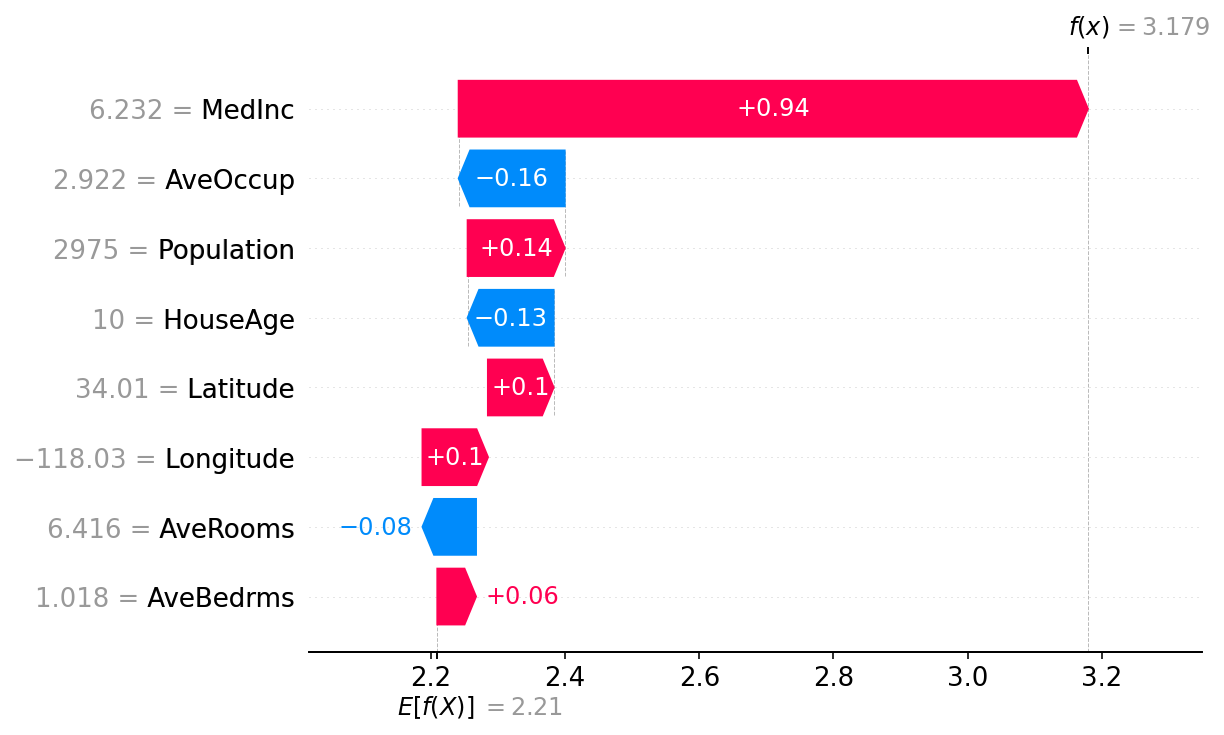
- How the SHAP waterfall plot works:
-
Start with the mean prediction. Given the value of
AveBedrmswas 1.018 for this prediction, this contributes+0.06to the prediction. Continue with this for the rest of the variables. The variables with the largest contributions (positive or negative) are at the top, and the lowest at the bottom.
Counterfactual Explanations
Counterfactual explanations answer the question: “What is the smallest change to the input features that would change the model’s prediction?” They provide actionable recourse by showing what would need to be different for a different outcome (Wachter et al., 2017).
“A counterfactual explanation of a prediction describes the smallest change to the feature values that changes the prediction to a predefined output.”
— Molnar (2020)
Given a model f, an instance \boldsymbol{x}, and a desired prediction y', a counterfactual \boldsymbol{x}' solves:
\boldsymbol{x}' = \arg\min_{\boldsymbol{x}'} \bigl( f(\boldsymbol{x}') - y' \bigr)^2 + d(\boldsymbol{x}, \boldsymbol{x}')
where d(\cdot, \cdot) measures the distance between the original and counterfactual instances.
Note
For insurance pricing, a counterfactual might tell Bob: “If your bonus-malus level were 5 instead of 12, your predicted premium would drop from $5,200 to $3,800.” This gives a contrastive explanation of why the prediction is higher. It is only actionable if the proposed change is feasible and under the policyholder’s control.
Grad-CAM

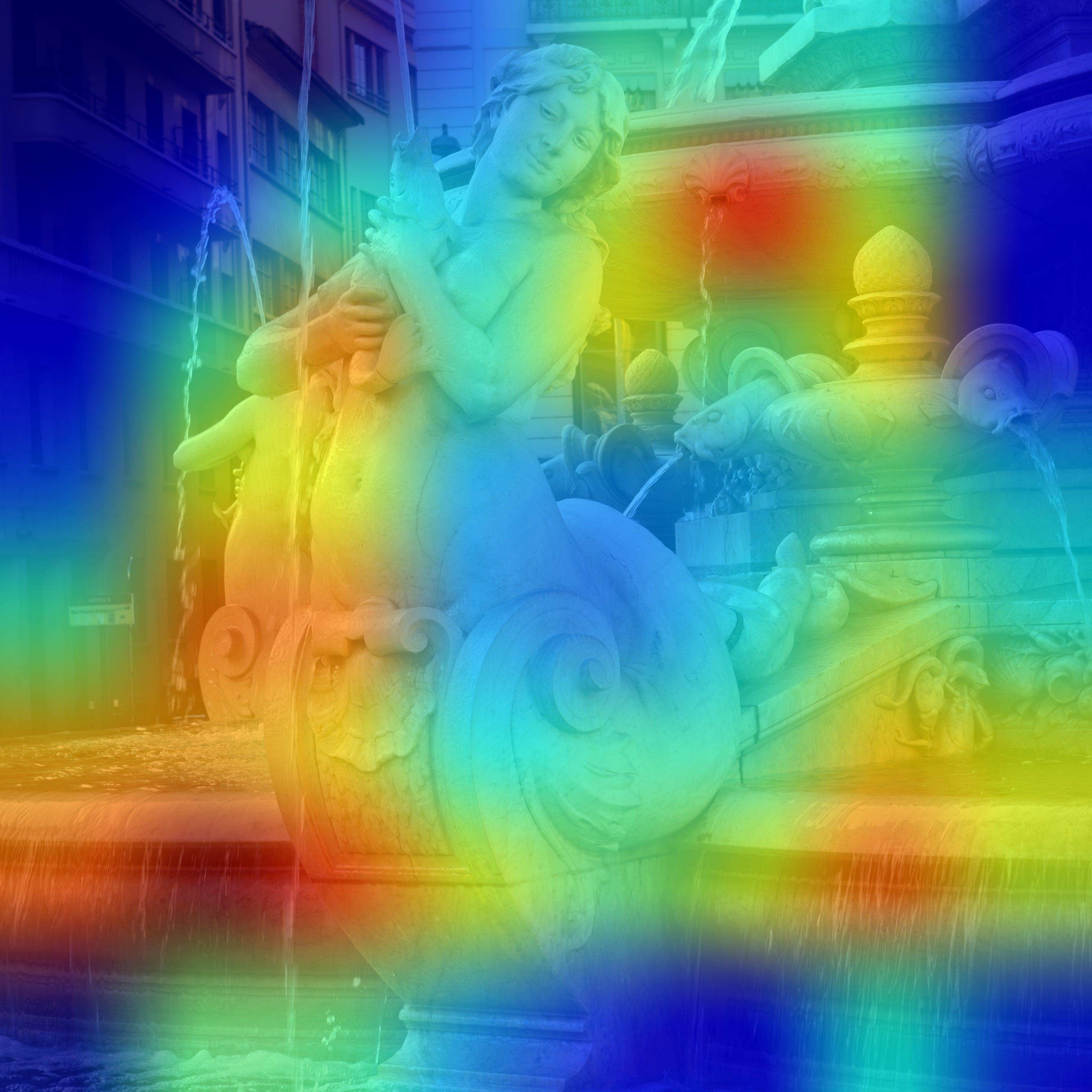
See, e.g., Keras tutorial.
Conclusion
Conclusion
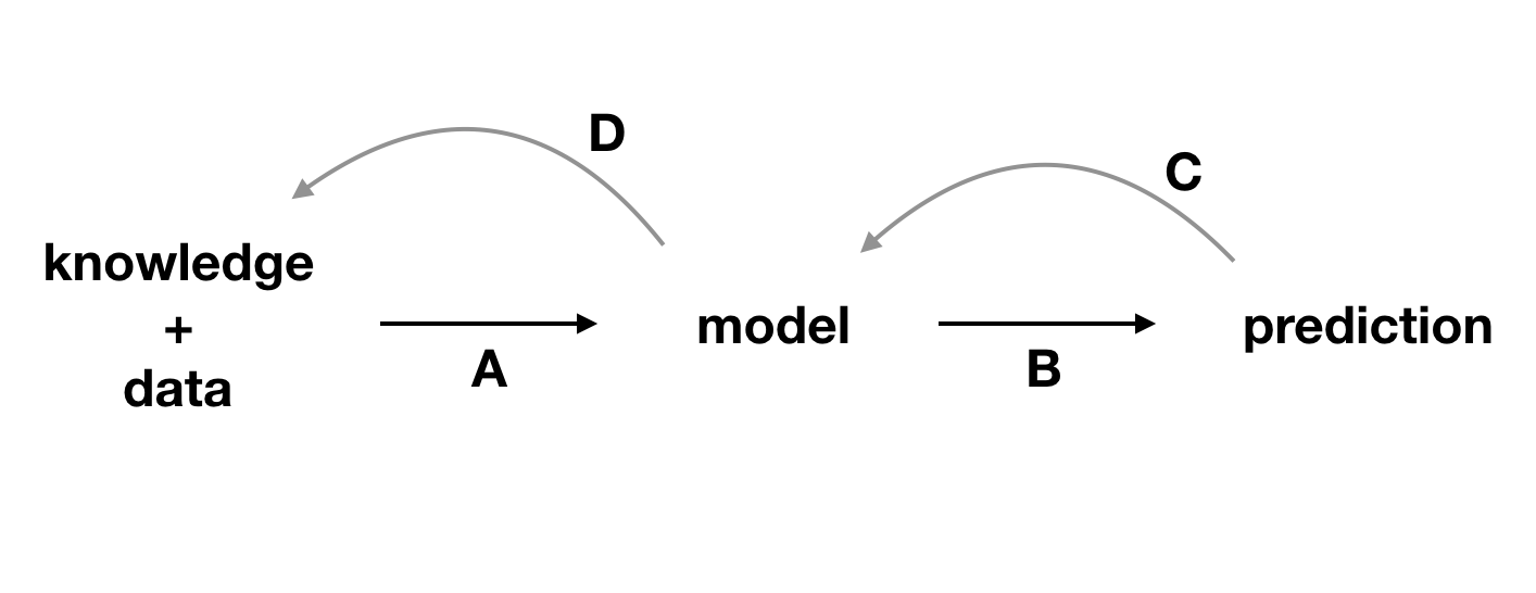
Package Versions
from watermark import watermark
print(watermark(python=True, packages="contextily,geopandas,keras,matplotlib,numpy,pandas,plotly,pygam,seaborn,scipy,shapely,sklearn,statsmodels,torch"))
Python implementation: CPython
Python version : 3.14.5
IPython version : 9.15.0
contextily : 1.7.0
geopandas : 1.1.4
keras : 3.15.0
matplotlib : 3.11.0
numpy : 2.5.1
pandas : 3.0.3
plotly : 6.8.0
pygam : 0.12.0
seaborn : 0.13.2
scipy : 1.18.0
shapely : 2.1.2
sklearn : 1.9.0
statsmodels: 0.14.6
torch : 2.12.1
Glossary
- adversarial examples
- counterfactual explanations
- ceteris paribus plot
- global interpretability
- Grad-CAM
- individual conditional expectation (ICE) plot
- inherent interpretability
- LIME
- local interpretability
- partial dependence plot
- permutation importance
- post-hoc explainability
- SHAP values
References
Agarwal, R., Melnick, L., Frosst, N., Zhang, X., Lengerich, B., Caruana, R., & Hinton, G. E. (2021). Neural Additive Models: Interpretable Machine Learning with Neural Nets. Advances in Neural Information Processing Systems, 34, 4699–4711.
Baeder, L., Brinkmann, P., & Xu, E. (2021). Interpretable machine learning for insurance: An introduction with examples. Society of Actuaries. https://www.soa.org/globalassets/assets/files/resources/research-report/2021/interpretable-machine-learning.pdf
Biecek, P., & Burzykowski, T. (2021). Explanatory Model Analysis. Chapman; Hall/CRC, New York. https://pbiecek.github.io/ema/
Breiman, L. (2001). Random forests. Machine Learning, 45(1), 5–32.
Carreira-Perpinán, M. A., & Tavallali, P. (2018). Alternating optimization of decision trees, with application to learning sparse oblique trees. Advances in Neural Information Processing Systems, 31.
Charpentier, A. (2024). Insurance, biases, discrimination and fairness. Springer.
Chen, Z., Lu, Y., Zhang, J., & Zhu, W. (2024). Managing weather risk with a neural network-based index insurance. Management Science, 70(7), 4306–4327.
Delcaillau, D., Ly, A., Papp, A., & Vermet, F. (2022). Model transparency and interpretability: Survey and application to the insurance industry. European Actuarial Journal, 12(2), 443–484.
Doshi-Velez, F., & Kim, B. (2017). Towards a rigorous science of interpretable machine learning.
Fisher, A., Rudin, C., & Dominici, F. (2019). All models are wrong, but many are useful: Learning a variable’s importance by studying an entire class of prediction models simultaneously. Journal of Machine Learning Research, 20(177), 1–81.
Goodfellow, I. J., Shlens, J., & Szegedy, C. (2014). Explaining and harnessing adversarial examples. arXiv Preprint arXiv:1412.6572.
Laub, P. J., Pho, T., & Wong, B. (2026). An interpretable deep learning model for general insurance pricing. Insurance: Mathematics and Economics, 103270.
Lundberg, S. M., & Lee, S.-I. (2017). A unified approach to interpreting model predictions. Advances in Neural Information Processing Systems, 30.
Molnar, C. (2020). Interpretable machine learning.
Ribeiro, M. T., Singh, S., & Guestrin, C. (2016). Why Should I Trust You?": Explaining the Predictions of Any Classifier. Proceedings of the 22nd ACM SIGKDD International Conference on Knowledge Discovery and Data Mining, 1135–1144.
Richman, R., & Wüthrich, M. V. (2023). LocalGLMnet: Interpretable deep learning for tabular data. Scandinavian Actuarial Journal, 2023(1), 71–95.
Rudin, C. (2019). Stop explaining black box machine learning models for high stakes decisions and use interpretable models instead. Nature Machine Intelligence, 1(5), 206–215.
Rudin, C., Chen, C., Chen, Z., Huang, H., Semenova, L., & Zhong, C. (2022). Interpretable machine learning: Fundamental principles and 10 grand challenges. Statistic Surveys, 16, 1–85.
Vredenburgh, K. (2022). The right to explanation. Journal of Political Philosophy, 30(2), 209–229.
Wachter, S., Mittelstadt, B., & Russell, C. (2017). Counterfactual explanations without opening the black box: Automated decisions and the GDPR. Harvard Journal of Law & Technology, 31(2), 841–887.
Xin, X., Hooker, G., & Huang, F. (2025). Pitfalls in machine learning interpretability: Manipulating partial dependence plots to hide discrimination. Insurance: Mathematics and Economics, 125, 103135. https://doi.org/10.1016/j.insmatheco.2025.103135