import matplotlib.pyplot as pltLab: Matplotlib
ACTL3143 & ACTL5111 Deep Learning for Actuaries
Matplotlib is a Python library for creating high-quality data visualisations. It can be used to build a wide variety of charts, and in this tutorial we will explore how to build line plots, scatter plots, bar plots, and histograms. Charts built using Matplotlib are highly customisable.
As a data scientist, the ability to visualise your data effectively is important as it allows you to develop a deep understanding and relationship with your data. You’ll be able to see potential trends and data characteristics that you can incorporate or account for in your modelling later.
Once Matplotlib is installed, you can import it into your Python program:
Note that we specifically need to import pyplot as opposed to Matplotlib itself. This is because pyplot is an interface for Matplotlib that enables the library to work more like MATLAB, in which you will first initialise the figure and then each function makes some change to that figure (source: https://matplotlib.org/stable/tutorials/introductory/pyplot.html).
Basic plot types
Line plot
Pyplot’s plot() function will create a line plot:
# Create sample data
x = [-2,-1,0,1,2]
y = [-4,-2,0,2,4]

# Create line plot
plt.plot(x,y)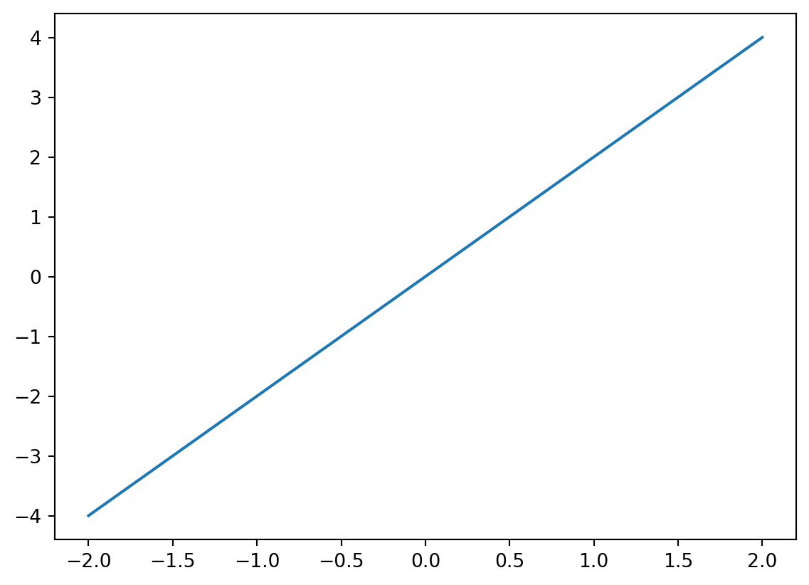
As you can see, we have created a simple line plot. We can customise this by adding a title, customising the x- and y-axes, and even changing the colour of the line:
# Create sample data
x = [-2,-1,0,1,2]
y = [-4,-2,0,2,4]

# Create line plot
plt.plot(x,y, color = "purple")

# Add title
plt.title("Plot of y = 2x")

# Add axes labels
plt.xlabel("x")
plt.ylabel("y")
Text(0, 0.5, 'y')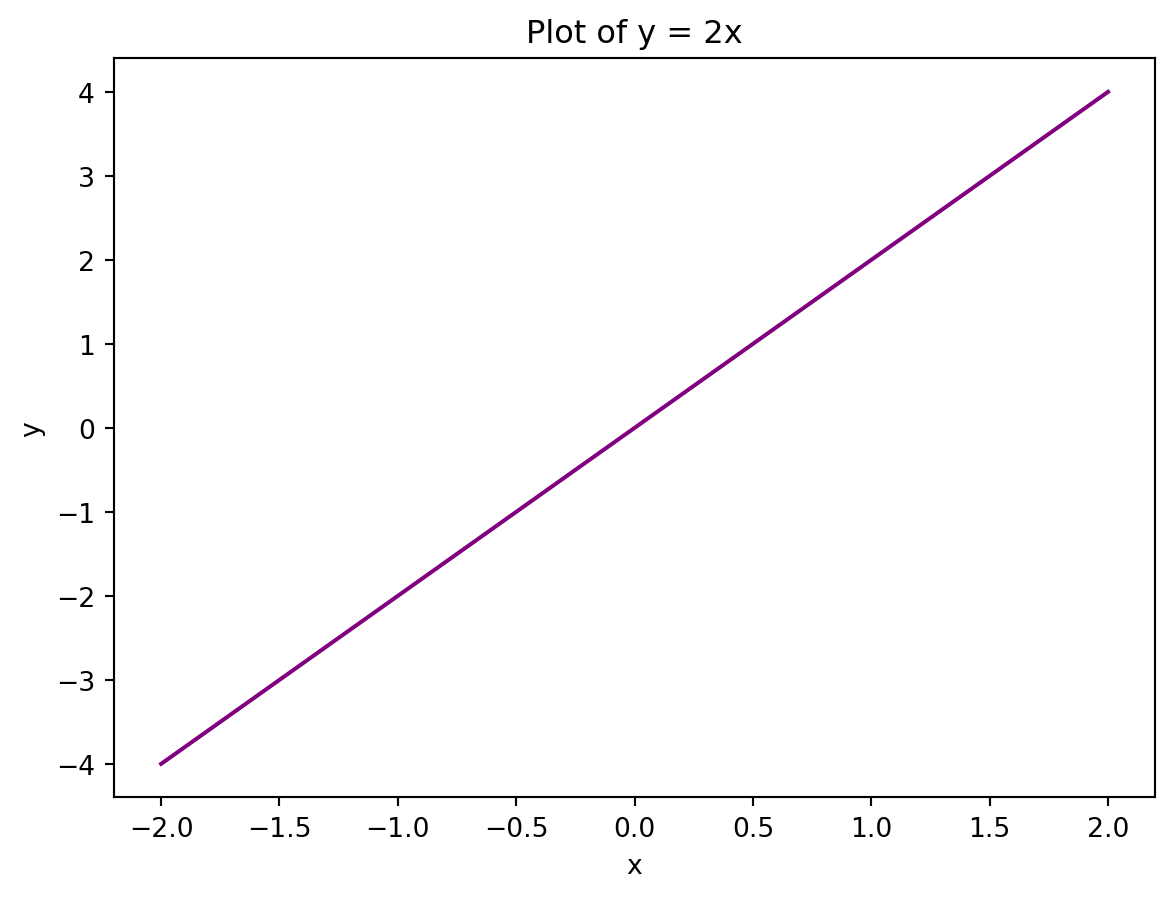
You can also add multiple lines to a plot:
# Create sample data
x = [-2,-1,0,1,2]
y1 = [-4,-2,0,2,4]
y2 = [6,3,0,-3,-6]

# Create line plot
plt.plot(x,y1, color = "purple")
plt.plot(x,y2, color = "green")

# Add title
plt.title("Plots of y = 2x and y = -3x")

# Add axes labels
plt.xlabel("x")
plt.ylabel("y")
Text(0, 0.5, 'y')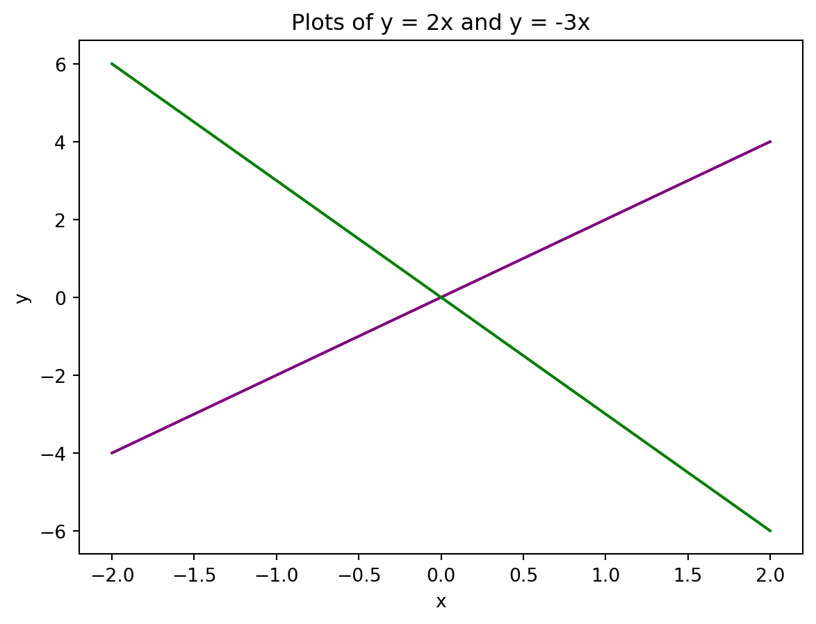
Scatter plot
We use plt.scatter() to put together a scatter plot:
# Create sample data
x = [0, 1, 2, 3, 4, 5]
y = [0, 1, 4, 9, 16, 25]

# Create scatter plot
plt.scatter(x, y)

# Add title
plt.title("Scatter plot of y = x^2, x >= 0")

# Add axes labels
plt.xlabel("x")
plt.ylabel("y")
Text(0, 0.5, 'y')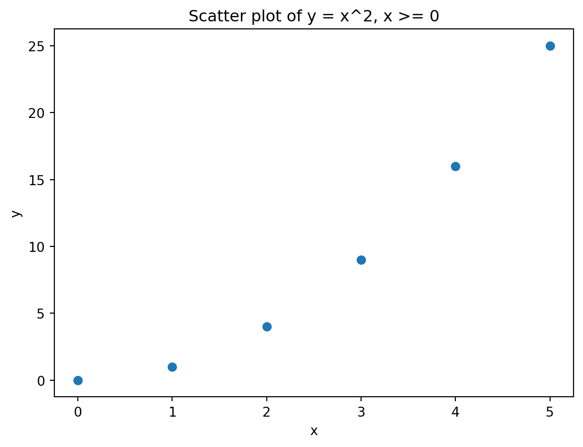
Bar plot
We use plt.bar() to put together a bar plot:
# Create sample data
x = [1, 2, 3, 4, 5]
y = [1, 4, 9, 16, 25]

# Create scatter plot
plt.bar(x, y)

# Add title
plt.title("Bar plot of y = x^2, x >= 0")

# Add axes labels
plt.xlabel("x")
plt.ylabel("y")
Text(0, 0.5, 'y')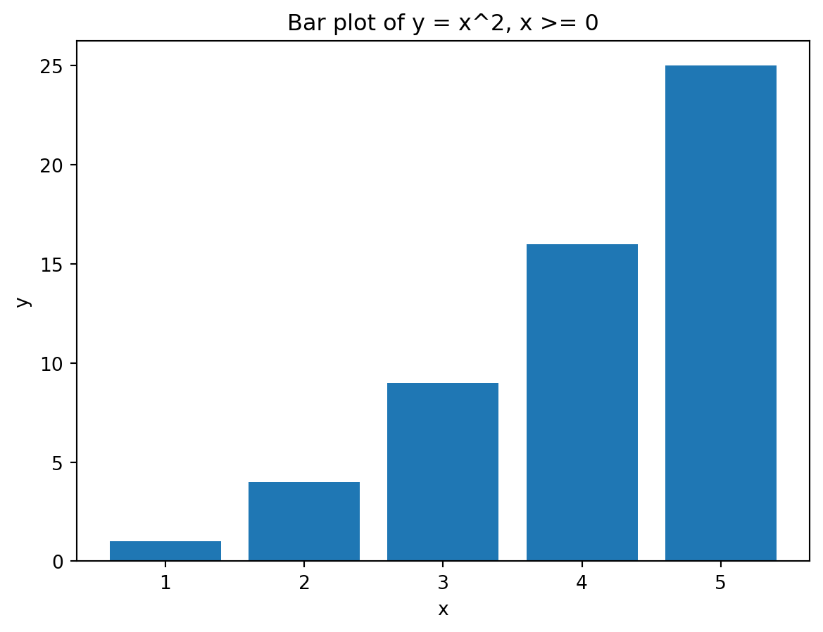
Histogram
We use plt.hist() to put together a histogram.
# Create sample data
x = [1.2,1.5,1.7,2,2.1,2.2,2.8,3.6,4.1,4.4,4.9]

# Create histogram
plt.hist(x)

# Add title
plt.title("Histogram")

# Add axes labels
plt.xlabel("x")
plt.ylabel("Frequency")
Text(0, 0.5, 'Frequency')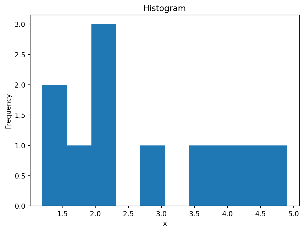
plt.hist() will automatically set the bin widths for you.
Advanced plot customisation
Histogram bin settings
While we are on the topic of histograms, let’s customise the histogram we have just created, specifically in terms of the bins.
You can set the number of bins that the histogram can have using the bins argument in plt.hist():
# Create sample data
x = [1.2,1.5,1.7,2,2.1,2.2,2.8,3.6,4.1,4.4,4.9]

# Create histogram with 4 bins
plt.hist(x, bins = 4)

# Add title
plt.title("Histogram, 4 bins")

# Add axes labels
plt.xlabel("x")
plt.ylabel("Frequency")
Text(0, 0.5, 'Frequency')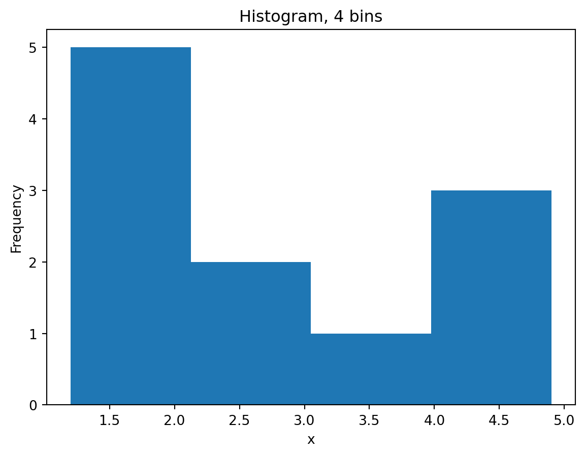
Alternatively, you can set custom bin edges:
# Create sample data
x = [1.2,1.5,1.7,2,2.1,2.2,2.8,3.6,4.1,4.4,4.9]

# Set custom bin edges
bin_edges = [0,1.5,3,4,5]

# Create histogram with 4 bins of custom width
plt.hist(x, bins = bin_edges, edgecolor = "black")

# Add title
plt.title("Histogram, 4 bins custom")

# Add axes labels
plt.xlabel("x")
plt.ylabel("Frequency")
Text(0, 0.5, 'Frequency')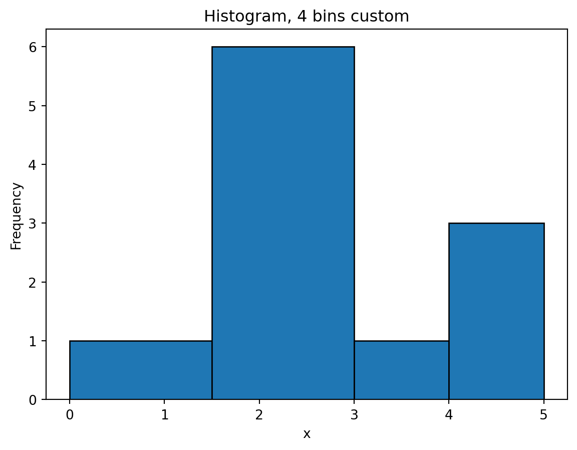
Editing axes
Let’s go back to our line plot of y = 2x:
# Create sample data
x = [-2,-1,0,1,2]
y = [-4,-2,0,2,4]

# Create line plot
plt.plot(x,y, color = "purple")

# Add title
plt.title("Plot of y = 2x")

# Add axes labels
plt.xlabel("x")
plt.ylabel("y")
Text(0, 0.5, 'y')
Notice that the tick marks for both the x- and y-axes are quite close together. You might prefer this as it gives you more granularity, however, some may find this quite cluttered. We can edit the axes tick marks (as well as the axes limits) using the plt.xticks() and plt.yticks() functions.
# Create sample data
x = [-2,-1,0,1,2]
y = [-4,-2,0,2,4]

# Create line plot
plt.plot(x,y, color = "purple")

# Add title
plt.title("Plot of y = 2x")

# Edit tick marks
plt.xticks(range(-2,3))
plt.yticks([-4,-2,0,2,4])

# Add axes labels
plt.xlabel("x")
plt.ylabel("y")
Text(0, 0.5, 'y')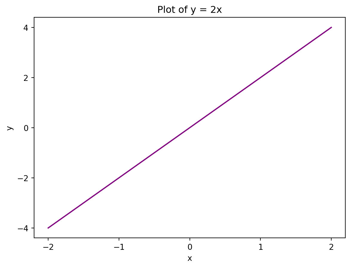
As you can see, the x- and y-axes do look significantly cleaner. We can improve how easy it is to see certain values by adding a grid using plt.grid(True)
# Create sample data
x = [-2,-1,0,1,2]
y = [-4,-2,0,2,4]

# Create line plot
plt.plot(x,y, color = "purple")

# Add title
plt.title("Plot of y = 2x")

# Edit tick marks
plt.xticks(range(-2,3))
plt.yticks([-4,-2,0,2,4])

# Add grid
plt.grid(True)

# Add axes labels
plt.xlabel("x")
plt.ylabel("y")
Text(0, 0.5, 'y')
You can also edit the x- and y-axis limits by using plt.xlim() and plt.ylim():
# Create sample data
x = [-2,-1,0,1,2]
y = [-4,-2,0,2,4]

# Create line plot
plt.plot(x,y, color = "purple")

# Add title
plt.title("Plot of y = 2x")

# Set axis limits
plt.xlim((-3,3))
plt.ylim((-5,5))

# Add axes labels
plt.xlabel("x")
plt.ylabel("y")
Text(0, 0.5, 'y')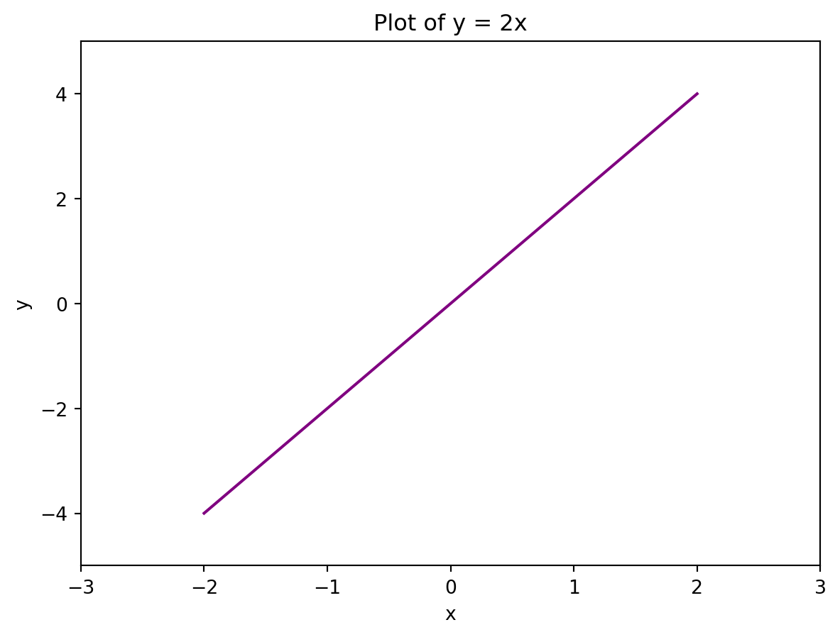
Formatting text
To format the text in a plot created using Matplotlib, you can use the fontsize and fontweight arguments of the various text functions, such as title, xlabel, and ylabel. These arguments allow you to specify the font size and font weight (i.e. thickness) of the text, respectively.
# Create sample data
x = [-2,-1,0,1,2]
y = [-4,-2,0,2,4]

# Create line plot
plt.plot(x,y, color = "purple")

# Add title and bold it
plt.title("Plot of y = 2x", fontweight = 'bold')

# Add axes labels and set their font sizes to 15
plt.xlabel("x", fontsize = 15)
plt.ylabel("y", fontsize = 15)
Text(0, 0.5, 'y')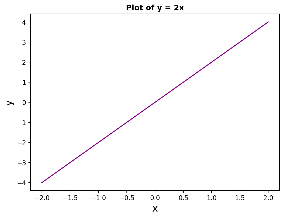
You can use the fontstyle argument to specify whether you would like to italicise your text. The fontfamily argument allows you to specify the font family, such as “serif”, “sans-serif”, or “monospace”. If you want to use a specific font, you can use the fontname argument instead.
# Create sample data
x = [-2,-1,0,1,2]
y = [-4,-2,0,2,4]

# Create line plot
plt.plot(x,y, color = "purple")

# Add title and bold it
plt.title("Plot of y = 2x", fontstyle = 'italic')

# Add axes labels and set their font sizes to 15
plt.xlabel("This is the x-axis", fontsize = 15, fontfamily = 'monospace')
plt.ylabel("This is the y-axis",
           fontsize = 15,
           fontfamily = 'serif')
Text(0, 0.5, 'This is the y-axis')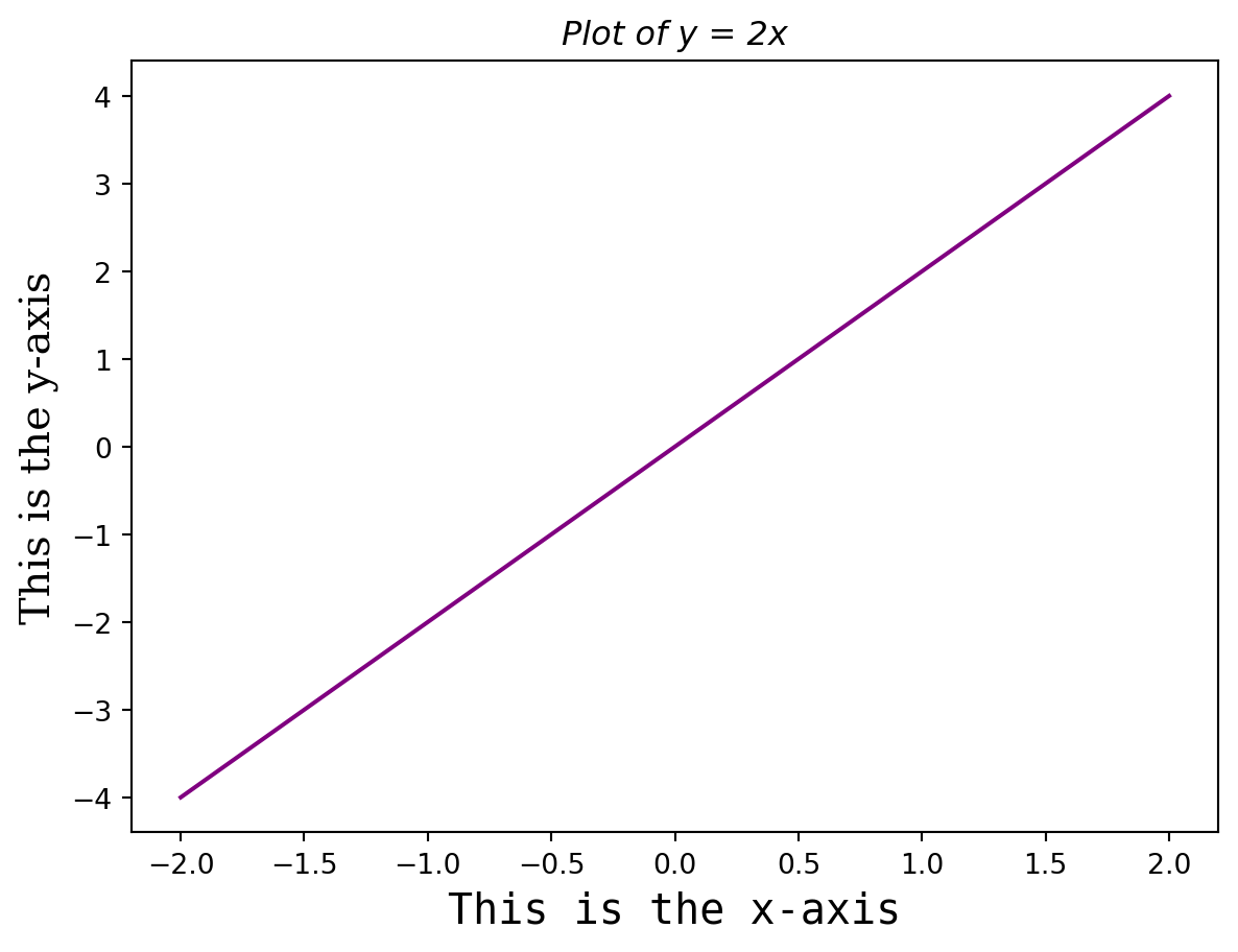
Adding a legend
You can add a legend to your plot using the plt.legend() argument. Notice that to label the lines in your plot, you need to use the label argument in the plt.plot() function, rather than through the legend function itself:
# Create sample data
x = [-2,-1,0,1,2]
y1 = [-4,-2,0,2,4]
y2 = [6,3,0,-3,-6]

# Create line plot
plt.plot(x,y1, color = "purple", label = "y = 2x")
plt.plot(x,y2, color = "green", label = "y = -3x")

# Add title
plt.title("Plots of y = 2x and y = -3x")

# Add a legend to the top right hand corner
plt.legend(loc="upper right")

# Add axes labels
plt.xlabel("x")
plt.ylabel("y")
Text(0, 0.5, 'y')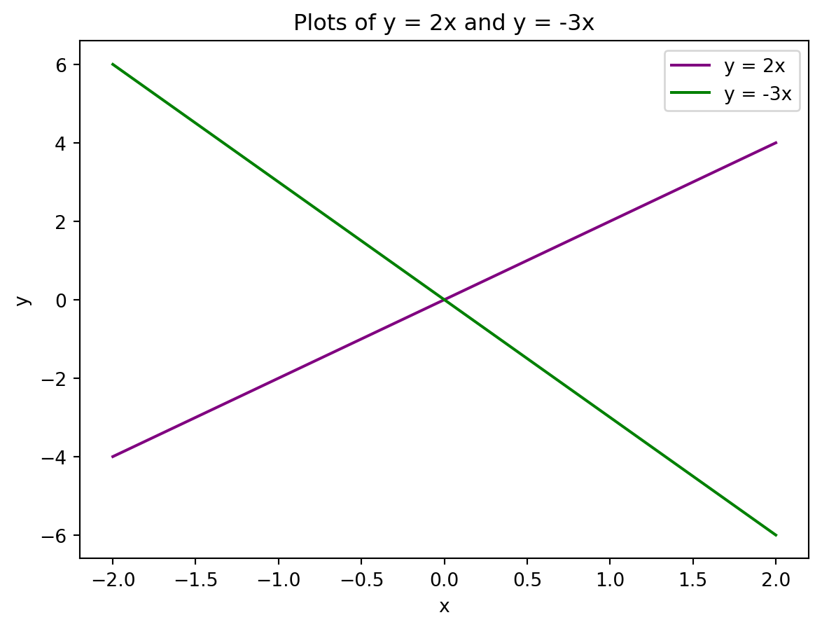
Subplots
If you want to visualise multiple plots at a time in the form of a grid, you can use the plt.subplots() function:
# Create sample data
x = [-2,-1,0,1,2]
y1 = [-4,-2,0,2,4]
y2 = [6,3,0,-3,-6]

# Create 1x2 grid of charts, with a figure size of 16x9 units
fig, ax = plt.subplots(nrows=1, ncols=2, figsize=(16, 9))

# Create a line plot in each space on the grid
ax[0].plot(x,y1, color = "purple")
ax[1].plot(x,y2, color = "green")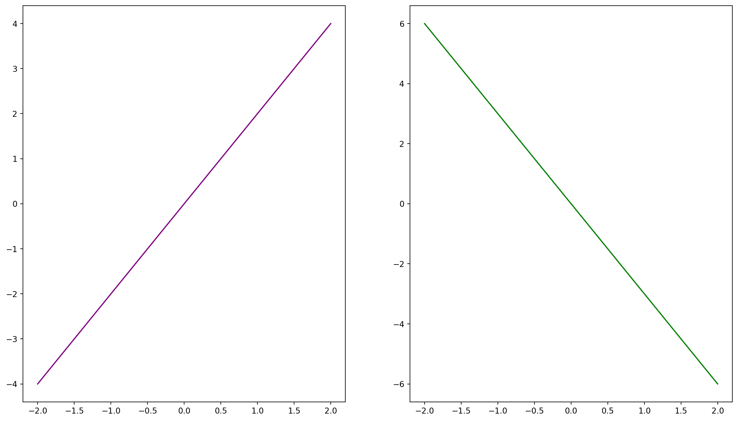
Saving plots
Use the plt.savefig() function to save your plots. This function takes in the name of the file that you want to save your chart to. Because of this, you can save a chart to various formats including PNG, JPEG, and TIFF.
Let’s fully build our line chart and save it to linechart.png.
# Create sample data
x = [-2,-1,0,1,2]
y1 = [-4,-2,0,2,4]
y2 = [6,3,0,-3,-6]

# Create line plot
plt.plot(x,y1, color = "purple", label = "y = 2x")
plt.plot(x,y2, color = "green", label = "y = -3x")

# Add title
plt.title("Plots of y = 2x and y = -3x")

# Add a legend to the top right hand corner
plt.legend(loc="upper right")

# Edit tick marks
plt.xticks(range(-2,3))
plt.yticks([-4,-2,0,2,4])

# Add grid
plt.grid(True)

# Add axes labels
plt.xlabel("x")
plt.ylabel("y")

# Save chart
plt.savefig("linechart.png")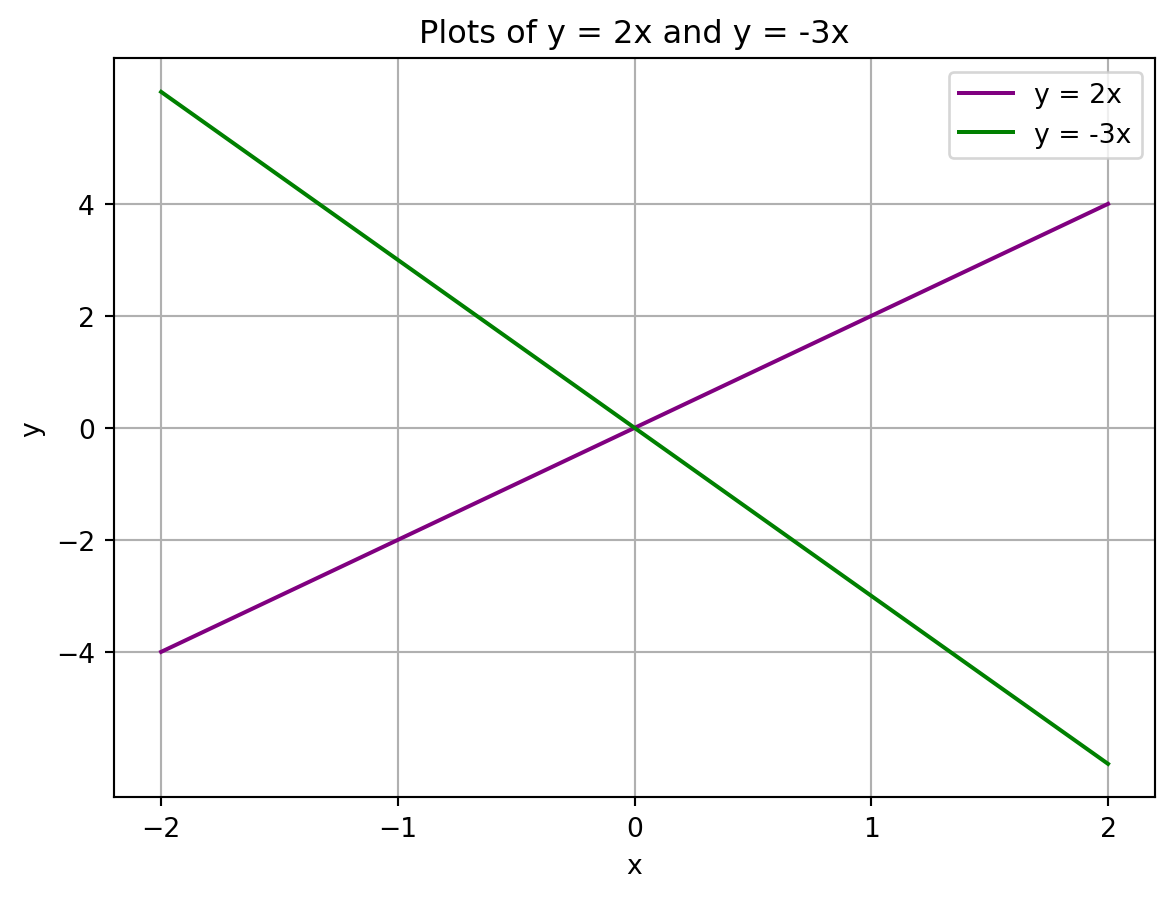
The chart should now appear in the file explorer pane in Google Colab.